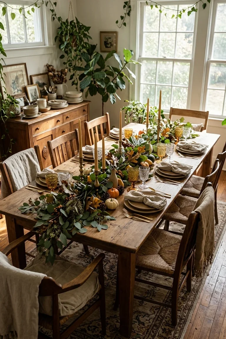

38 Pink Christmas Kitchen Decor Color Pairings to Paint
Most people pick a pink by falling for one swatch under the store’s fluorescent tubes, then roll it across a whole wall before checking it in their own light. That’s how a sweet blush turns into a flat bubblegum slab by Thanksgiving. Pink christmas kitchen decor works best when the pink is chosen for its undertone first and its sweetness second.
Below are 38 palette and undertone pairings, each with the reasoning, the room it suits, and the one thing to watch. Real paint names are included so a sample pot is a short trip away.
Key Takeaways
- Check a pink’s undertone (blue, yellow, or gray) before choosing any red, green, or metal to sit beside it.
- Sample paint on two walls and watch it from 8am to 8pm before buying a full gallon.
- Limit a kitchen to two pinks and one strong contrast color so the scheme reads as intentional.
- Bulb temperature changes pink dramatically, so 2700K lighting suits peachy pinks and 3000K suits cooler rose.
The color logic behind great pink christmas kitchen decor
Pink christmas kitchen decor works when the pink has a clear undertone and every other color is chosen to agree with it. A yellow-leaning pink (think salmon or peach) loves brass, olive, and cream. A blue-leaning pink (think rose or orchid) loves silver, navy, and icy tones.
Here’s a counterintuitive fact: a pink wall looks about a shade deeper and more saturated once it covers 40 square feet than it did on the 2-inch chip. Plan to go one step paler than instinct says.
And the kitchen is a tricky room for this. Hard surfaces bounce light around, so every pink reads brighter than it would in a bedroom.
Blush walls and a 48-inch oak shelf
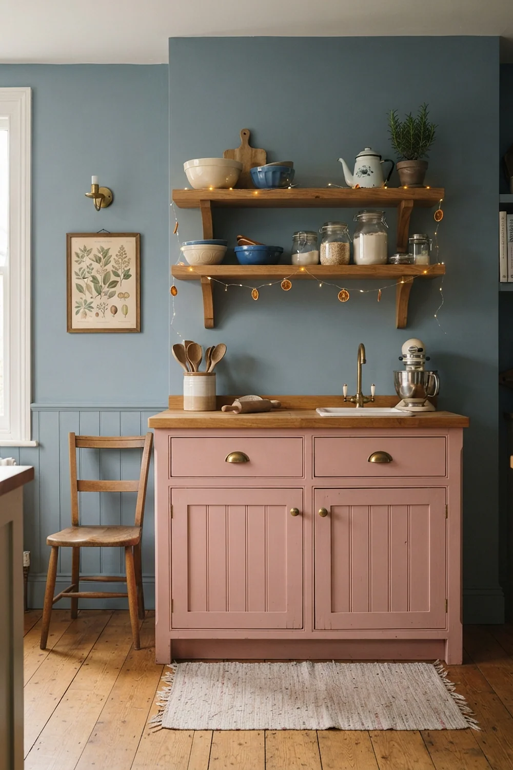
A 48-inch floating oak shelf, 10 inches deep, is about the right length to hold a row of pink and white ornaments without crowding a blush wall. Paint the wall a pale pink such as Benjamin Moore First Light, and the oak’s yellow grain reads as a natural partner.
This suits galley kitchens where wall space between cabinets is short. Keep objects to two tiers, because pink backgrounds get busy fast once glitter joins in.
Dusty rose and sage green
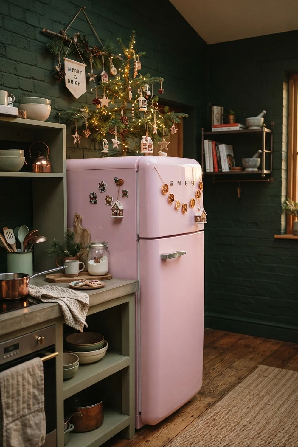
Dusty rose cabinet doors with a sage garland draped across the top rail look restful instead of loud. Both colors carry gray in their base, so neither shouts, and the pairing gives Christmas feeling without the red-and-green punch.
It’s the right move for people who find traditional holiday color tiring. Test that the green leans gray (Sherwin-Williams Sea Salt is a useful comparison chip), because a yellow-leaning green turns the rose muddy.
Cream linen against a pale pink backsplash
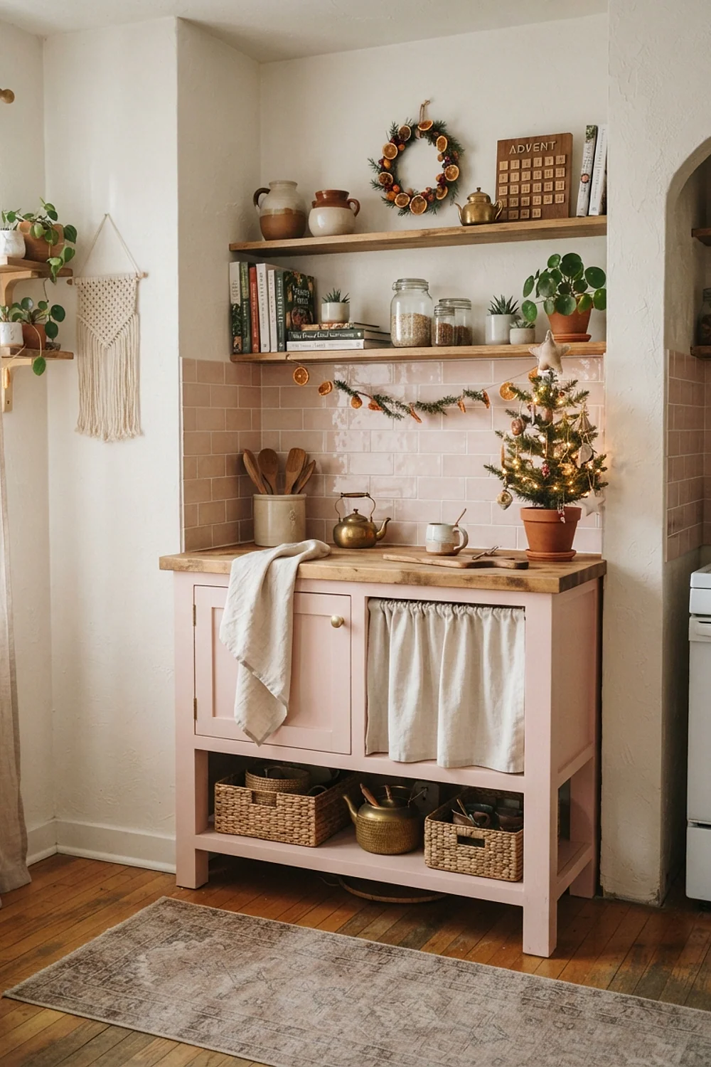
Cream linen tea towels have a dry, slightly nubby hand that calms a sugary pink backsplash. The fabric’s off-white softens the contrast so the pink reads as a background rather than the main event.
Choose washed linen at about 180 gsm, which drapes well from an oven handle or a hook. Fresh, unwashed linen stays stiff and creased, and that looks messy rather than rustic.
Pink rails with brushed brass hooks
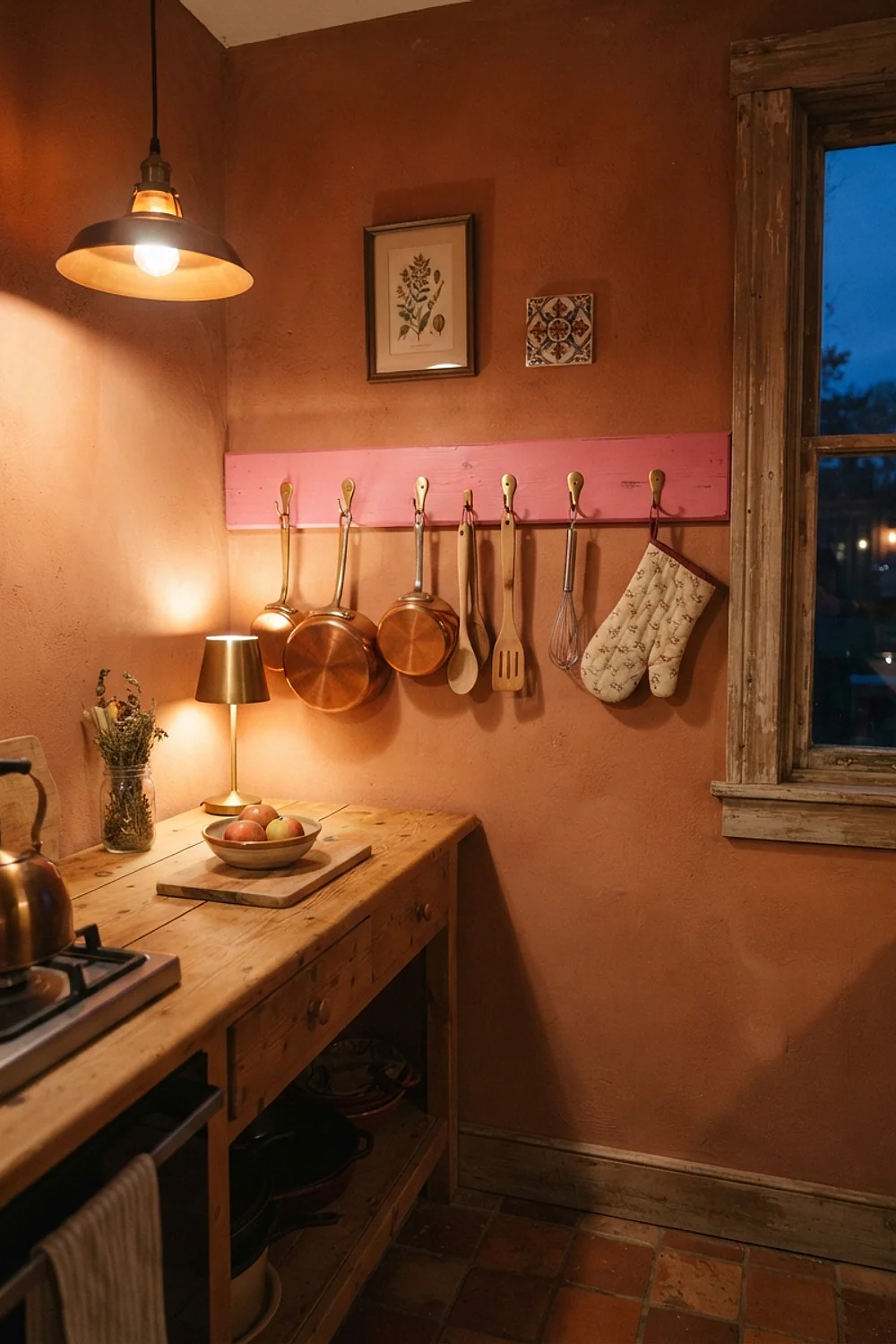
Brushed brass hooks on a 36-inch pink-painted peg rail give mugs, wreaths, and stockings a place to hang. Brass has a yellow base, which flatters peachy and salmon pinks and keeps them from going chalky. A set of five hooks runs around $28.
This is a smart fix for kitchens with no spare drawer space. Avoid shiny polished brass, which can look like a bathroom fixture next to pink.
Pink and matte black metal
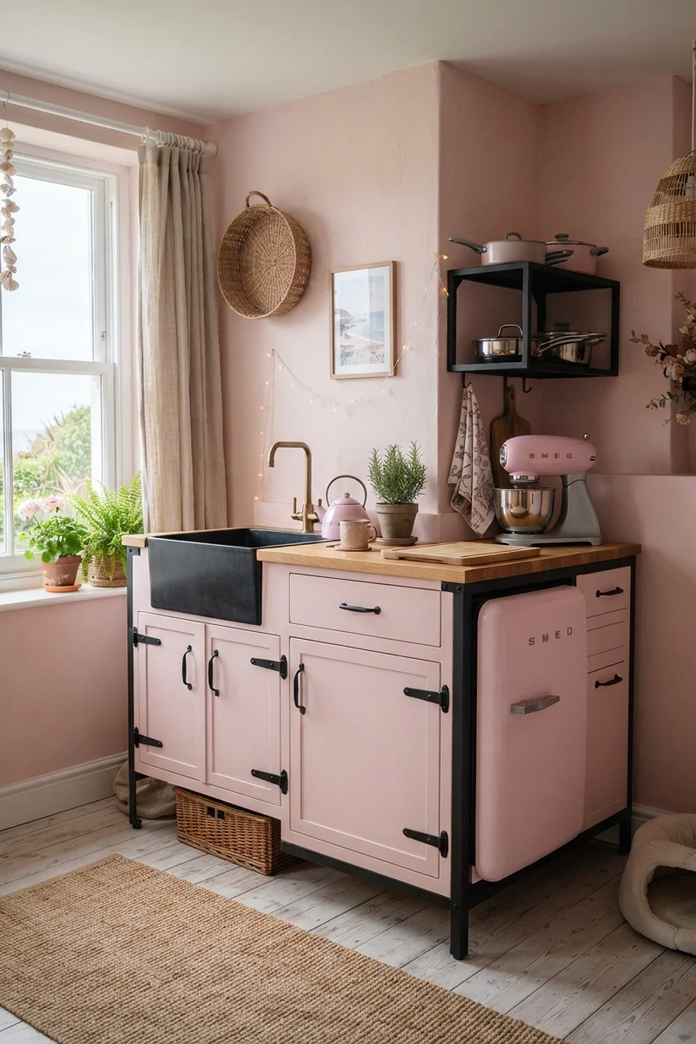
A black powder-coated steel picture ledge, about 2 inches deep, gives a pink wall a graphic line. The black acts like an outline in a drawing, and it makes the pink look cleaner and more modern.
It suits newer kitchens with flat-front cabinets. Skip gloss black here, since it shows every fingerprint and smear, and a kitchen collects those daily.
Raspberry and shell pink, three steps apart

Raspberry cushions on a shell-pink bench seat make a tonal scheme that looks planned. The trick is spacing the two colors at least three paint-chip steps apart, so they read as a pair and not as an almost-match.
This works in open kitchens with a breakfast nook, where there’s room for a layered corner. Don’t use a red-leaning raspberry with a blue-leaning pink, because the two will quarrel.
One emerald velvet cushion on a pink bench
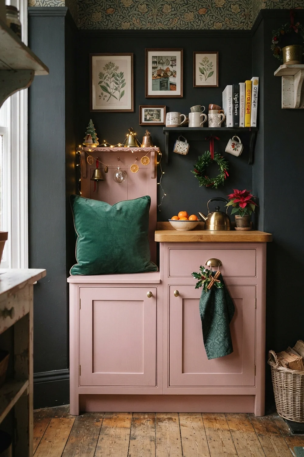
One emerald velvet cushion, about 18 by 18 inches, is enough to turn a pink-upholstered banquette into a Christmas scene. Velvet has a nap that changes shade as you brush your hand across it, and that depth stops the green from looking flat.
Use a single cushion, or two at most. A pile of green and pink pillows in a kitchen corner starts to look like a department store window.
Peach-leaning pink with 2700K string lights
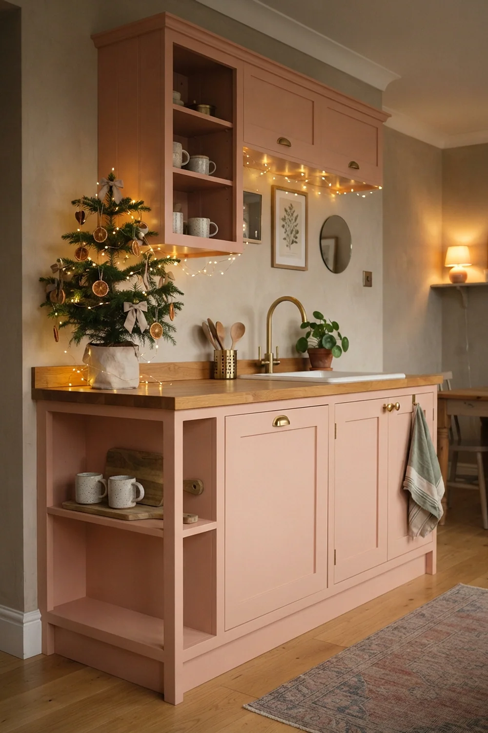
At 4pm in December, low sun turns a peach-leaning pink almost coral, and 2700K string lights extend that glow into the evening. The two warm sources agree, so the wall looks lit from within instead of washed out. A 50-foot strand of warm-white LEDs runs about $15.
This suits kitchens with a south or west window. Cool white bulbs would drain the peach and leave a dull beige-pink.
Icy blue on one side of a pink room
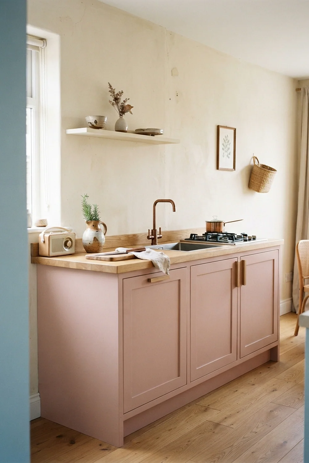
Icy blue glassware and ornaments belong on one side of the kitchen only, say the window run, while the pink holds the cooking wall. Splitting the colors by zone keeps the room from feeling like a pastel blender.
That layout works best in L-shaped kitchens, where the corner becomes a natural color break. Keep the blue pale and slightly gray, not turquoise.
Pink with a copper kettle on the counter

A copper kettle on a stovetop burner earns its place twice: it boils water, and it adds a glint of orange-brown that makes a pink backsplash glow. Copper is a working metal here, not just a prop.
It suits households that actually use the kettle daily. Know that copper tarnishes in about three weeks if untreated, so a lacquered finish saves polishing.
Hot pink in pieces under 12 inches
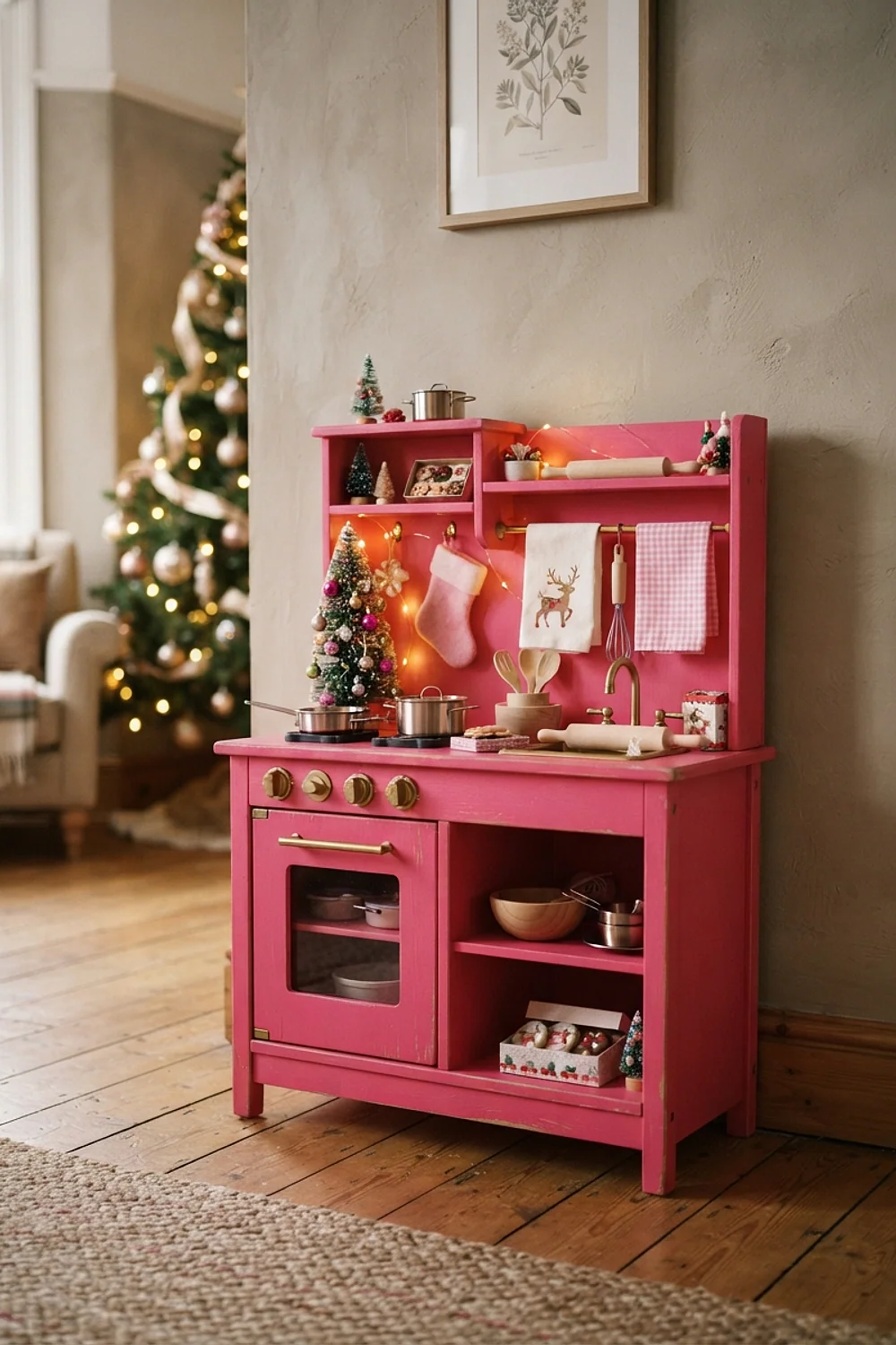
Hot pink works in small hits: a 10-inch ornament bowl, a pair of 8-inch candles, a ribbon spool. Keeping each piece under about 12 inches stops the color from taking over a white kitchen, because a saturated shade reads louder the more surface it covers.
That ratio suits renters and anyone with white cabinets they can’t change, since the white backdrop makes every small piece look deliberate and everything can be packed away in January. Put no more than four hot pink objects in view from the doorway.
Pink uppers over navy lowers

Pink upper cabinets over lowers in a deep navy such as Benjamin Moore Hale Navy give the room a heavy base and a light top, the way a tall room should be balanced. A gallon of cabinet-grade paint runs about $70 to $85, and two gallons cover an average kitchen.
This is the bold option for kitchens with 9-foot ceilings and good daylight. In a small, dim kitchen, the navy will shrink the floor area visibly.
A pink wool runner over gray floors

A 2-by-6-foot wool runner in pale pink feels dense and slightly springy under bare feet on a cold December morning. The pink reads as soft against gray tile or concrete, which would otherwise feel chilly, and the thick pile cushions hard flooring.
It suits galley kitchens where people stand at a sink for long stretches and want cushioning. Add a non-slip felt pad, because wool on tile slides, and a moving rug near a hot stove is a trip risk.
Pink walls with rattan baskets
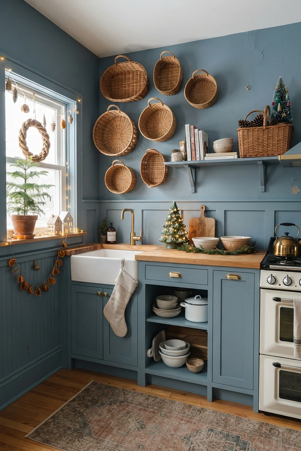
Rattan baskets about 14 inches wide hide tinsel, spare candles, and gift wrap on a low shelf, and the woven texture looks good against pink. The natural tan sits between the pink and the floor, so it blends rather than competes.
This works in kitchens with no pantry or mudroom nearby. Choose baskets with lids if the shelf is visible, otherwise the contents show through the weave.
Pink and mercury glass
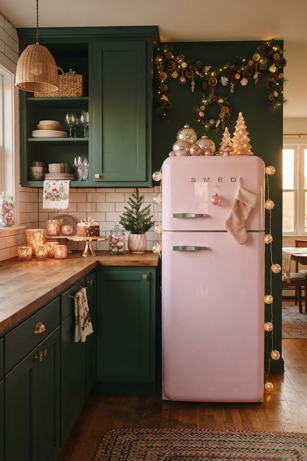
Mercury glass votives (about $4 each) reflect pink walls back in a speckled, antique-looking way. The silvery finish has a cool undertone, which sharpens a pink that might otherwise feel too sweet.
It suits kitchens with lots of wood, since the glass adds shine to match the grain. Cluster in odd numbers on a tray, and leave out any with chipped coating, which looks like peeling paint.
Pink and fire-engine red

Pairing a cool bubblegum pink with a true tomato red is the commonest holiday color mistake in kitchens. People do it because red and pink are “related,” then wonder why the room hums unpleasantly. The blue base in the pink fights the orange base in the red.
Instead, pick a red with a matching undertone, such as a berry or crimson for blue-leaning pinks, or a tomato for salmon pinks. Hold the two chips side by side in daylight before buying either.
Pink with pewter and silver candlesticks
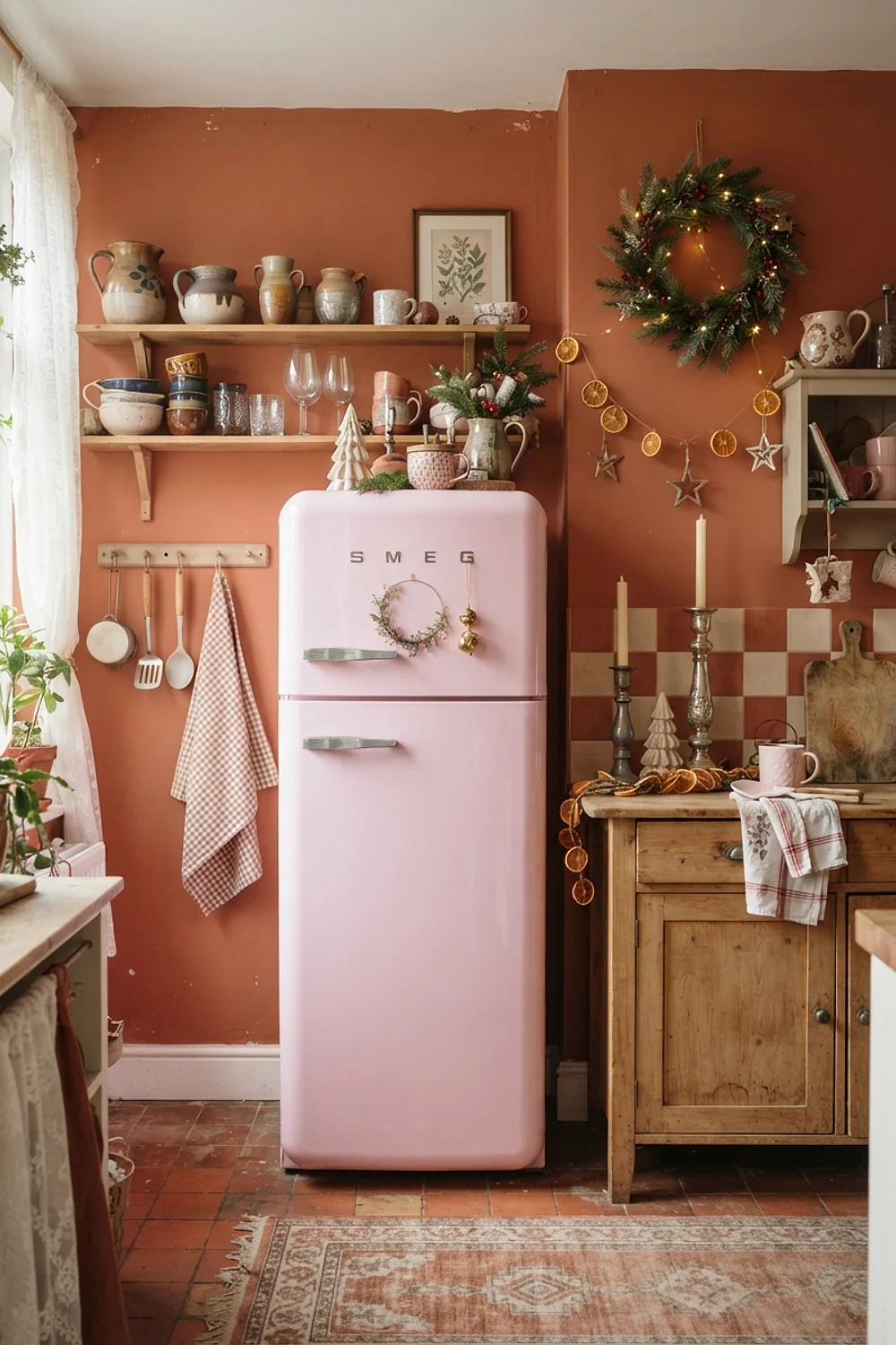
Pewter and silver candlesticks, 8 to 12 inches tall, bring a cool shine that suits blue-leaning rose. Hammered pewter has a slightly gray cast, which keeps the pink from sliding into children’s-party territory.
This is best for kitchens with stainless appliances, where the metals echo each other. Group three candlesticks of varied heights, and don’t mix in gold unless it’s very pale.
Pink in beeswax candlelight

Beeswax taper candles give off amber light and a faint honey smell, and at dusk they push pink toward apricot. Set two on the dining end of a kitchen and the walls pick up the flicker.
That makes sense for open kitchens where dinner happens at the island. Keep candles at least 12 inches from any hanging garland, since dry greenery catches quickly.
A pink island with white shaker perimeter cabinets
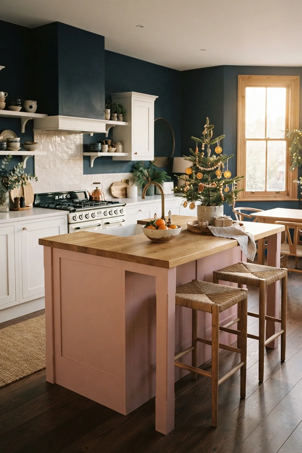
A pink island, 36 inches high, surrounded by white shaker cabinets makes the island the visual center without repainting the whole room. Farrow and Ball Setting Plaster is a muted pink that stays calm in this role.
It suits kitchens big enough to circle the island with at least 42 inches of clearance. In tighter rooms the pink block will loom over the walkway.
Pink with oiled butcher block
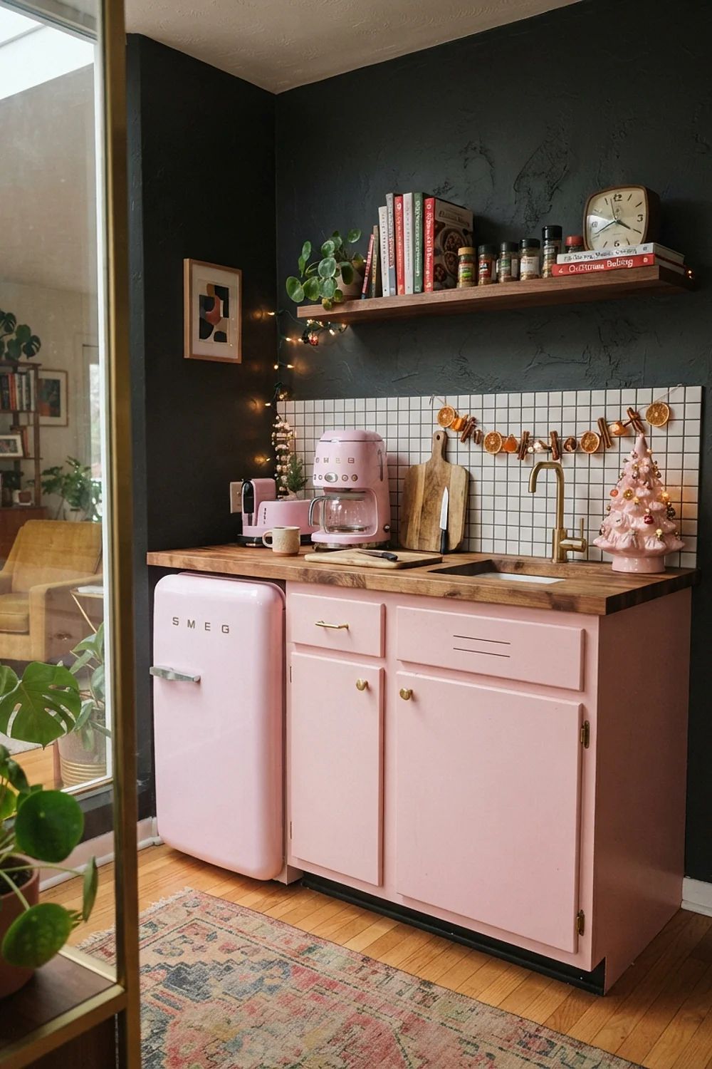
Pink tile or painted cabinets beside an oiled butcher block top make the wood’s amber look rich against cool color. A 6-foot oak slab costs roughly $200 to $300, and the wood does real work as a prep surface.
It’s a good match for people who use their counters hard. Reoil it twice a year or the wood dries to a pale gray that clashes with the pink.
A 9-foot evergreen garland over pink cabinets
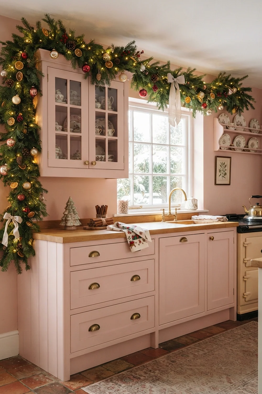
A 9-foot evergreen garland draped over pink upper cabinets works because the length matches a full cabinet run. Farrow and Ball Studio Green is the kind of deep green that echoes it in paint if the garland is faux.
This suits wide kitchens with a long uninterrupted wall. In a short run, use a shorter garland and let it swag rather than stretch.
Pink and chocolate brown
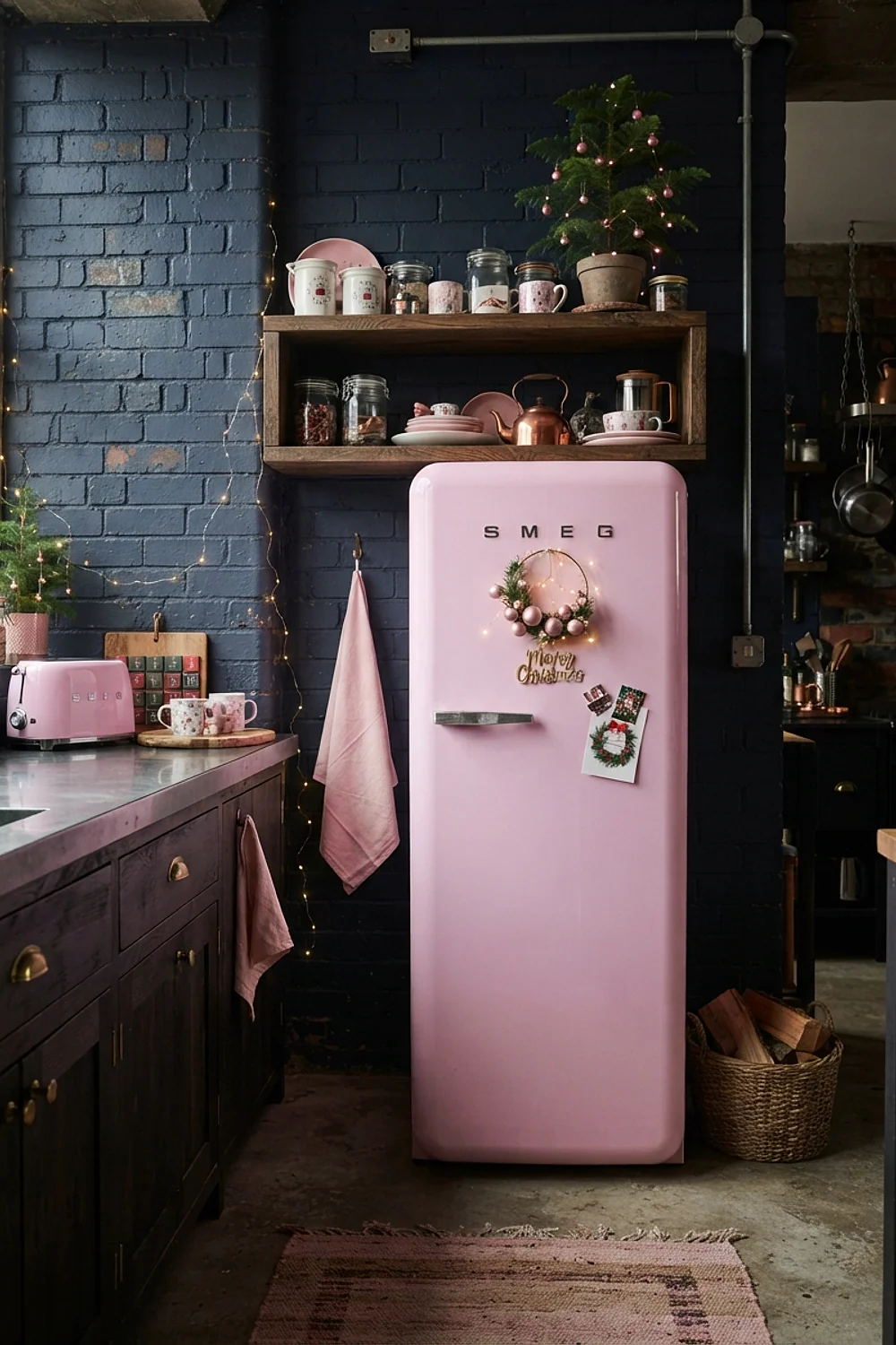
Chocolate brown acts as a neutral beside pink, the way navy does in a blazer. Brown wooden bowls or a stained shelf make a pale pink look grown-up and slightly retro.
It suits mid-century kitchens and older homes with dark woodwork. Pick a brown with a red base, not a gray one, so it feels related to the pink instead of cold.
Pink and cream buffalo check

Pink and cream buffalo check in cotton, as a table runner or oven mitts, has a crisp, slightly textured weave that holds its shape. The check pattern breaks up a solid pink and prevents it from feeling too flat.
That’s useful in farmhouse-style kitchens. Keep the check at 1 inch or larger, because tiny checks vibrate next to painted walls.
Pink glassware behind glass-front cabinets

Glass-front cabinet doors let pink Depression glass, which runs $15 to $40 a piece, glow with the light from a window. The translucent pink looks like candy held to the light, and the glass keeps dust off the pieces between holidays.
This works for people who like to display and rotate objects, and for budgets that build a collection one piece at a time. Avoid stuffing the shelves, and leave a hand’s width between pieces so each one can catch light.
Pink with terracotta pots
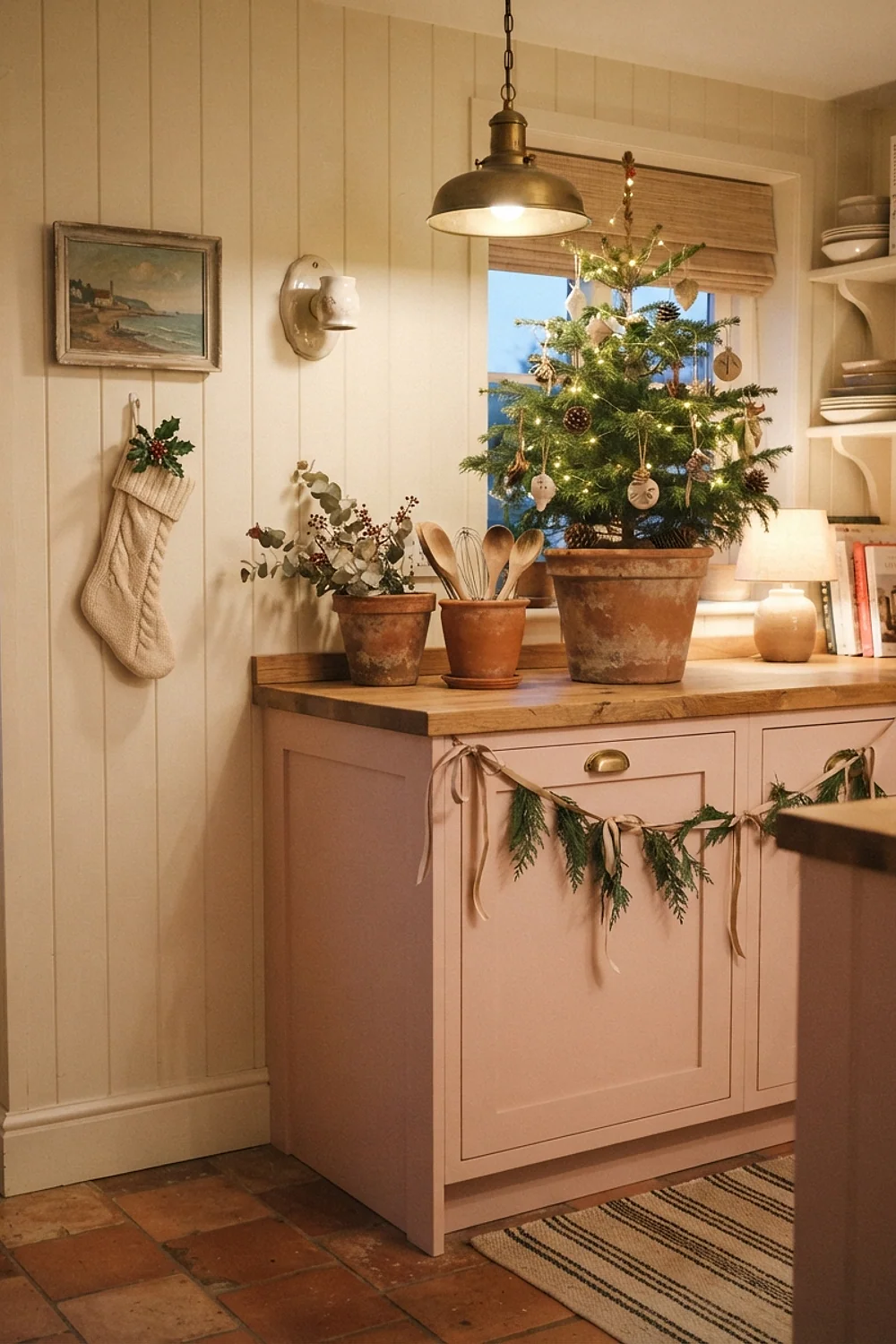
Terracotta pots, 6 inches across, planted with rosemary or paperwhites give pink a grounded, earthy partner. The clay is porous and slightly gritty to touch, and its orange base matches peachy pinks well, so the two read as one warm family.
It suits kitchens with a bright sill, where herbs and bulbs get the light they need and the pots double as living decor. Put a saucer under each pot, since clay weeps water onto painted wood and can leave rings.
Pink and lavender, used sparingly

A single lavender candle among pink ornaments can work, but pink beside lavender drifts toward a purple-pink that feels like a spring party, not Christmas. More than one lavender piece muddies the story, because the eye stops reading holiday warmth and starts reading pastel.
Limit lavender to about 10 percent of what’s visible. This suits schemes that are mostly white or pale pink and need one cool accent. If the pink already has a violet base, skip lavender altogether.
A 3-foot pink feather tree on the counter
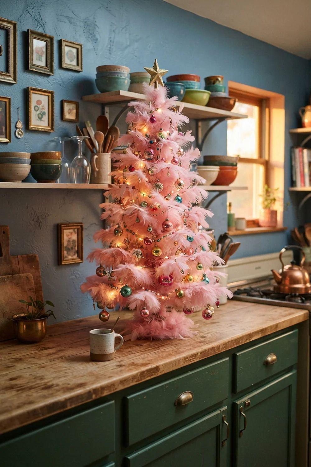
A 3-foot pink feather tree on the counter has a soft, fluffy texture that photographs well and stays out of the way. It gives the room a tree without taking up floor space, and the sparse, airy branches show off a few small ornaments.
It suits small kitchens and apartments where every square foot of floor is spoken for. Feathers shed a little and don’t like steam, so keep the tree away from the stovetop and the kettle.
Pink under 3000K cabinet lighting
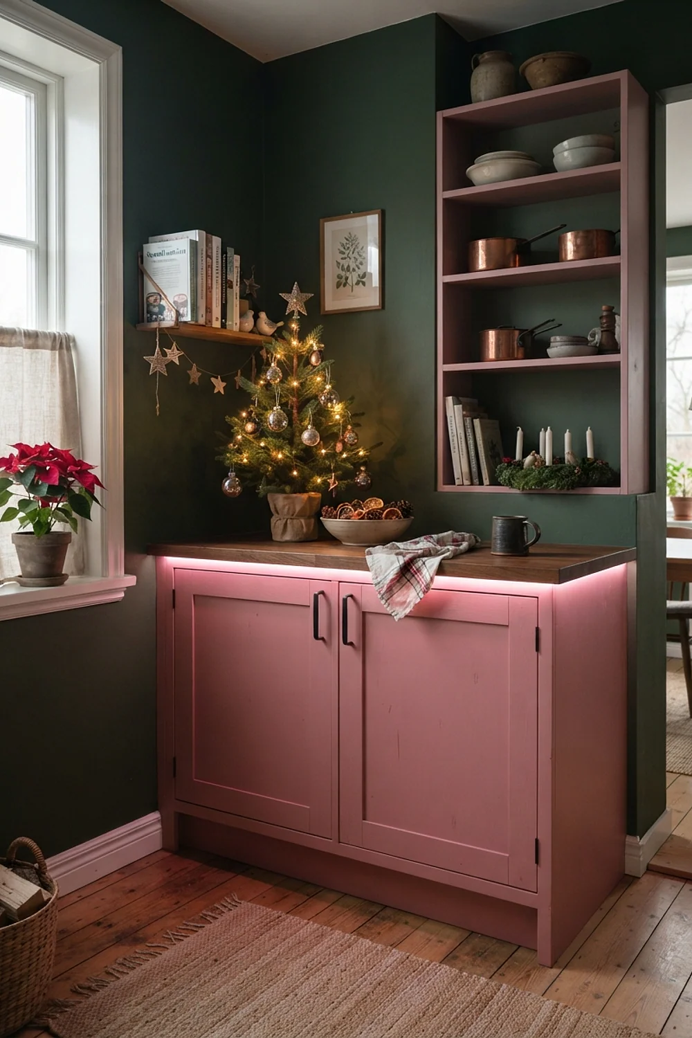
LED strips under the cabinets at 3000K with a CRI of 90 or higher keep pink tile looking like pink and not like beige. Cheap strips with a low CRI turn pink gray and make food look dull.
This suits kitchens with a pink or coral backsplash that sits under task lights. Test the strip before sticking it up, since the adhesive marks paint.
A pink tablescape on a 6-foot peninsula
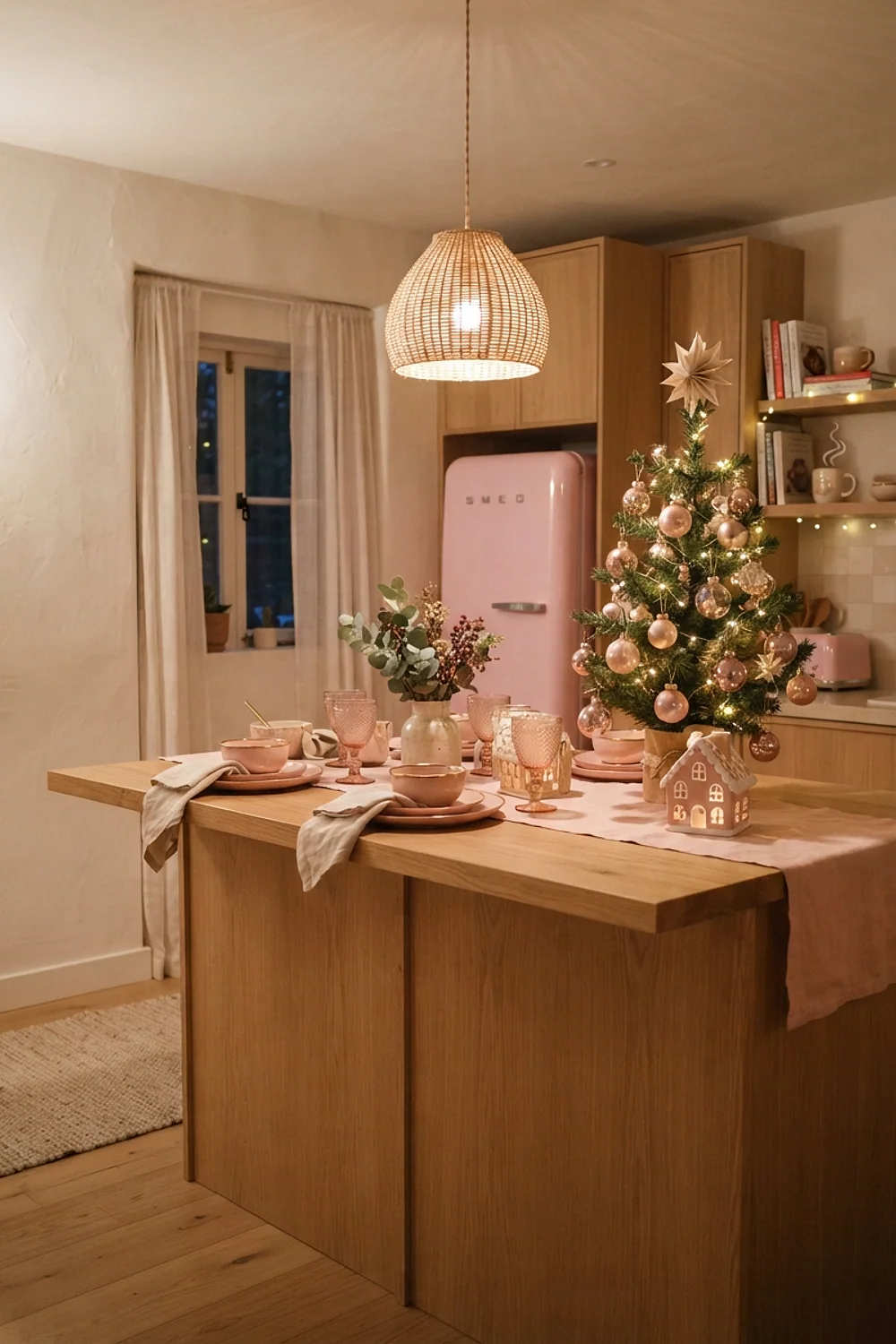
Along a 6-foot peninsula, three pink candle holders spaced about 18 inches apart make a clear line that guides the eye from cooking zone to dining zone. They cost around $25 for the set, so the whole arrangement is easy on a modest budget.
That layout suits kitchens where the peninsula separates two areas and doubles as a serving spot. Keep the center clear so people can still set down trays, and avoid crowding the line with extra greenery or bowls.
Pink with stainless steel appliances

Stainless steel gives a cool, neutral background that lets pink accents read clearly. A pink enamel kettle or a pink toaster against a steel range stands out without competing, since the metal reflects light rather than adding its own color.
It suits rental kitchens where the appliances are fixed and can’t be swapped. Wipe fingerprints off steel before decorating, since smudges and pink glitter together look grubby, and skip glitter near the range where it can drift into food.
A 5-foot pink tree with gold ornaments

A 5-foot pink tree in a corner, with about an 18-inch footprint, fills a blank wall and still leaves room to open the nearby cabinet. Pale gold ornaments echo a pink tree’s sheen without hardening the look, where bright silver would turn it cold.
This works in eat-in kitchens with a spare corner. Measure the swing of the door first, so the tree doesn’t block it, and keep the branches clear of any heater or vent.
Pink and olive
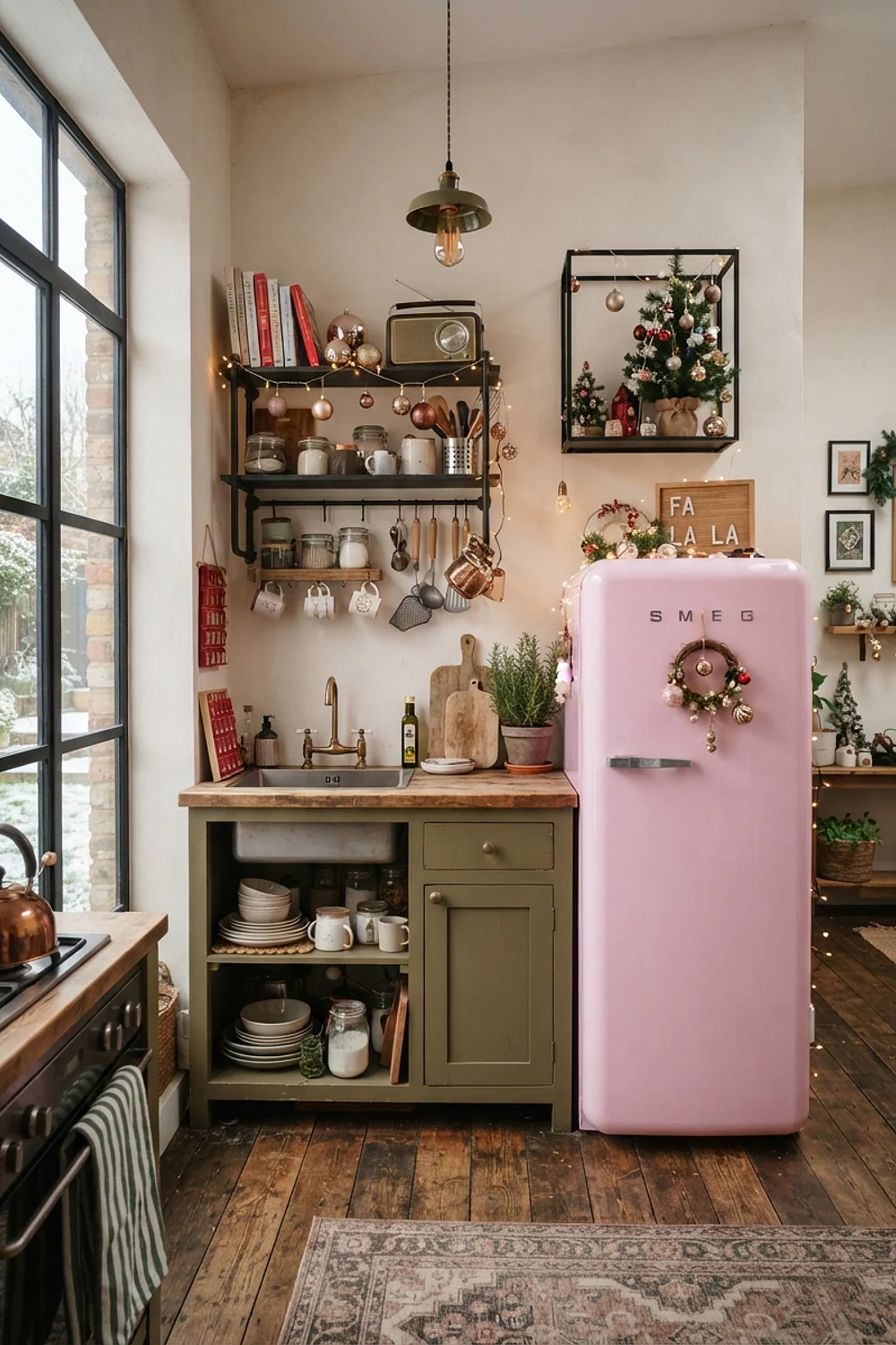
An olive ceramic bowl or a swag of olive branches brings in the color in a natural way. Olive green has a yellow-brown base that quiets a bright pink and makes it feel vintage, like a mid-century kitchen.
It suits kitchens with older wood floors, whose warm tones tie the two colors together. Avoid an olive that’s too yellow, which can look like mustard next to pink, and hold a branch against the pink first.
Pink with a sheepskin stool cover
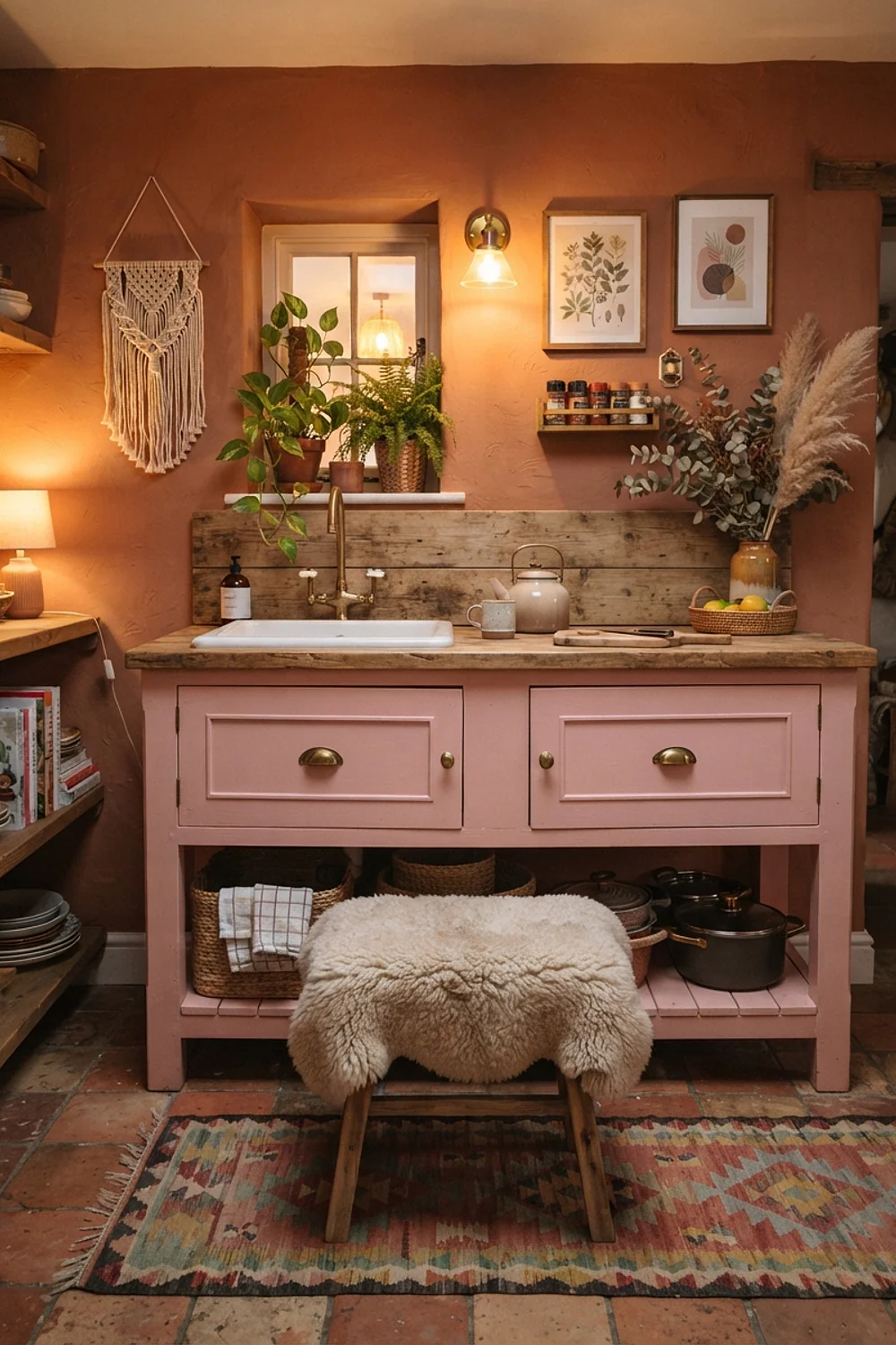
A sheepskin cover on an 18-inch round stool has a deep, springy pile that makes a hard seat inviting. In ivory or pale pink it adds comfort without adding another hard color. It costs around $30.
That suits breakfast bars where people linger over coffee. Choose a real or faux pile with a non-slip backing, or it’ll creep off the seat.
A pink pegboard for wall storage
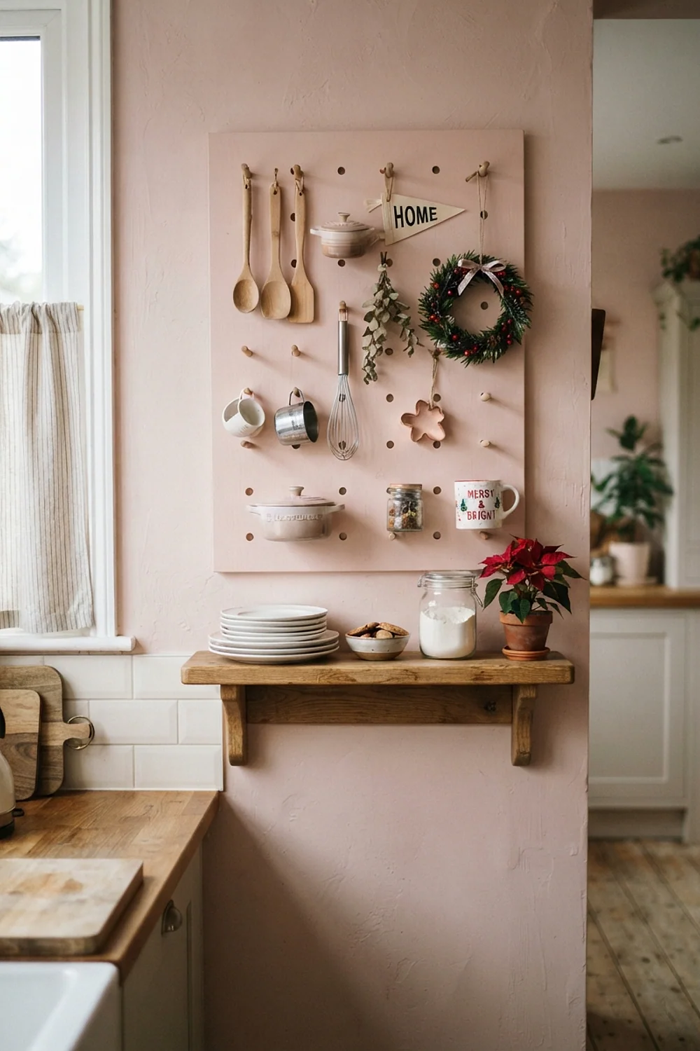
A 24-by-36-inch pegboard painted pink, with wooden pegs and small baskets, turns unused wall into storage for ornaments and wrapping supplies. Painted board holds color well, and the grid gives the design a tidy structure that keeps loose items visible.
This is a smart choice for tiny kitchens with no spare drawer or cupboard space. Prime the board first, since raw hardboard soaks up paint and leaves a patchy finish, and mount it on spacers so the pegs have room to sit.
Pink with speckled stoneware
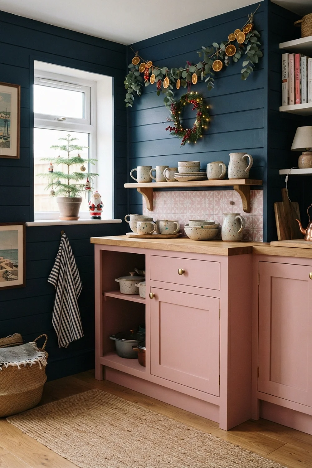
Speckled stoneware mugs have a matte, slightly rough glaze that pairs well with a smooth pink wall. The tiny brown flecks add visual interest in an otherwise quiet scheme, and the contrast of textures keeps a flat pink from looking sterile.
It suits people who like handmade-looking pieces and want mugs that get used daily, not just displayed. Check that the glaze is food-safe and dishwasher-safe, since some craft glazes fade or flake over time.
Too many pinks at once

A kitchen with five different pinks, from salmon towels to cool rose ornaments, looks like a paint chip rack. The eye can’t find the main color and the room feels unsettled, because warm and cool pinks fight each other.
Stick to two pinks, one light and one deep, with the same undertone. Everything else in the room should be neutral or a single contrast color. This rule helps most when gifts and hand-me-down decor arrive in mismatched shades; hold a swatch or ornament up to the wall before buying.
Pink with paper snowflakes
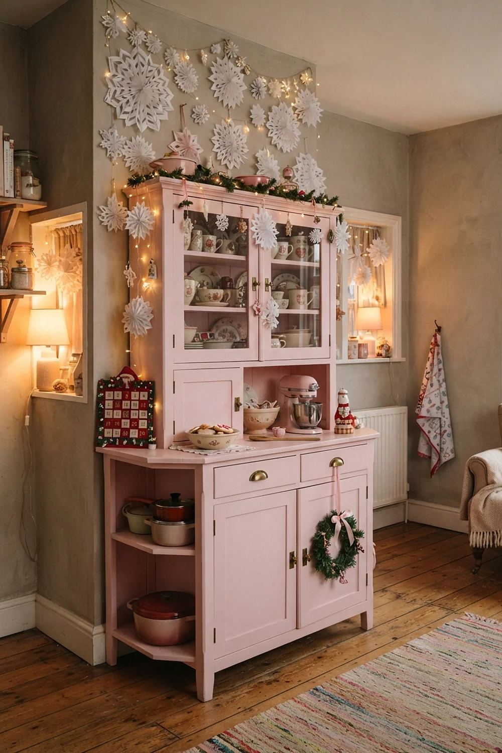
White paper snowflakes taped to a pink window or hung from the ceiling cost about $6 for a pack of paper. The white has a crisp edge that makes pink look fresher, and the cut patterns throw shadows on the wall.
This suits renters and anyone who wants a quick change. Hang them with removable tape, not pins, so the paint stays intact.
Pink in a north-facing kitchen
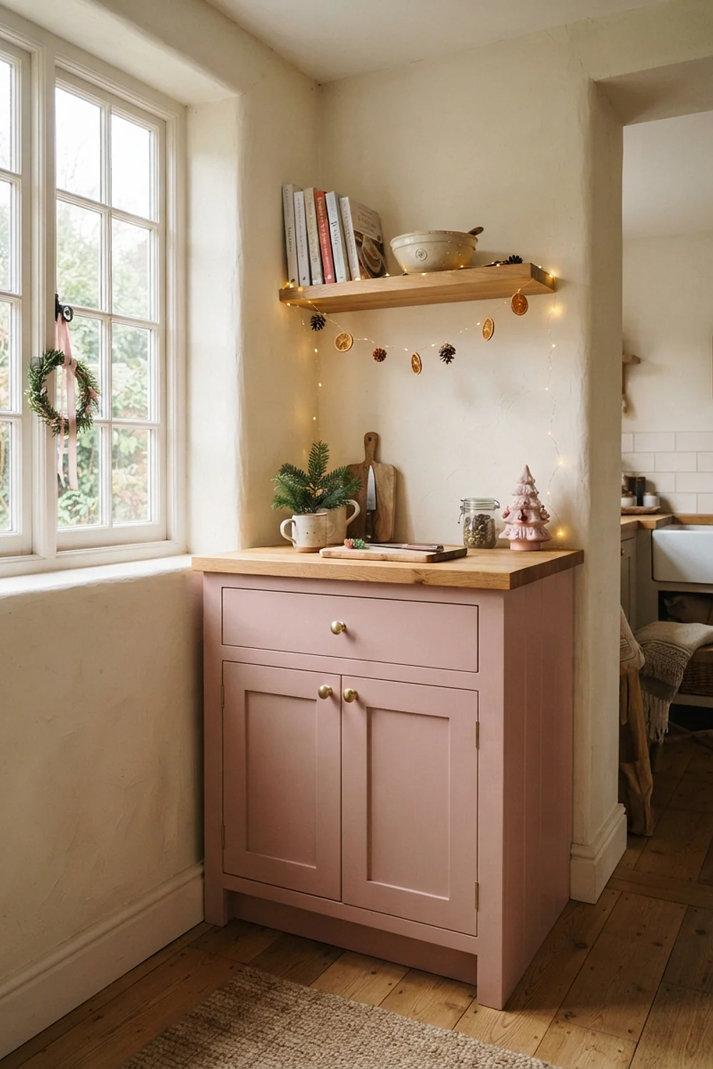
In a north-facing kitchen, cool daylight pulls pink toward gray, so a peachy or salmon pink balances it. Farrow and Ball Calamine has enough warmth to hold its color in that light, even on overcast December days.
It suits any kitchen that feels chilly through the day, since the warm undertone makes the room feel less cold. Avoid blue-leaning pinks here, since they’ll go lavender-gray by mid-afternoon; test a sample on the wall and check it at that hour.
Testing colors for pink christmas kitchen decor before you commit
Sample pots cost about $5 to $8 each, and they save a gallon of regret. Paint two 2-by-2-foot squares on different walls, not on one, because a kitchen has several light conditions.
Then follow the process:
- Roll the sample on a sheet of white poster board, so it can be moved around.
- Check it at 8am, noon, 4pm, and again at night under your usual bulbs.
- Hold it next to the cabinets, countertop, and floor, since pink changes beside each of them.
- Add the red or green you plan to use, and see whether the pair holds up.
By the second coat on a test patch, the true color shows. The first coat is usually patchy and lighter than the final result.
And don’t judge on a gray, rainy Sunday alone. Pink can look lifeless in flat light and glorious two days later in sun.
Rookie errors
Here’s the deal: most pink problems come down to undertone, not tone, and they’re fixable without repainting the room. Identify what’s off first, then pick the cheapest change.
Pink christmas kitchen decor that feels too sweet usually needs a grayer neighbor, not a different pink. A matte black ledge or pewter candlesticks can cut the sugar quickly.
- Pink looks too purple: add yellow-based brass or olive green to pull it warmer.
- Pink looks too orange: add icy blue or silver to cool it.
- Pink looks flat: swap bulbs to 2700K and add a mirror or mercury glass.
- Pink overwhelms the room: cover half of it with white shelving or a large garland.
If the wall itself is wrong, repaint just the main wall and leave the rest. One fresh color against three old ones often looks deliberate.
Pick one pairing and start there
Pink christmas kitchen decor doesn’t need all 38 ideas at once. It needs one clear undertone, one contrast color, and lighting that flatters both.
Start with the pairing that suits your existing cabinets and floor, then add a second layer after a week of living with it. Save or pin this list so it’s ready when sample pots are in hand, and begin with a single paint chip taped beside your window to see how it behaves at 4pm.