
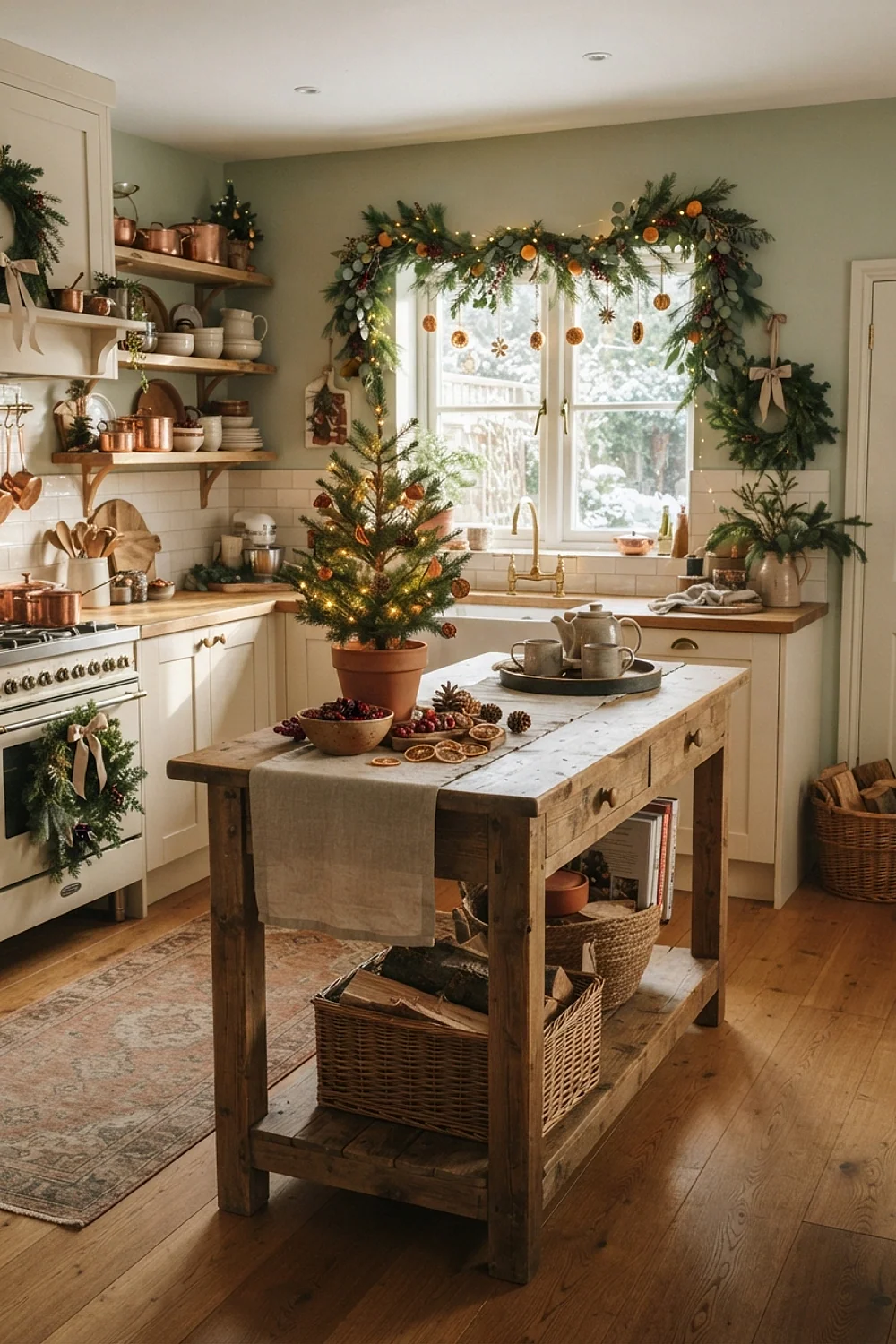
How to Choose the Right Colors for Cozy Christmas Kitchen
Which colors make a kitchen feel like Christmas without turning it into a gift shop? The answer for cozy christmas kitchen decor is a muted base, one saturated holiday color, and a metal or wood that catches lamplight.
Below are 41 specific palette and undertone pairings, with paint names, finishes, and measurements. Each one explains why it works, which kitchen it suits, and what to avoid.
Key Takeaways
- Undertone matters more than hue, because a red or green with the wrong undertone fights your cabinets.
- Test every paint sample on two walls and look at it at 9am, 4pm, and under evening bulbs.
- Holiday color works best as one saturated anchor plus a neutral base, never three competing brights.
- Bulb temperature changes red and green dramatically, so 2700K bulbs belong in any Christmas kitchen.
The color logic behind great cozy christmas kitchen decor
Evergreen Fog and Alabaster
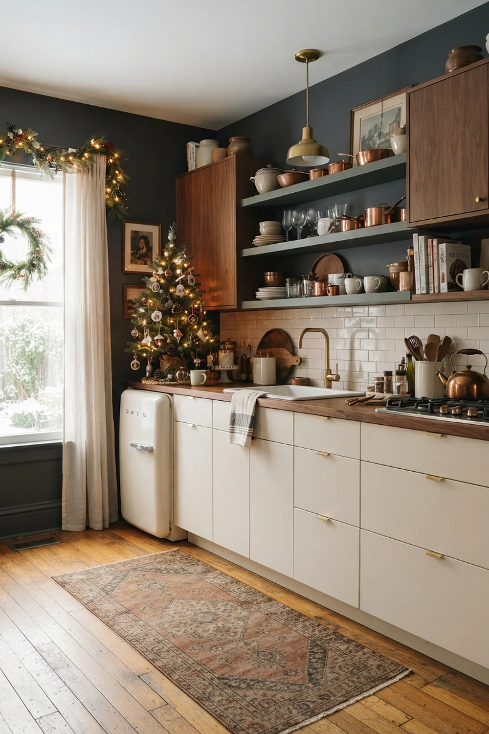
Sherwin-Williams Evergreen Fog is a gray-green with enough black in it to behave like a neutral. Painted on lower cabinets and paired with Alabaster walls, it handles a busy family kitchen where fingerprints show.
It suits galley kitchens under 120 square feet, because the muted green never shouts. Choose a satin finish, since flat paint on cabinet doors will scuff within a month.
Hale Navy with brass and cranberry
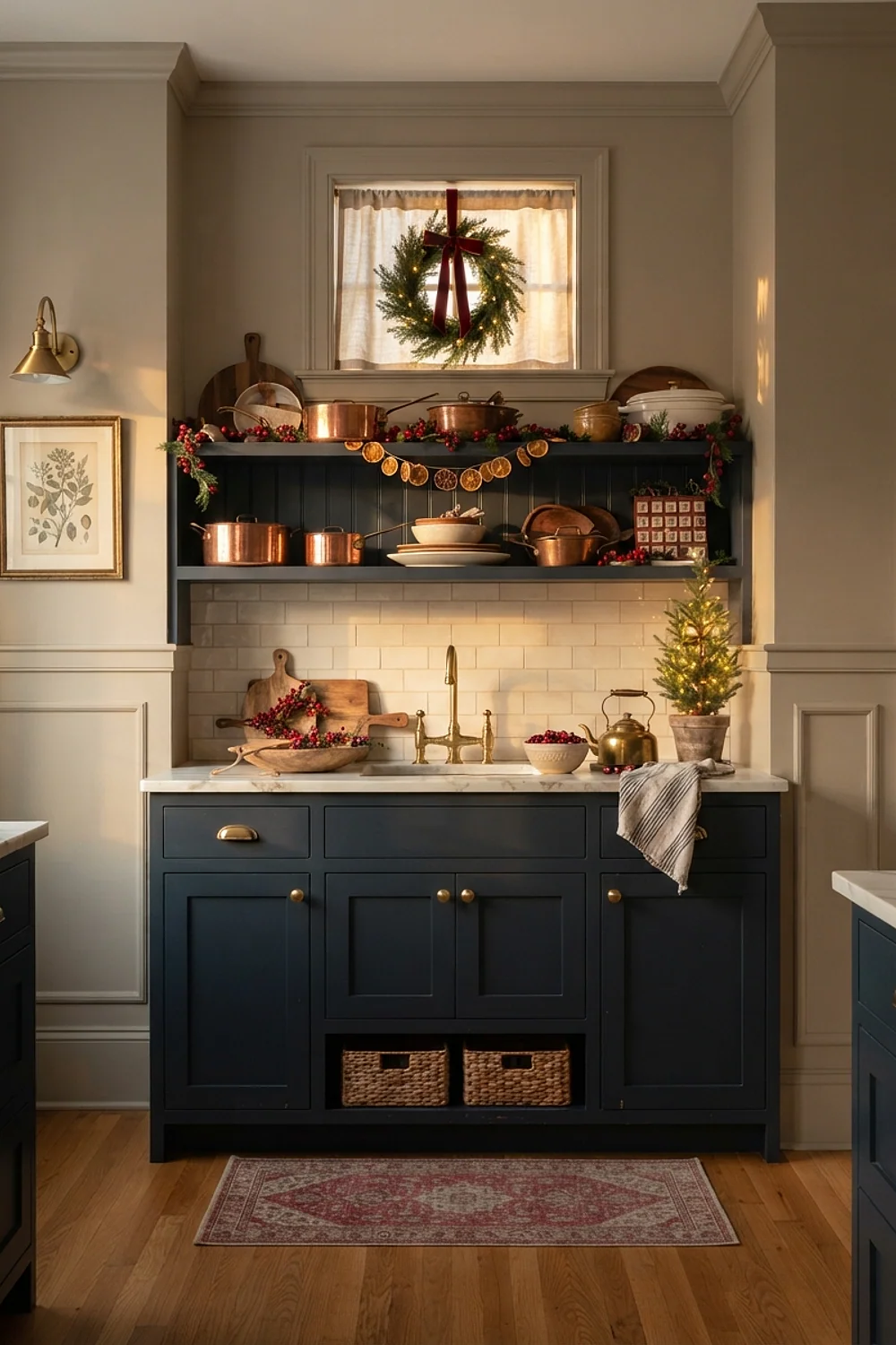
Benjamin Moore Hale Navy turns nearly black at 4pm on a gray December afternoon, then glows blue under a pendant. Brass pulls and a single cranberry runner pick up the lamp light.
This works best in kitchens with a south window. In a north-facing room, the navy goes flat, so use 2700K bulbs and skip the cool white LED strips.
Cloud White cabinets with buffalo check textiles
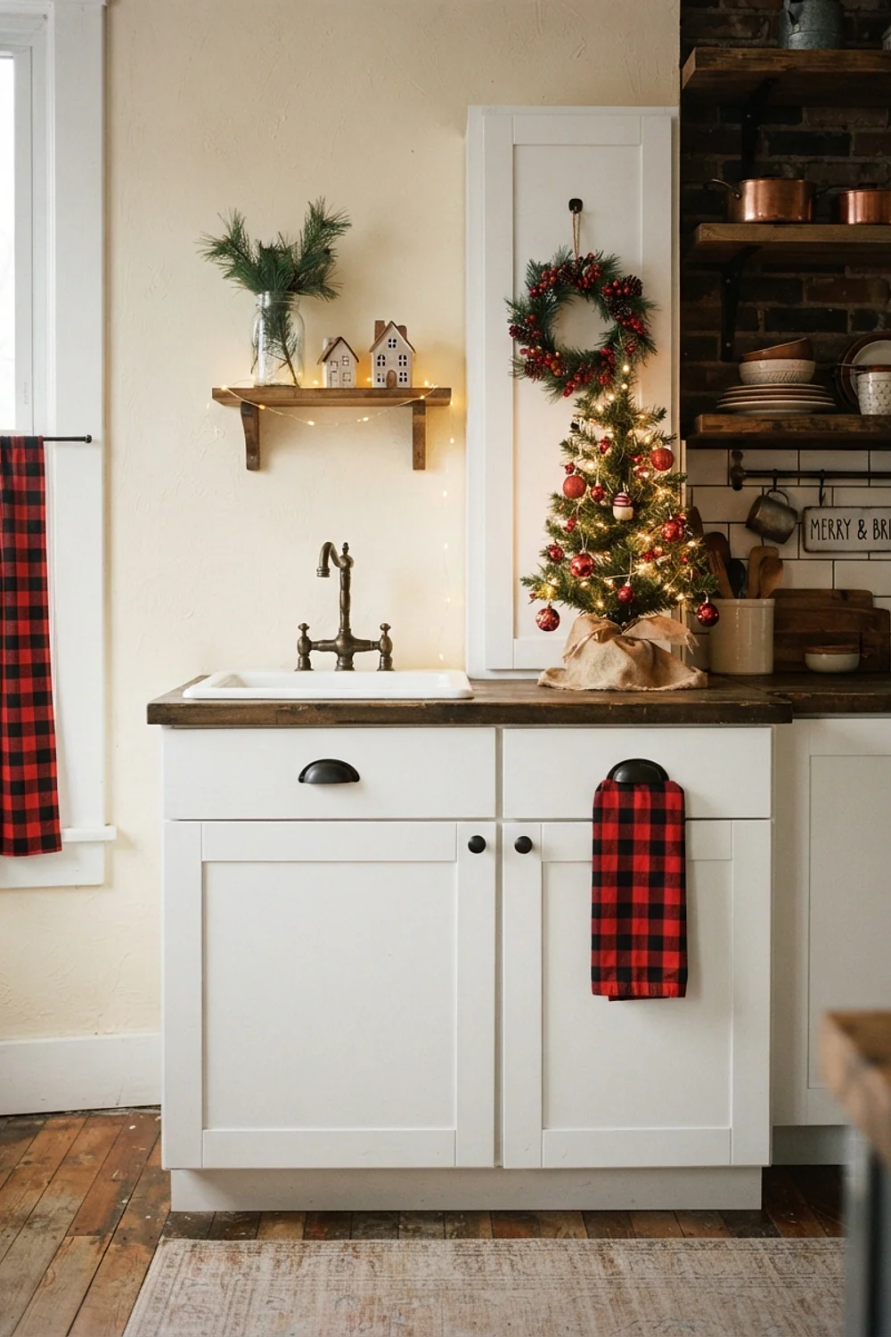
Red and black buffalo check dish towels on Cloud White cabinets give you Christmas in the cheapest swappable layer. Benjamin Moore Cloud White has a slight yellow lean that keeps the check from looking harsh.
Renters get the most from this one, since nothing gets painted. Keep the check to two items, a towel and an oven-mitt-sized pot holder, or it starts to look like a diner.
Green Smoke beside oatmeal linen
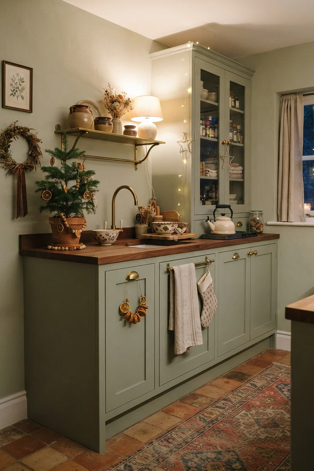
Farrow & Ball Green Smoke has a blue-gray base that looks almost dusty, and oatmeal linen curtains stop it from going cold. The two share the same low saturation, so they sit together without effort.
Pick this if you want a kitchen that still looks right on January 3rd. A strand of dried eucalyptus is enough to read as Christmas without a single red object.
Kendall Charcoal and copper
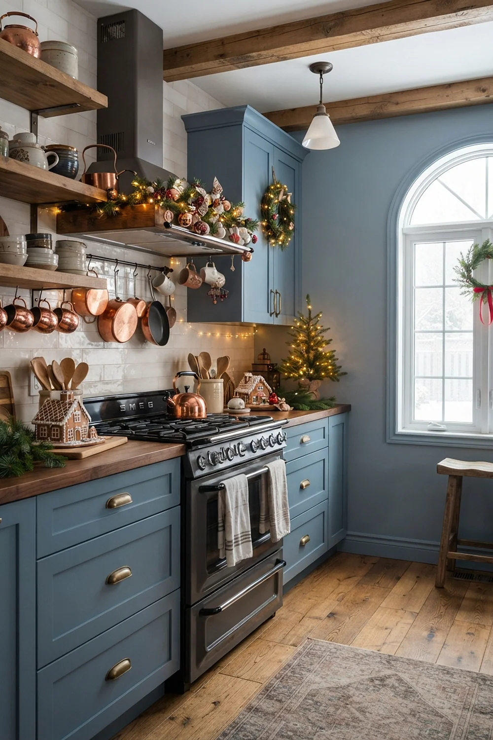
A 36-inch copper pot rack against Benjamin Moore Kendall Charcoal gives the metal a dark backdrop to glow against. Charcoal also makes a small kitchen feel deeper, since the edges of the room dissolve.
That is the counterintuitive part: in a dim 10-by-10 kitchen, a dark wall often reads larger than white. It needs good task lighting under the cabinets, or the room turns into a cave.
Setting Plaster and forest green
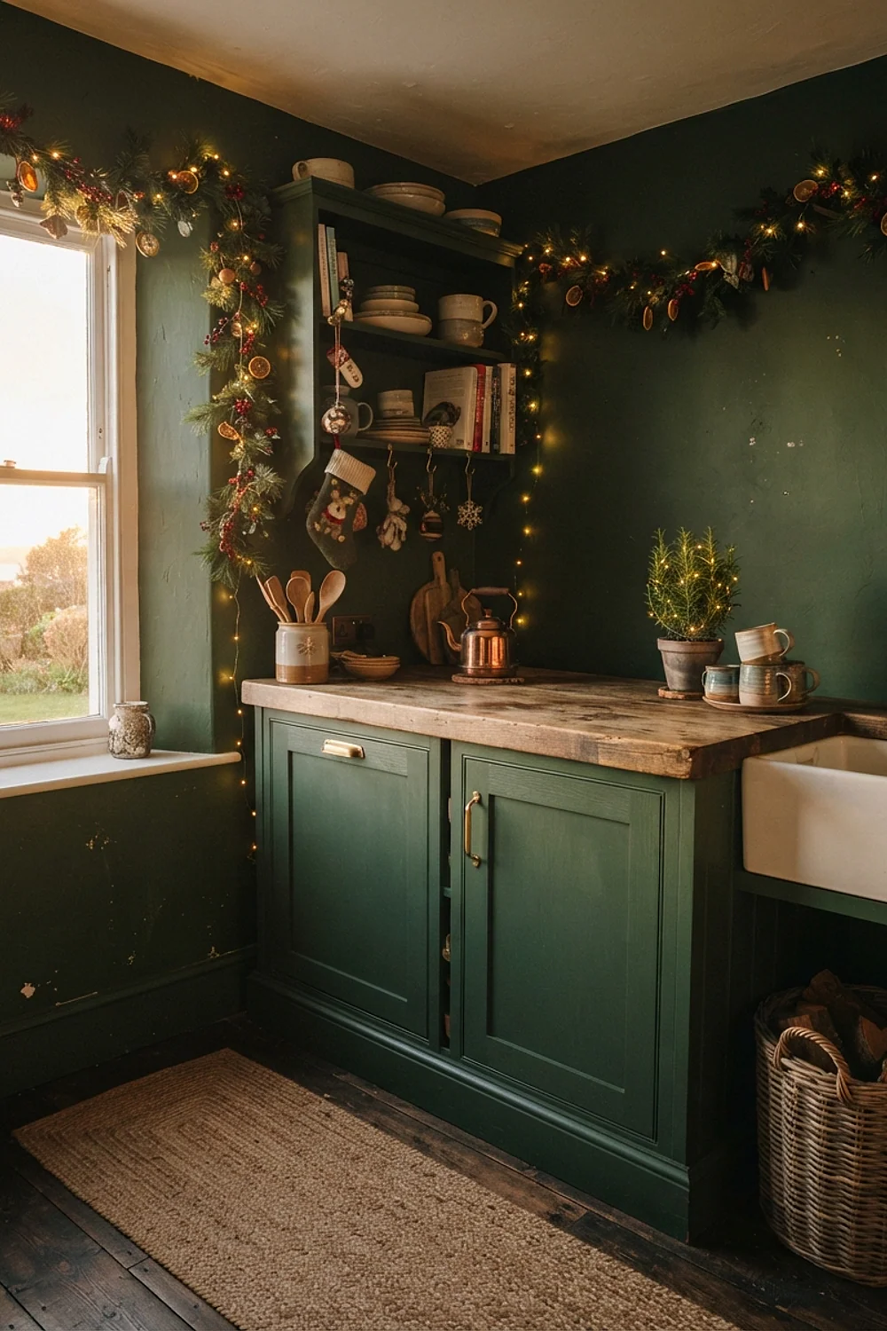
Dusty enough to pass as a clay neutral, Farrow & Ball Setting Plaster is really a pink. Put it on the long wall and a forest green on the island, and the layout reads in two clear zones.
The pairing suits open-plan kitchens where the island faces the living room. Avoid a bright pink undertone in the green, which turns the combination into a candy cane.
Sea Salt with silver and white
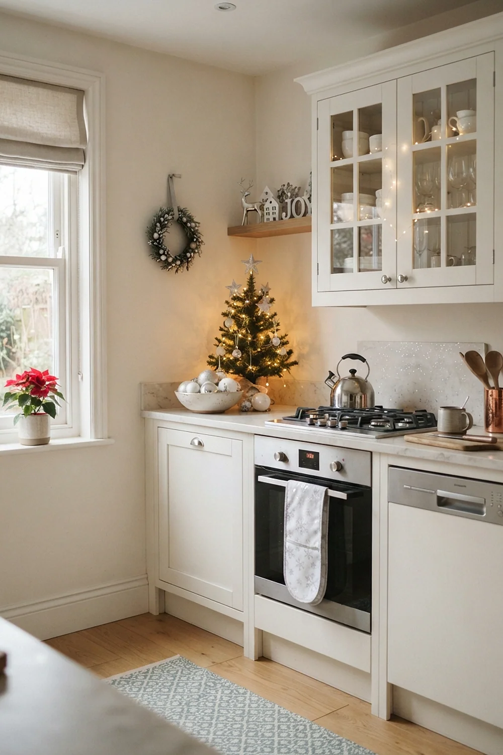
Sherwin-Williams Sea Salt is a pale green-gray that leans cooler in morning light and softer by evening. Silver tray stacks and white ceramic pitchers keep the frost-on-a-window feel.
Open shelving suits this best, because you can store the seasonal pieces in plain sight. Group them in odd numbers on shelves 10-12 inches deep, and leave a third of each shelf bare.
Rookwood Dark Red and cream
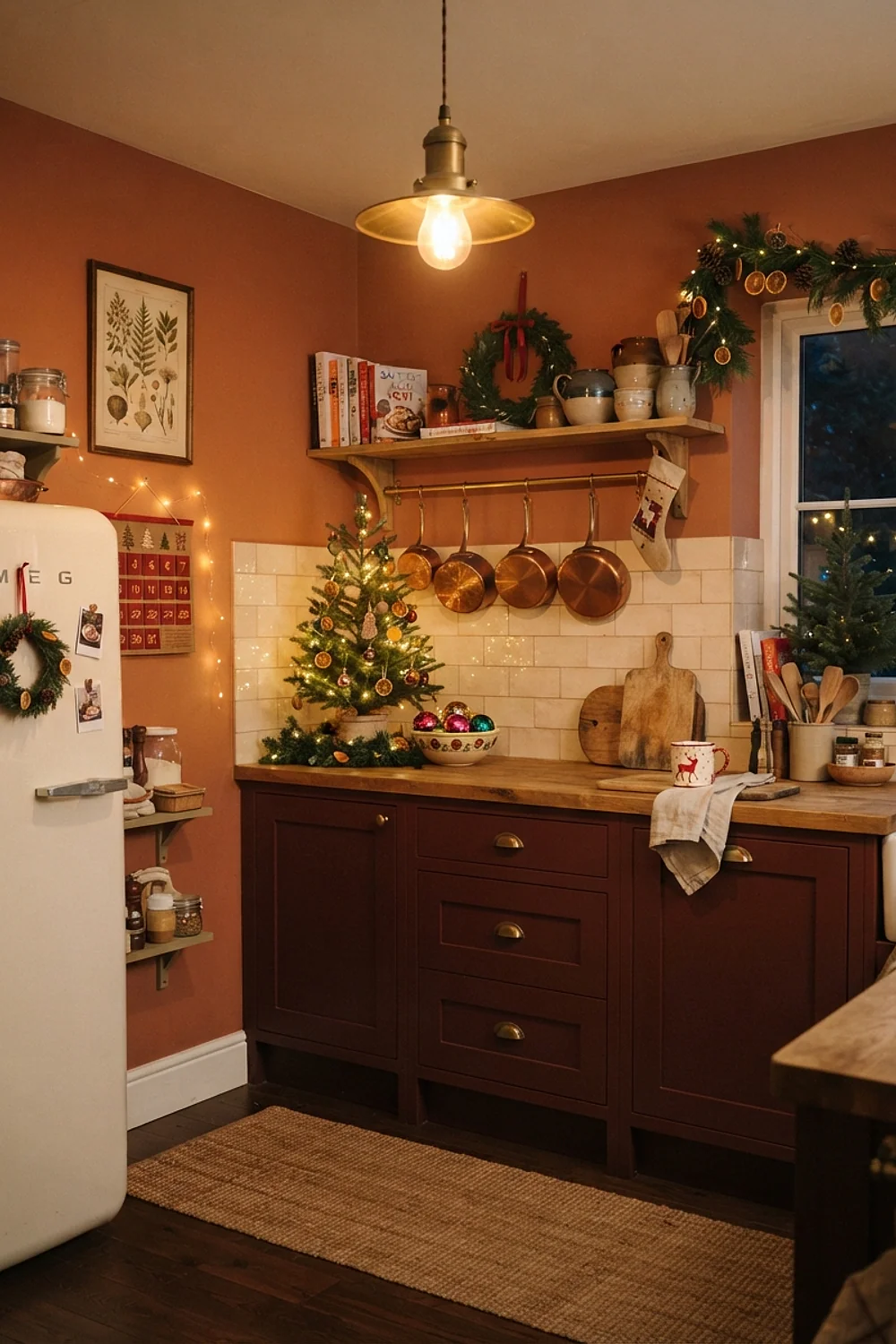
On a single wall after dark, Sherwin-Williams Rookwood Dark Red can look like brick. Cream trim and cream countertops stop the red from swallowing the room.
People often paint all four walls and wonder why the kitchen feels like the inside of a gift box. Stick to one wall, ideally the one behind the range, and leave the rest pale.
Revere Pewter with cream wool
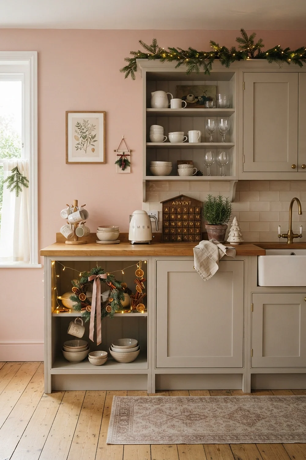
A cream wool throw over a counter stool feels dense and soft under your palm, and Benjamin Moore Revere Pewter gives it a greige backdrop that never competes. The wall stays quiet while the textile does the talking.
Suits anyone with a breakfast nook, where people sit longest. Choose wool or a wool blend, since acrylic throws pill after a few washes.
Urbane Bronze and fresh pine
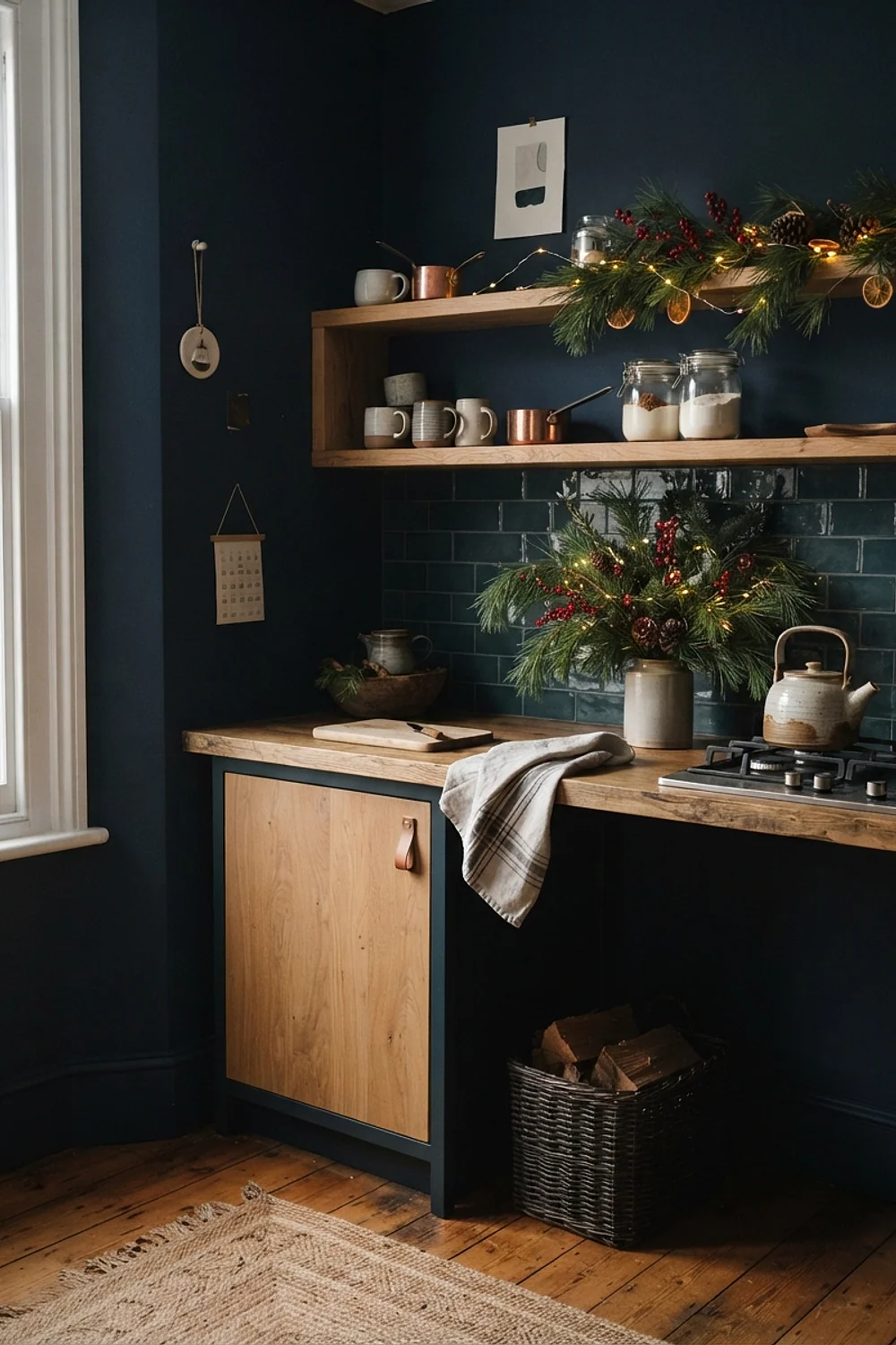
Bark on a pine branch is almost the same brown-gray as Sherwin-Williams Urbane Bronze. A real fir garland on a bronze-painted shelf or mantel looks like it grew there.
This is the pairing for kitchens with butcher block or walnut counters. Fresh greenery drops needles, so keep it off the sink side and mist it every other day to hold the scent.
Tricorn Black with antique gold
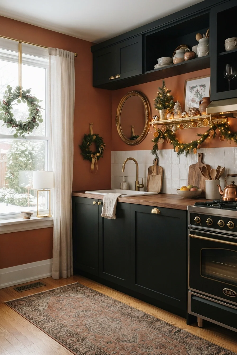
Pantry doors or lower cabinets in Sherwin-Williams Tricorn Black turn gold frames and candlesticks into the brightest thing in the room. The contrast is strong, so one or two gold pieces do the job.
It suits kitchens with plenty of daylight, since black eats light. Use an eggshell sheen, which hides roller marks better than flat on a dark color.
Accessible Beige and berry red
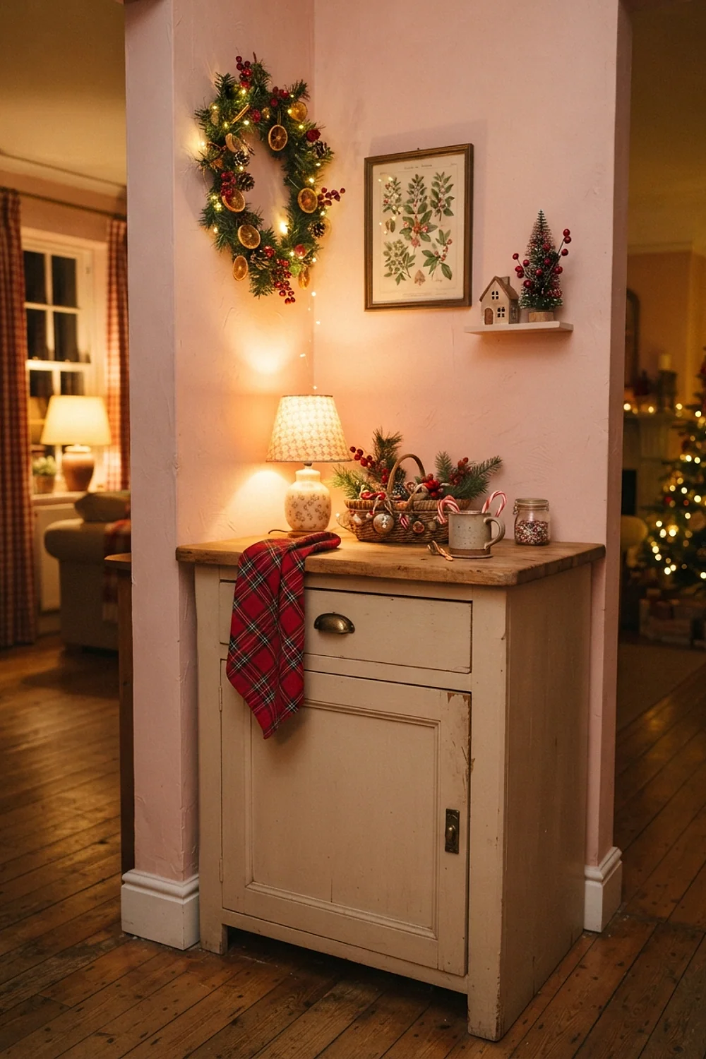
A wall painted Sherwin-Williams Accessible Beige is a true greige that doesn’t turn yellow under 2700K bulbs. Berry red candles and a berry-toned bowl look intentional against it, even in a poorly lit galley, because the quiet backdrop makes a little red read as a choice.
Evening is where this works best, and it suits small budgets, since a few candles and one bowl do the job. Candle flames pull the red toward orange, so pick a berry with a touch of blue in it, not a tomato red.
Pigeon and natural oak
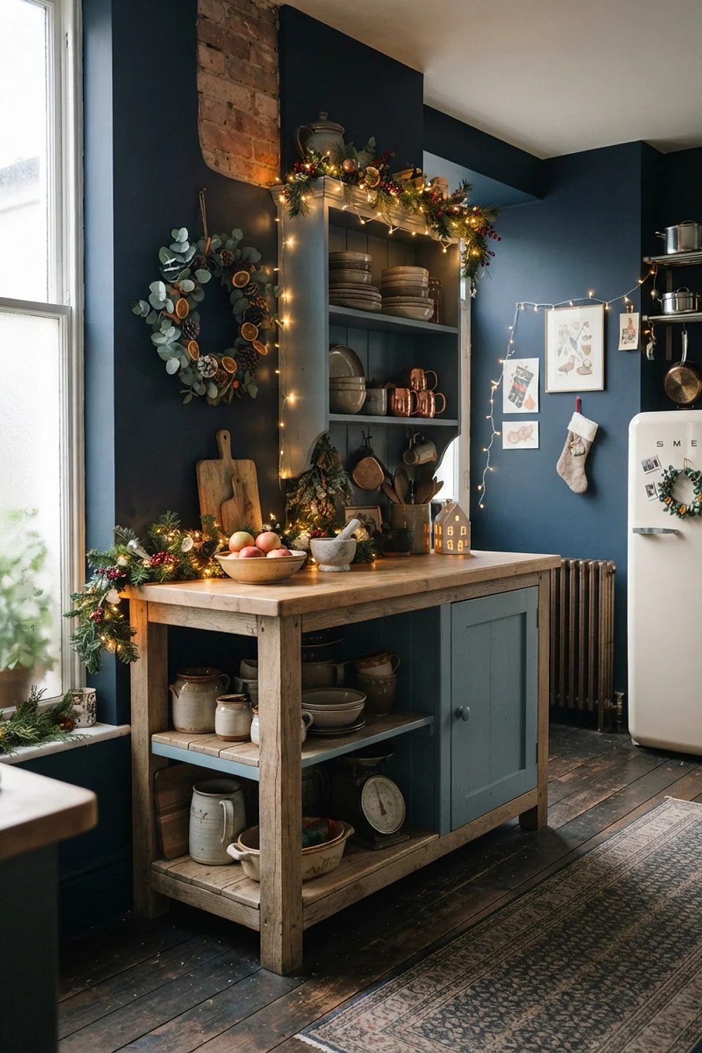
Natural oak open shelves bring out the green side of Farrow & Ball Pigeon, a paint that sits between gray and green. A single wooden bowl of pinecones is the whole holiday gesture, and the wood grain does the rest.
It suits quiet households that dislike obvious decoration, and it costs almost nothing since pinecones can be gathered outdoors. Keep the oak unfinished or in a matte oil, since a glossy polyurethane fights the soft paint.
Caliente on the island with white cabinets
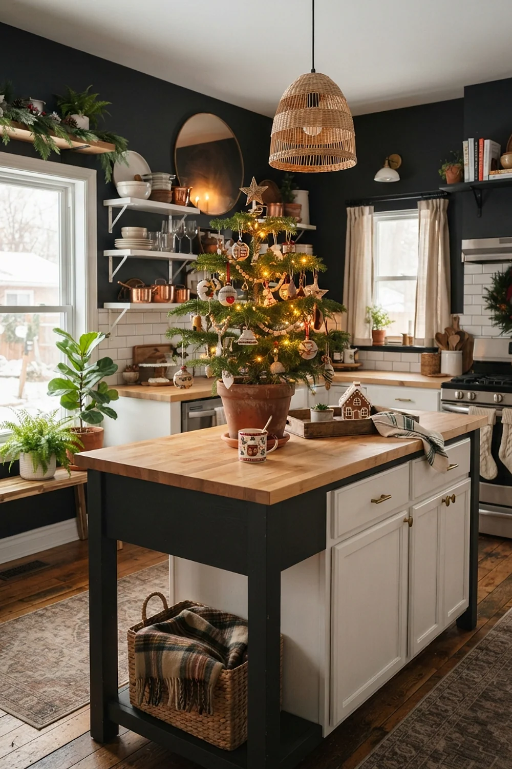
For a clear, confident red such as Benjamin Moore Caliente, a kitchen island is the right size to carry it. Painted on a 48-by-30-inch island with white perimeter cabinets, it reads as the single bold move.
Glossy red doors reflect the room like the side of a toaster, so go satin instead. This pairing suits households that leave the island red all year, not just in December.
More cozy christmas kitchen decor palettes for every kind of light
Palladian Blue with a soft brick red
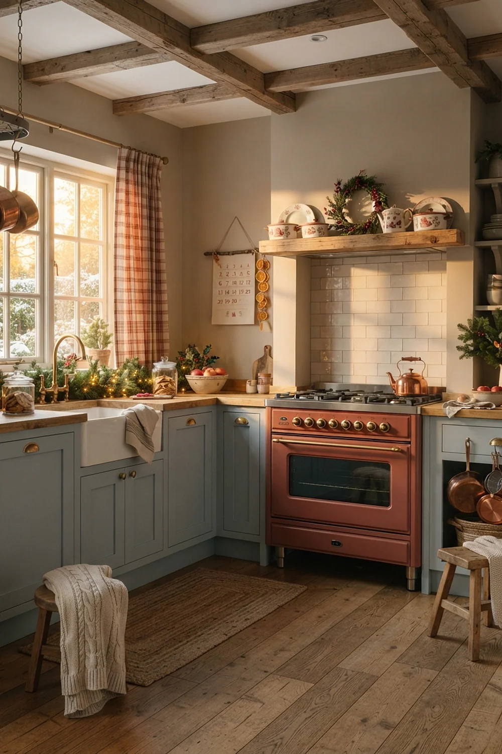
A brick-red enamel pot on a small shelf is enough scale for the red against Benjamin Moore Palladian Blue, a pale blue-green that looks like frost on a windowpane. Because the blue is so light, a larger red piece would overwhelm it.
This works in sunny breakfast rooms, where morning daylight keeps the frosty tint clear. Don’t use it in a dark kitchen, where the blue goes gray and the red looks heavy.
Hague Blue and brass in a galley
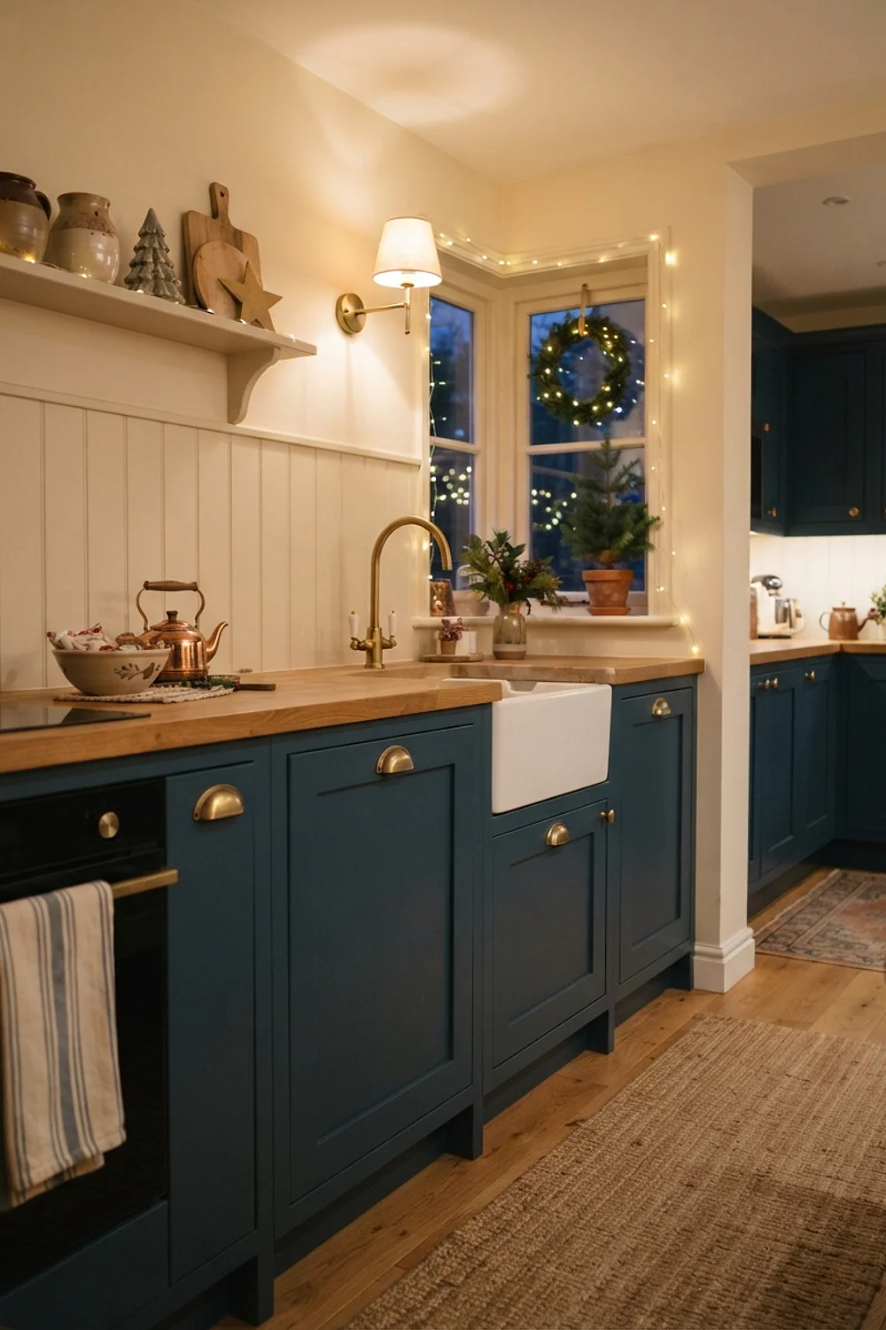
Brass cup hooks along a 30-inch rail turn the end wall into a display, and Farrow & Ball Hague Blue, which is nearly navy, gives the brass a deep backdrop that makes it glow. A galley kitchen offers two long walls to work with.
Plan the layout first, since the dark color makes cabinets recede. Keep upper cabinets white or open so the room doesn’t feel like a tunnel, especially in a narrow galley with little daylight.
Dovetail and pine green
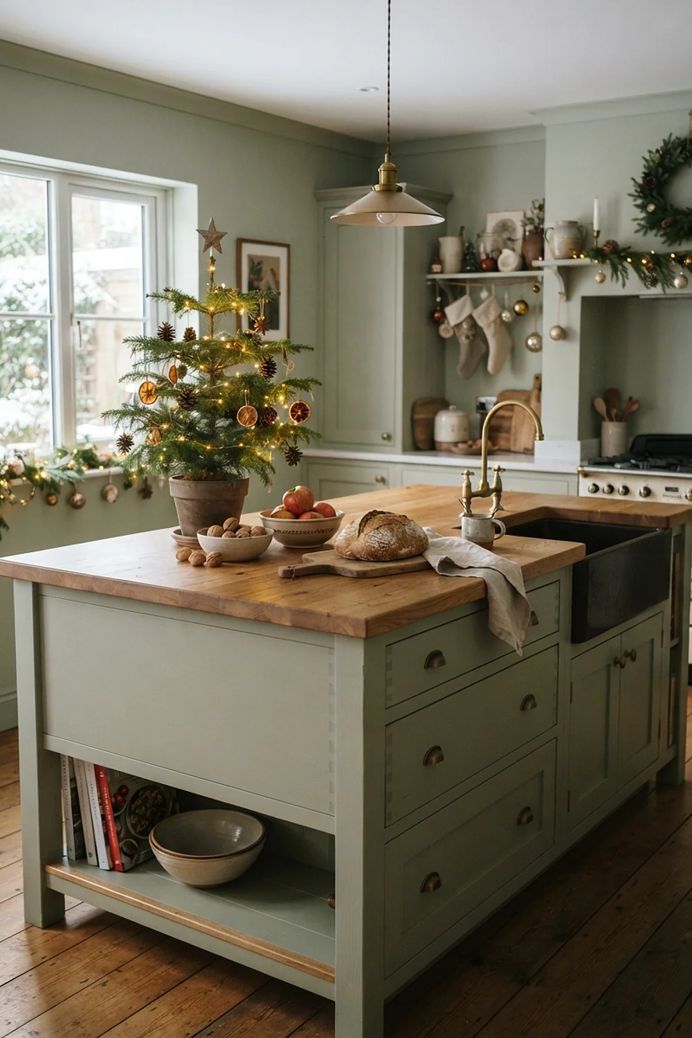
Storage baskets in dark pine green, lined up on a pantry shelf, make a neat row of color without clutter. Sherwin-Williams Dovetail, a mid-tone gray, works as a stage for green because it is neutral enough to let the baskets stand out.
Use woven seagrass or felt baskets rather than plastic bins, which look flat and shiny against the paint. Plan on 12-by-12-inch cubes, which fit standard pantry shelving, so a small pantry can hold a full row.
Pewter Green and bright holiday red
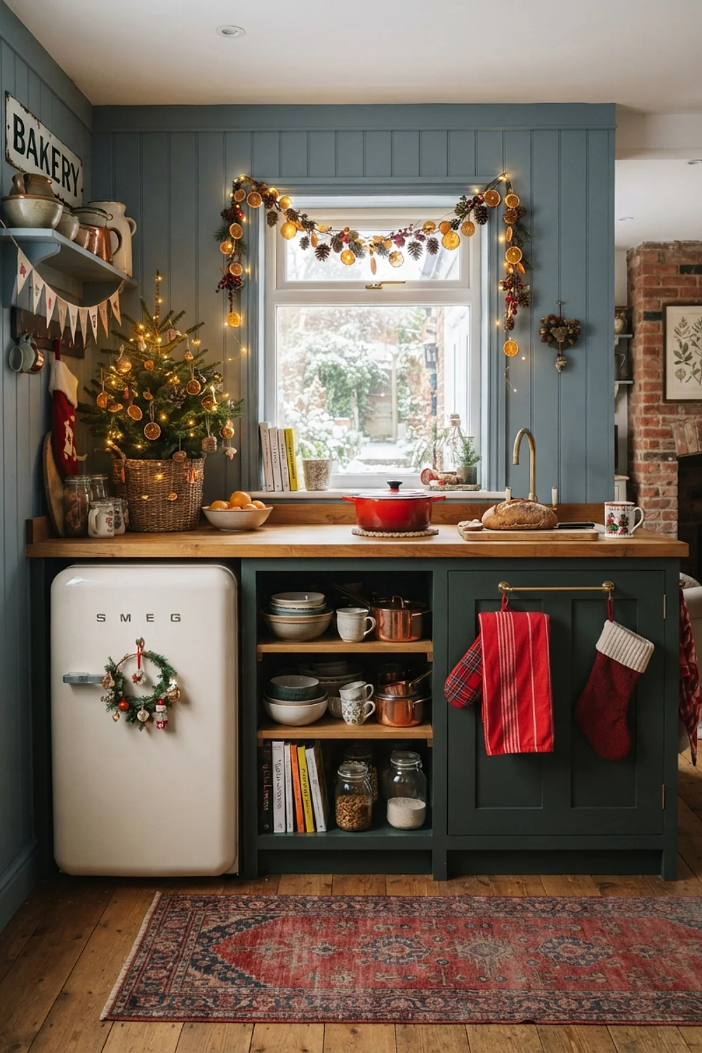
Plenty of people put a pure fire-engine red beside Sherwin-Williams Pewter Green, a muted green that looks gorgeous by candlelight. That clash hurts, because the red fights the gray in the green and makes both look dirty.
Pick a red with brown in it, like a brick or a madder red. The pair then looks like an old woolen blanket.
Skimming Stone and holly
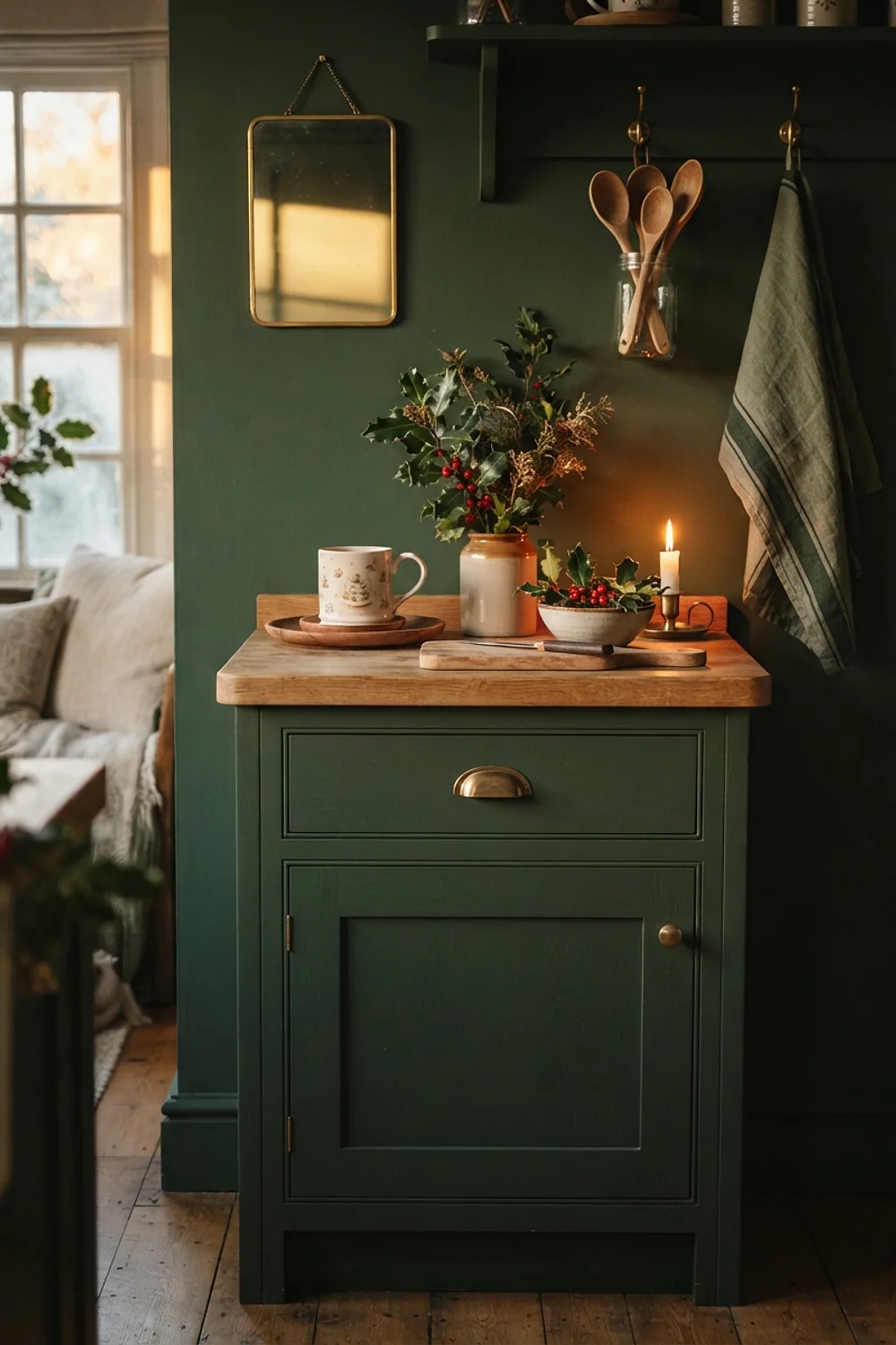
Cut holly sprigs in a ceramic jug provide dark green and berry red against Farrow & Ball Skimming Stone, a pale warm gray. Fresh holly stays presentable for about a week in cool rooms.
It’s comfortable for anyone who dislikes strong color, since the wall is almost beige. Keep holly out of reach of pets and toddlers, because the berries are toxic.
Ultra Pure White, black, and garland
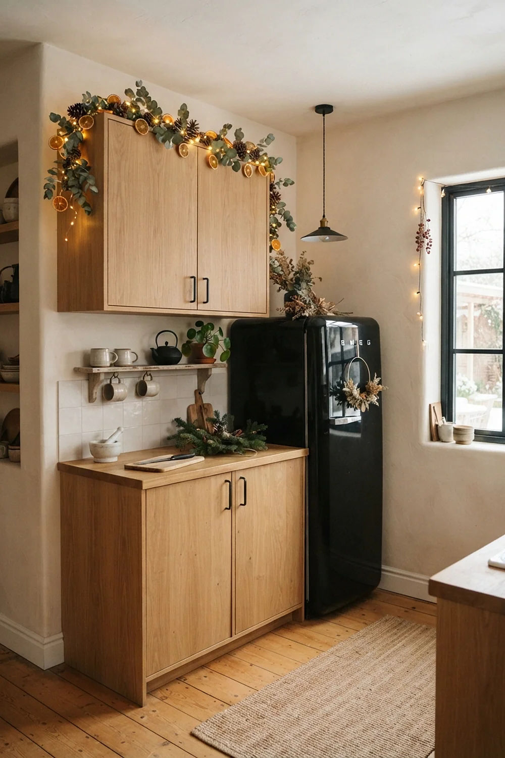
Matte black hardware and a plain evergreen garland give a Scandinavian look against Behr Ultra Pure White, a clean, slightly cool white. Materials matter here: iron, wood, and fresh branches with no shine, so every surface looks honest and unfussy.
This suits modern flat-front cabinets, whose plain doors echo the simple lines of the garland and hardware. Skip glitter ornaments, which look cheap against crisp white and scatter light in a way that fights the calm.
Book Room Red and weathered oak
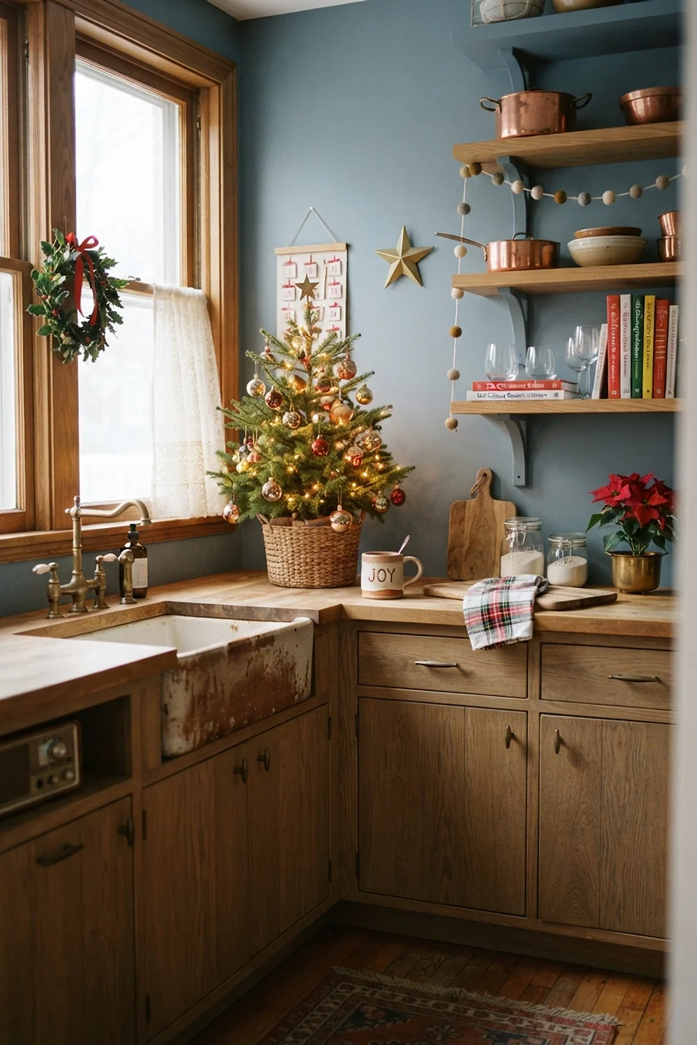
Weathered oak looks aged and rich in tone against Farrow & Ball Book Room Red, a brown-leaning red. A single farmhouse table under it feels like a room that has been lived in for decades.
Use it in kitchens with an eat-in area of at least 8 by 10 feet. The wall color is so dark that anything smaller feels crowded.
Calamine pink with forest green
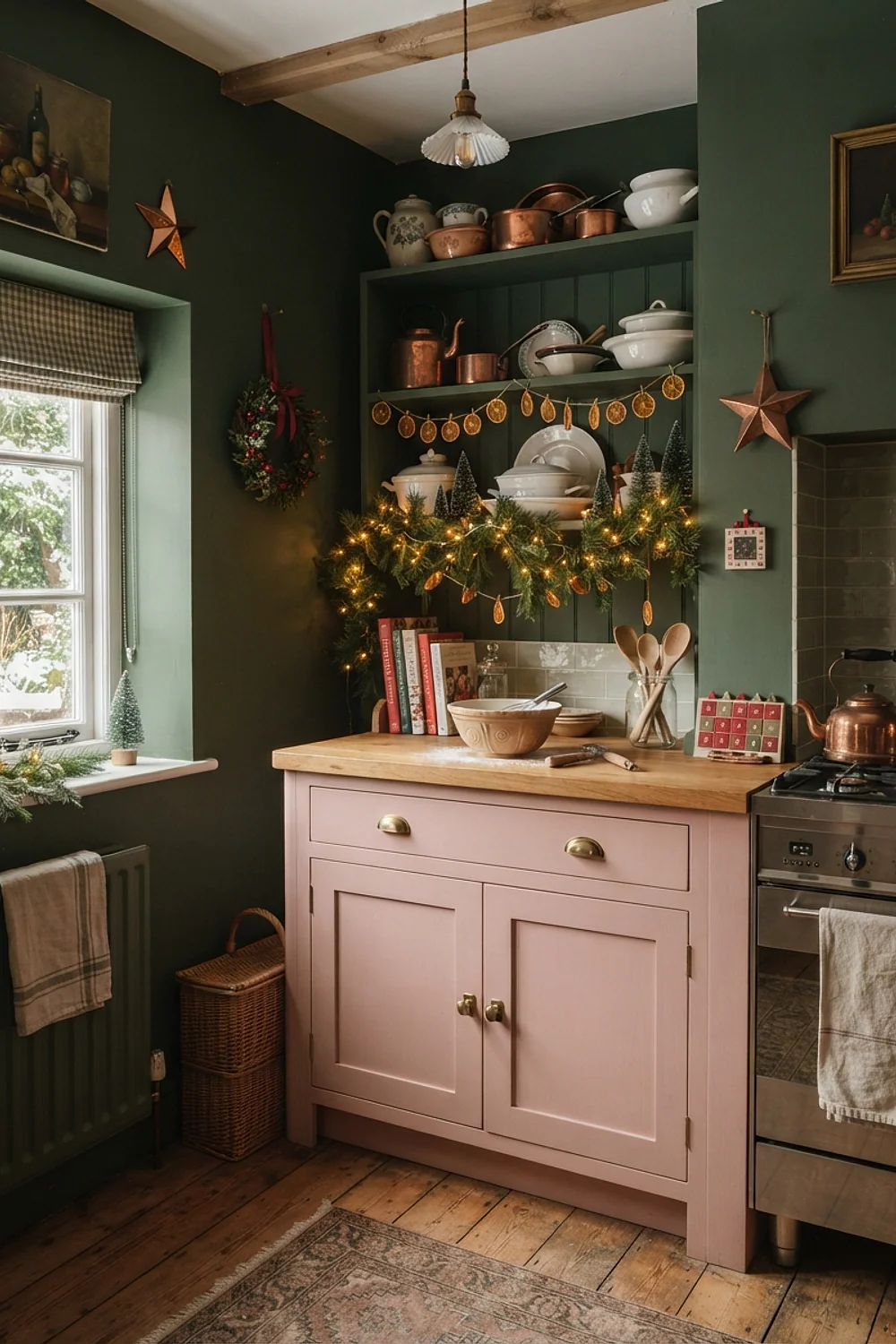
A forest green runner grounds Farrow & Ball Calamine, a pale pink that reads as plaster under gray winter light. Lit by a 2700K pendant at dusk, the wall turns peachy and welcoming. The deep green keeps the sweetness from turning sugary.
It suits north-facing kitchens that need a lift, since the warm pink offsets cool, bluish daylight. Test it first on a large swatch, because the pink can read stronger than the chip suggests.
Elephant’s Breath with tartan
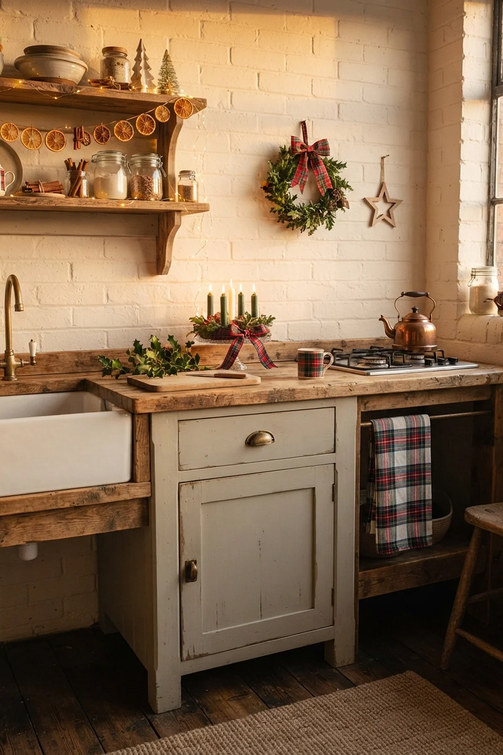
Tartan looks expensive against Farrow & Ball Elephant’s Breath, a taupe-pink. A red and green wool tartan table runner measuring 14 by 72 inches is all it needs.
Real wool tartan has a slight prickle and a matte surface, which looks better than shiny polyester. Choose a tartan that includes the taupe, so the paint appears to pick up from it.
Studio Green and gold foil
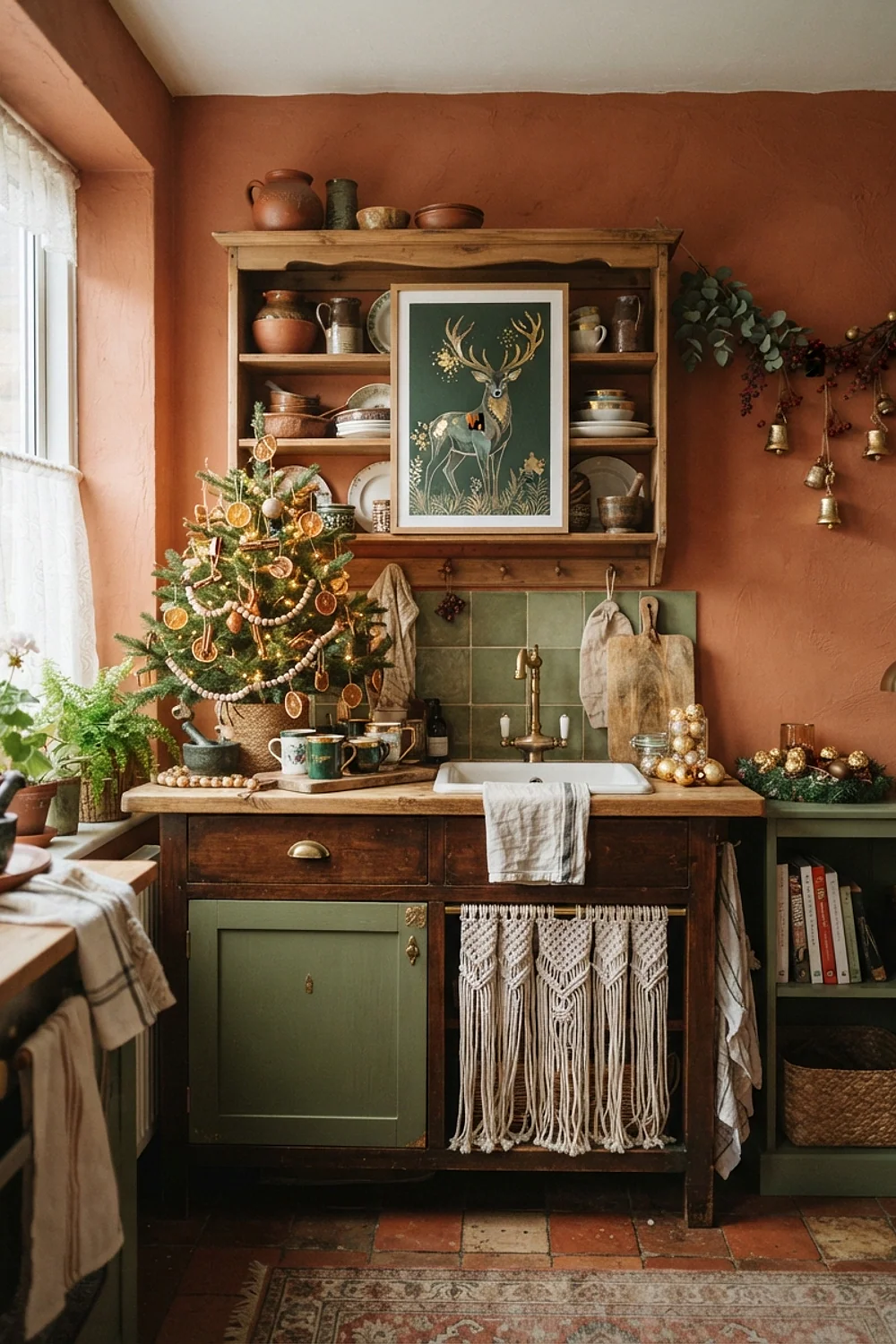
Gold-edged plates stacked on open shelves look like fireflies against Farrow & Ball Studio Green, an almost black green that looks inky at night. The gold edges catch lamp and candle light, so the plates seem to glow against the dark wall.
Use this one on a feature wall, not the whole kitchen, so a kitchen with a single open-shelf wall is the best fit. Applying it everywhere makes the room feel like a library, and a library is too dim for chopping vegetables.
Inchyra Blue with silver
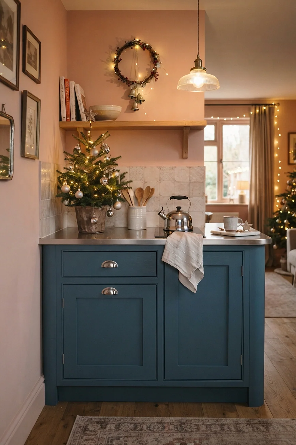
Silver candlesticks 8-12 inches tall look excellent against Farrow & Ball Inchyra Blue, a gray-blue with a green edge. The scale matters, since tiny silver pieces vanish, while tall ones catch light and make a clear vertical line against the wall.
It suits kitchens with high ceilings, where the blue has room to breathe, and a console or wide sill can hold a group of three sticks. Polish tarnished silver before the holidays, since dull silver looks like dust.
Rainwashed and sage
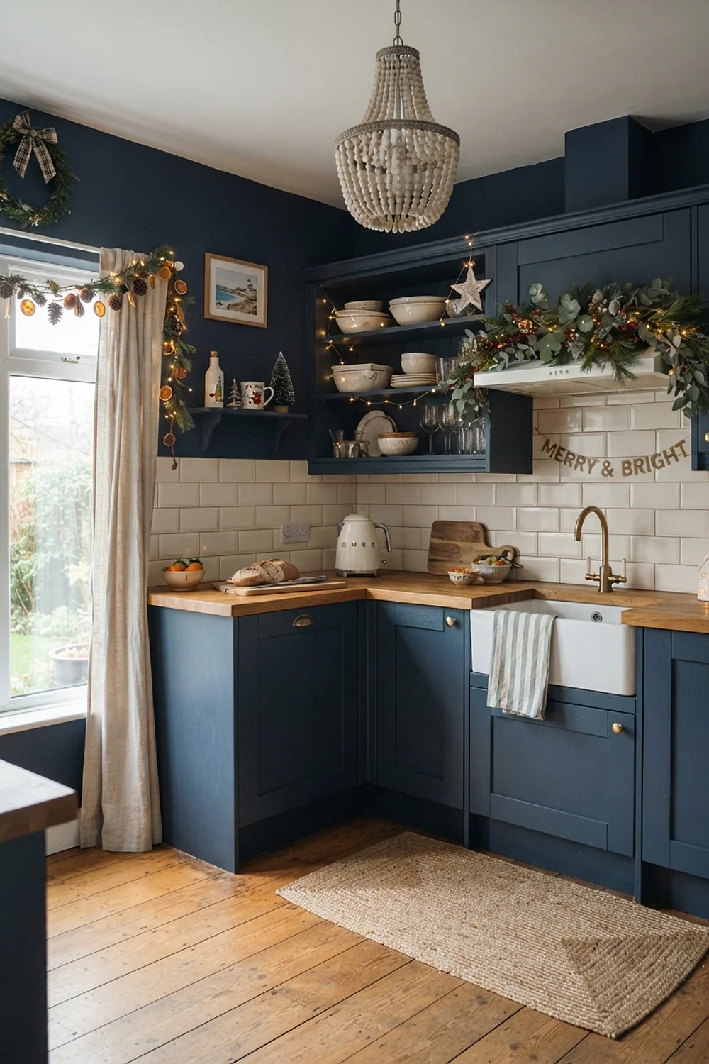
Sage green ceramics on a counter run give the room a layered, calm feel against Sherwin-Williams Rainwashed, a pale aqua gray that reads as nearly white at noon. The paint stays quiet, so the sage supplies the depth.
It’s a good choice for galley layouts where the window is at the far end. Place the sage pieces along the sightline to draw the eye toward the light, and avoid scattering them randomly, which breaks that pull.
Collingwood and wool storage
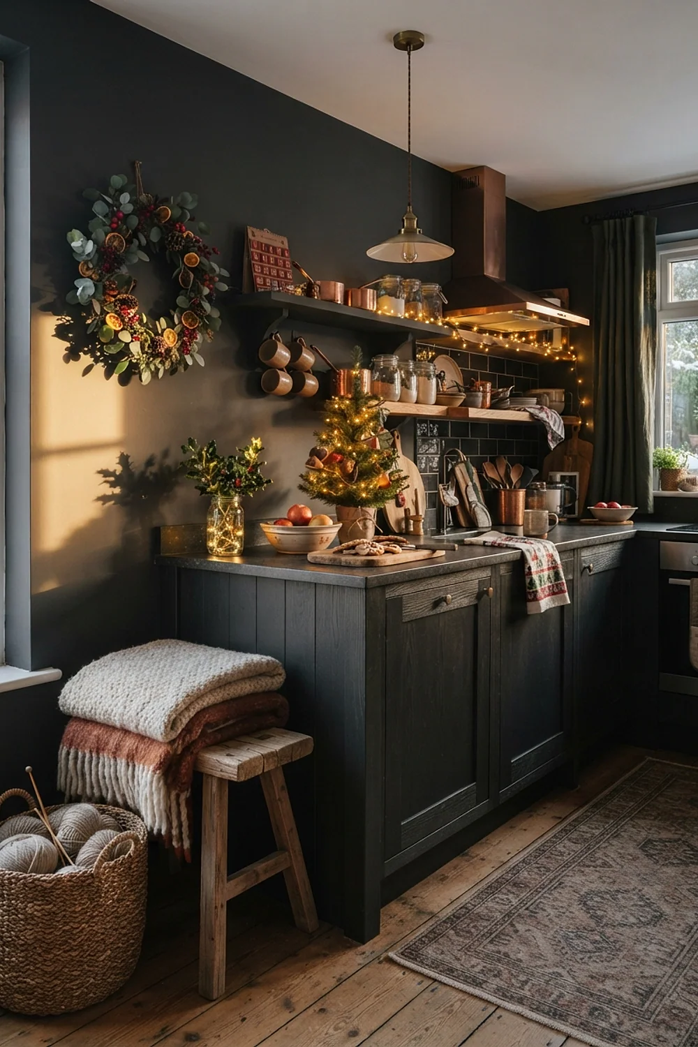
Felted wool bins in muted red and cream store linens and cookie-tin-sized gifts without looking like storage. Benjamin Moore Collingwood, a light gray-beige, gives them a soft backdrop that suits mudroom-style kitchens. The wool also softens the look of a hard-working entry.
Those bins fit under benches 16 inches high, so the hallway or entry zone keeps its seating and hides the clutter, which helps in a busy household. Avoid thin felt, which sags once it’s loaded.
Sulking Room Pink with deep green
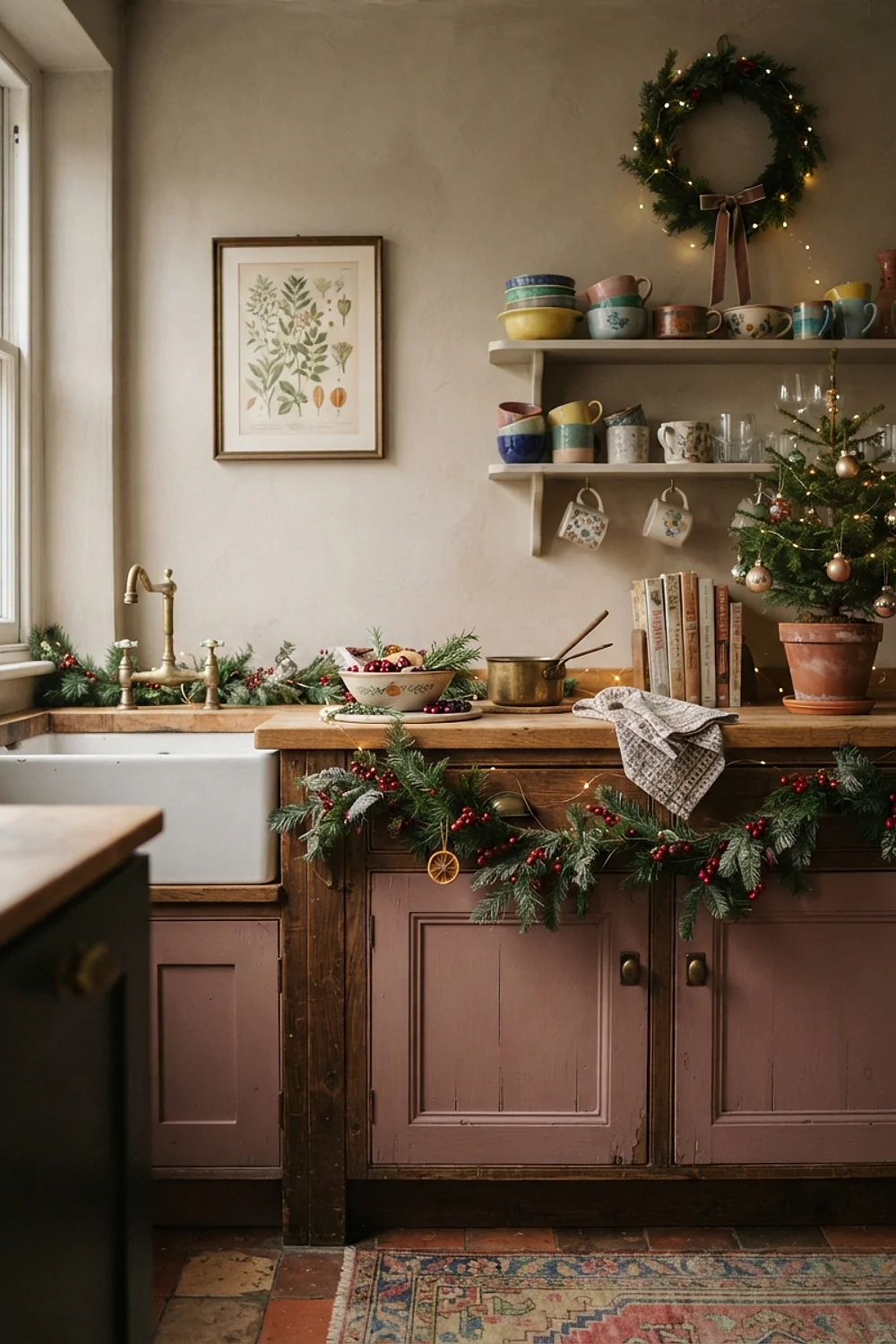
Cabinet doors painted in Farrow & Ball Sulking Room Pink, a bold, dusty pink, turn a kitchen into a surprise. Pairing it with dark green keeps the mood deep and theatrical, because green absorbs the sweetness.
Renters should use it on cabinets rather than walls, since cabinets can be repainted and walls usually cannot without a landlord’s permission. The usual mistake is pairing it with bright red, which looks sweet and sticky. Test a 24-inch square before committing, and view it at night under kitchen bulbs, since pink shifts warmer in lamplight.
Notes from real rooms
Kendall Charcoal with cream and holly
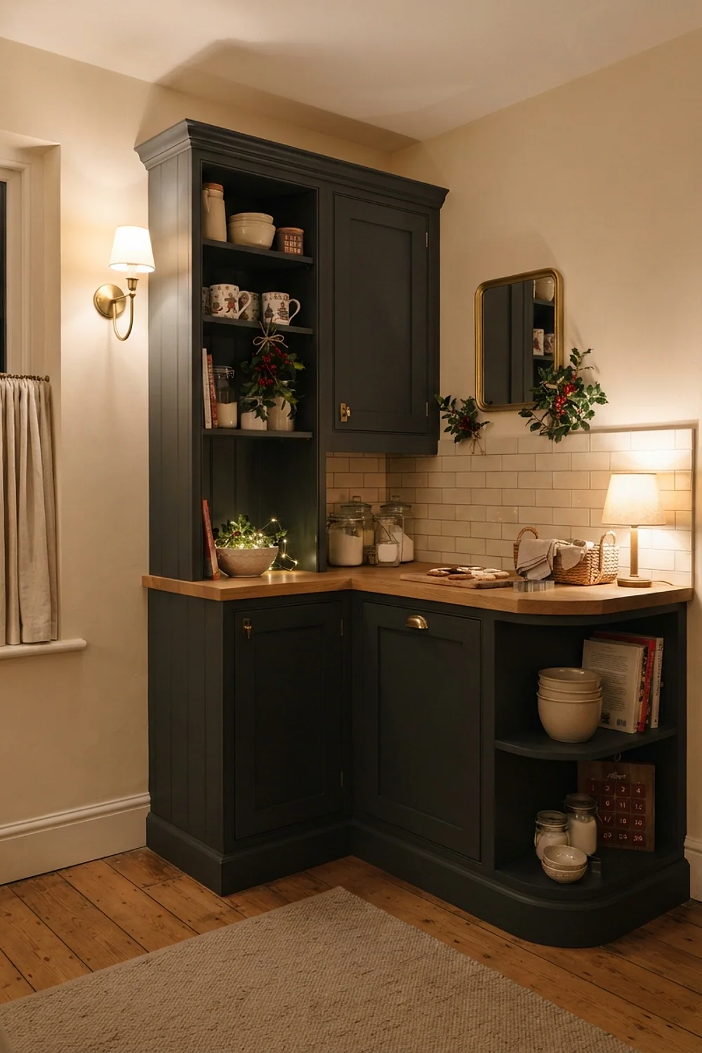
A charcoal kitchen softens quickly when cream ceramics and a small holly wreath sit against it. Cream is easier on the eye than stark white next to dark paint, and the holly contributes the only green.
This suits anyone who sits in the kitchen long, since the low contrast feels calm. Add a sheepskin on a stool for the touch of texture.
Pointing white and eucalyptus
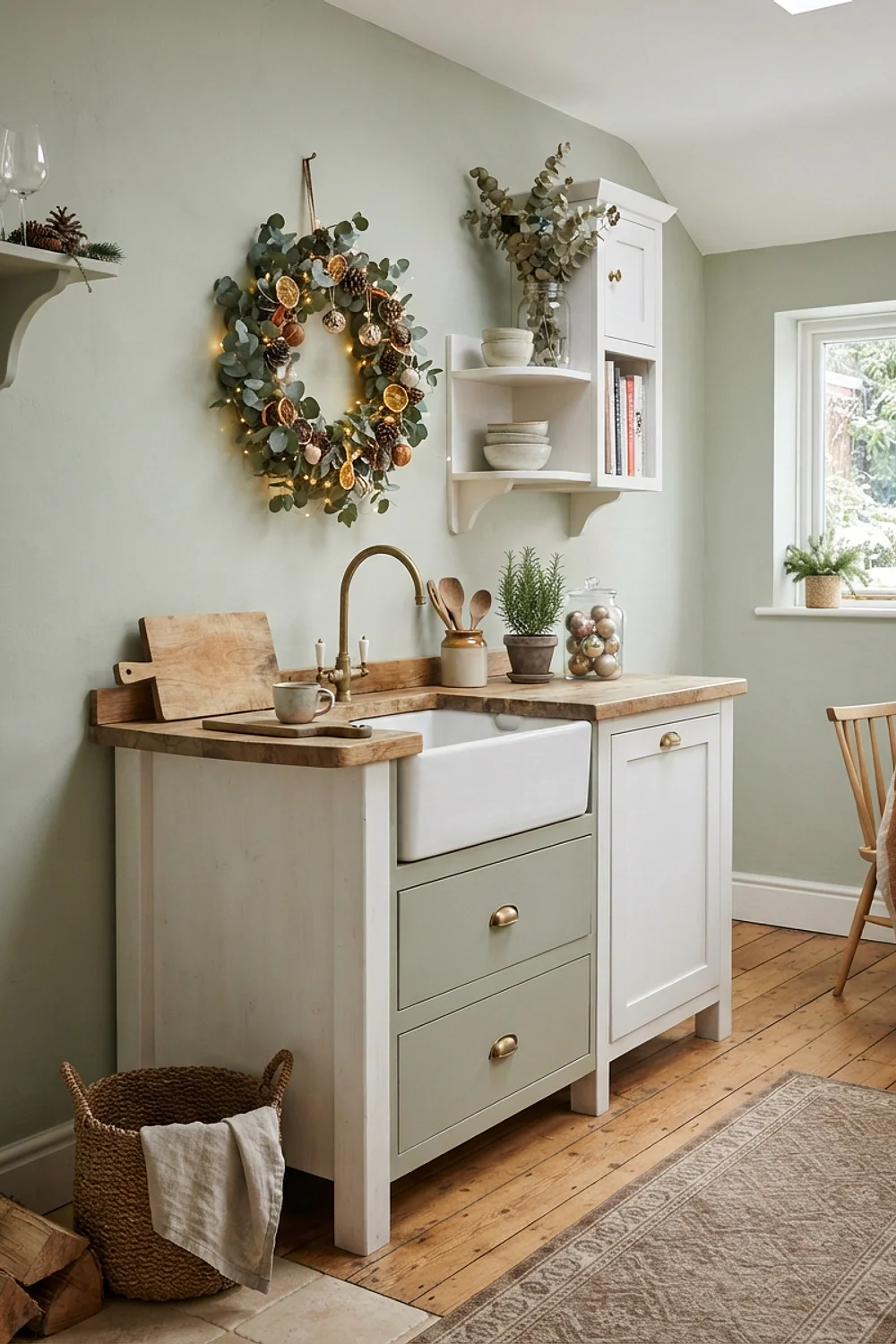
A bundle of eucalyptus hung from a rail above the window fills the room with its smell. Farrow & Ball Pointing, a creamy white, makes the silvery leaves look like they are lit from inside.
It works in small white kitchens that need life without color, and the warmth of cooking helps release the scent, though hanging it a few feet from the stove avoids scorching. Replace the stems every 10 days, since dried eucalyptus turns brittle fast.
Navy and rust
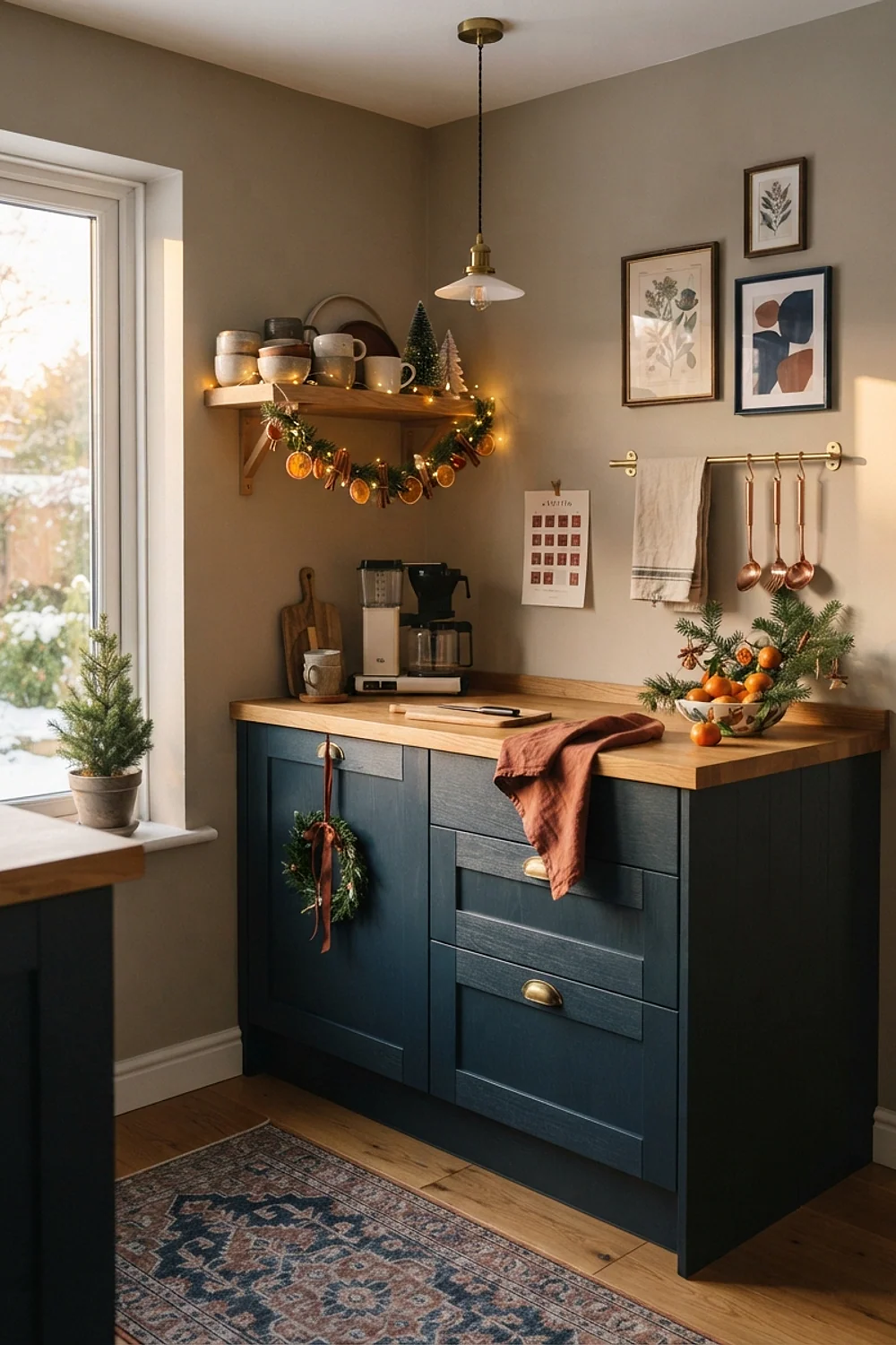
A rust-colored enamel kettle and terracotta pots on navy cabinets offer a different take on holiday color. Rust is a cousin of red that survives dim light better, since its orange warmth still glows where a deeper red goes dark.
It suits kitchens with copper fixtures, because the metal echoes the rust. Keep the navy to the base cabinets, and the room won’t feel top-heavy, since dark upper cabinets lower the ceiling visually.
Olive and plum
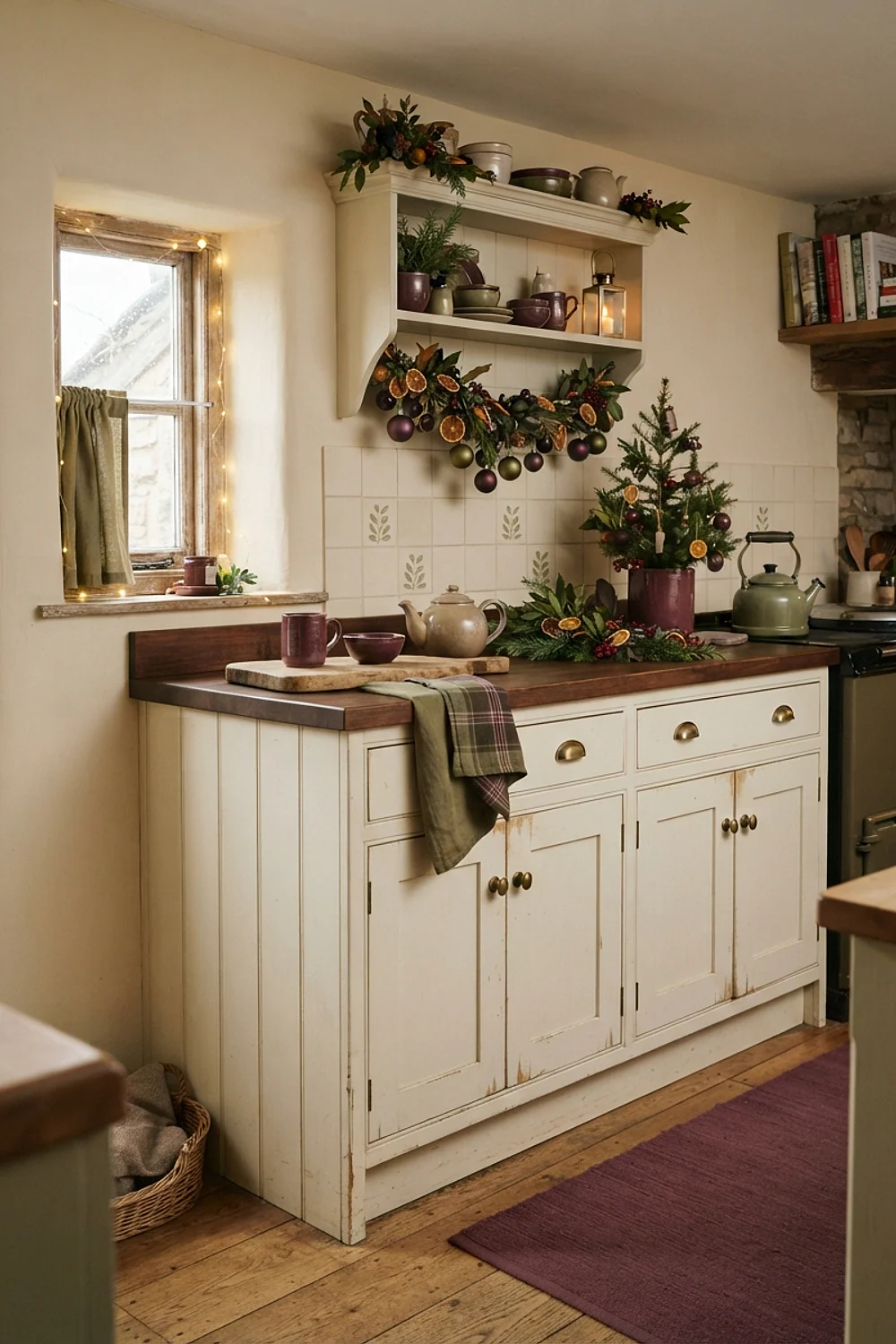
Olive walls with a plum table runner appear in old Dutch paintings, and the pair suits the lamp-lit gloom of December. The olive’s yellow base makes the plum glow, because plum’s blue-red sits opposite yellow-green and gains depth beside it.
It is a pairing for kitchens with a bay window and a lot of natural wood, where daylight and warm timber soften the darkness. Use a matte olive, since a satin finish makes it look like a hospital corridor; the sheen also shows every roller mark.
Black, white, and one red accent
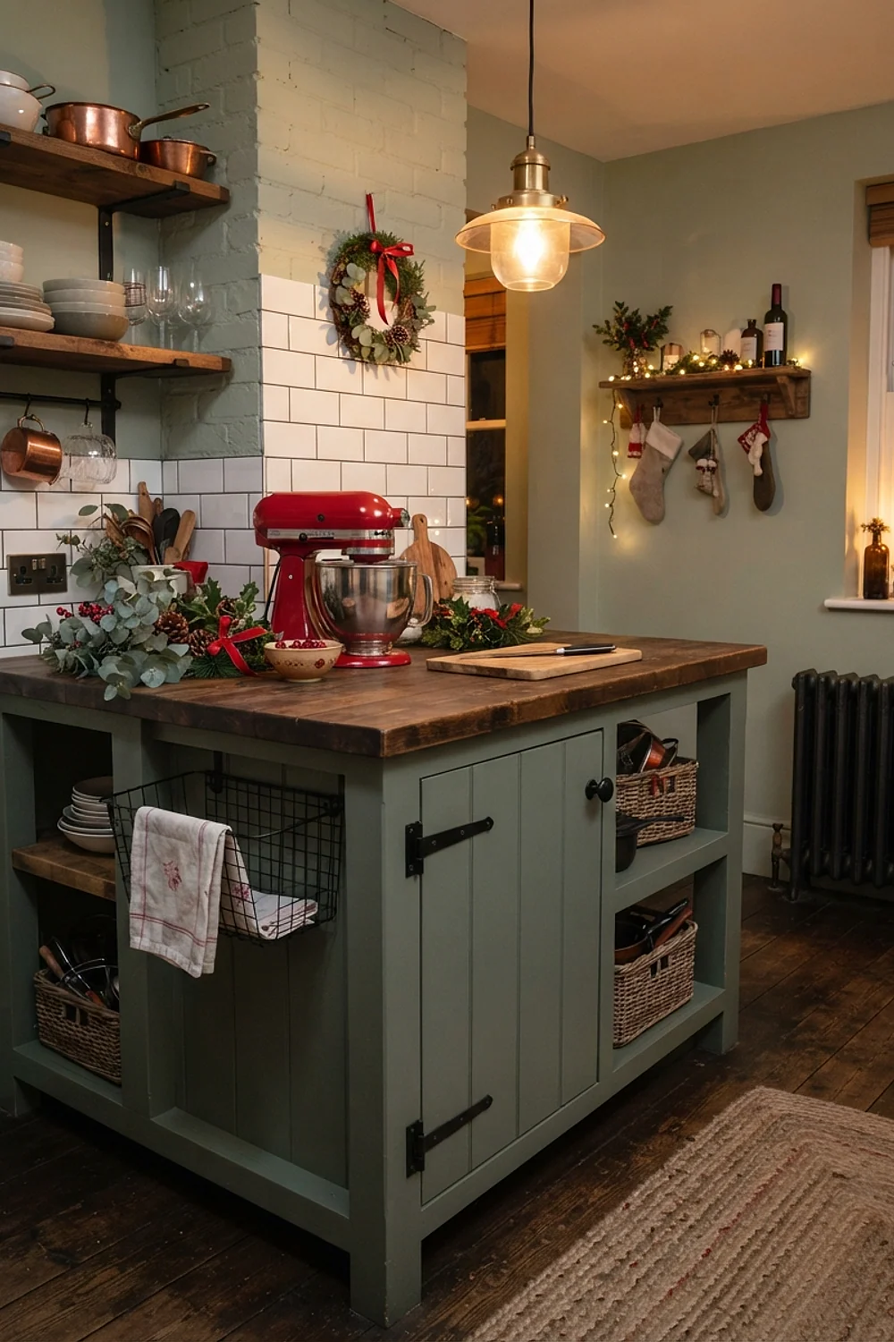
A black and white tile floor with a single red object, such as a 5-quart enamel pot, is a crisp holiday look. The restraint makes the red feel deliberate, and the high contrast underneath gives the pot a graphic stage.
It is best for modern kitchens that dislike clutter, and for small budgets, since one pot on the stove is the whole purchase. Limit red to one object per sightline, or the effect disappears; a red kettle, red towel, and red bowl in view at once read as a sale display.
Antique gold on deep green
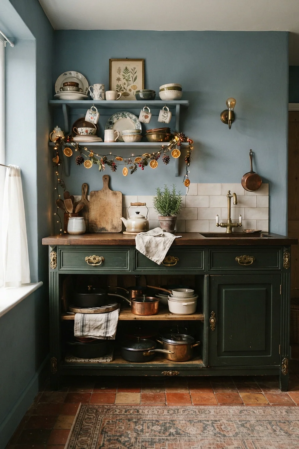
Gold leaf frames and brass candlesticks on dark green cabinets give a look close to a jewelry box lining. The gold needs a matte or brushed finish, as mirror-polished brass looks like a hotel lobby.
Plan it in kitchens with under-cabinet lighting, since the gold needs a light source to wake it. A 3000K strip is the highest to go before the green turns yellow.
Copper and teal
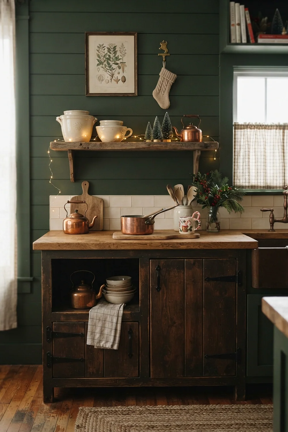
A teal backsplash with copper molds hung in a row creates a Victorian feel, and teal is the opposite of orange on the color wheel. Opposites intensify each other, so the copper looks brighter and the teal looks deeper.
The scale of the tiles matters: 3-by-6-inch subway tiles give a quieter field than mosaic, which lets the molds be the pattern. This suits a kitchen with a long, clear wall above the range. Avoid mixing in red, which crowds the contrast.
Cream and burgundy
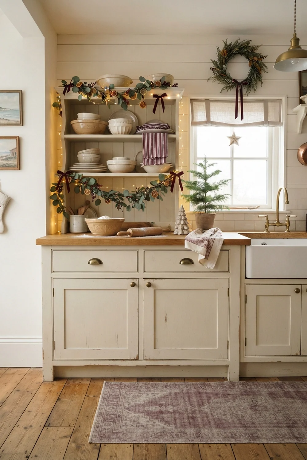
Cream cabinets with burgundy cloth napkins feel like a dinner party in an old house, because burgundy is red with the volume turned down. Both colors share a yellow-brown undertone, so they never clash.
Use it where the kitchen opens to a dining area, so the napkins and table linens carry the color across. A long layout of 12 feet or more gives the burgundy enough runway. In a short galley, too much burgundy turns heavy, so keep it to textiles.
Silver and icy blue
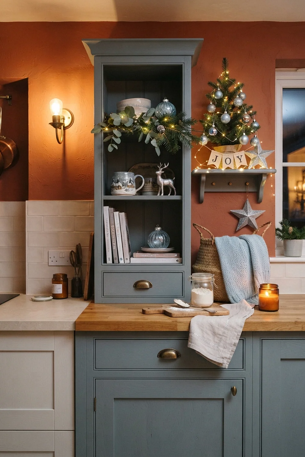
Pale blue glassware on white shelves, with silver trays beneath, feels like the first snow. The cool palette comes alive when a 2700K lamp sits nearby, because the warm glow keeps the icy tones from looking clinical.
Those who find red and green too traditional will like this, especially in a kitchen with open shelving. Store the glassware on a rail so it doesn’t gather dust, and wipe it before the holidays; fingerprints show badly on pale glass and polished silver.
Chestnut brown and red
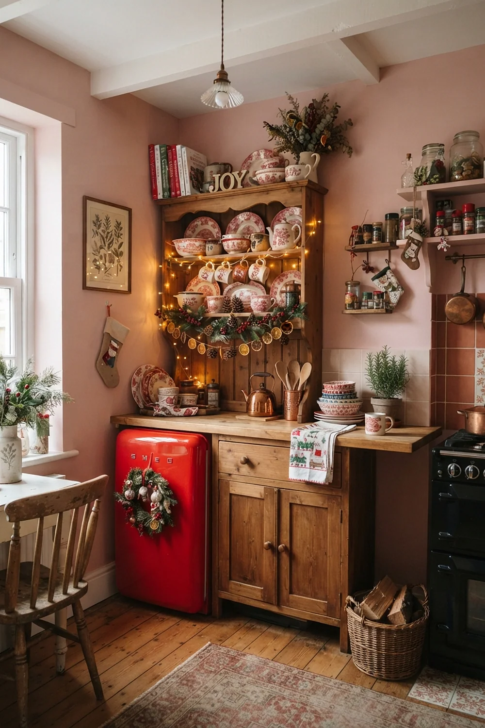
A chestnut brown wood floor with a red area rug blends into a single autumn-to-winter story. The common mistake is a rug that’s too small; choose 2.5 by 8 feet for a galley.
Brown acts as a neutral here, so the red stays cozy and not loud. Check that the red has brown in it, as pink-leaning reds look wrong.
Jute and red ribbon
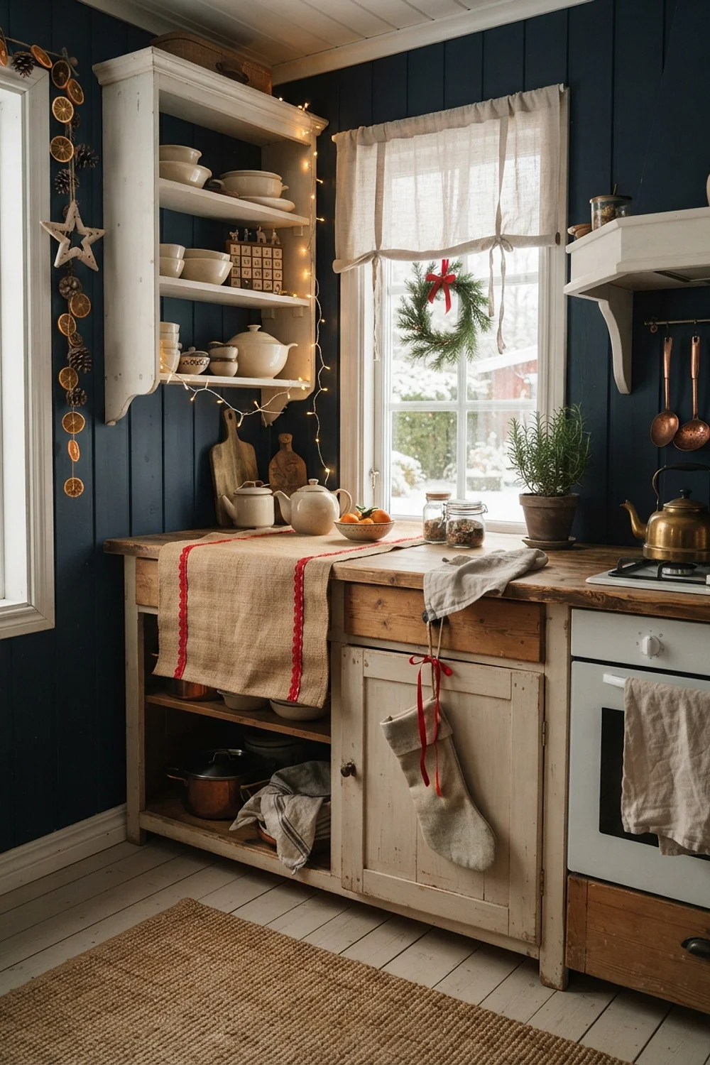
Natural jute rugs have a scratchy, coarse hand under bare feet, and a few yards of red velvet ribbon on a pantry door look like an old-fashioned gift tag. The roughness makes the ribbon feel soft by comparison.
Suitable for farmhouse kitchens with exposed beams, where the raw fibers echo the timber overhead. Use wire-edged ribbon about 1.5 inches wide, which holds a bow shape all season. Unwired velvet droops within days, and a limp bow looks neglected by mid-December.
Matte black and pine
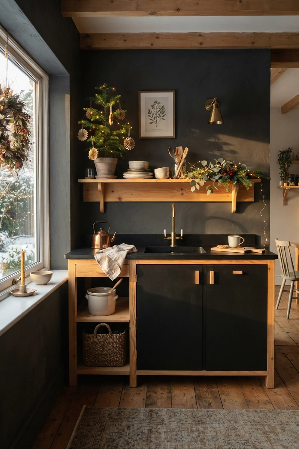
Raw pine boughs sit well beside matte black faucets and cabinet pulls, since the materials share a rough, unpolished look. Pine’s needle scent is the best part, and it costs nothing if boughs come from trimmed branches or a tree lot’s discards.
It suits industrial kitchens with concrete counters, where the green is the only living thing in a gray room. Skip chrome, which reflects the greens and makes them look gray. Keep boughs away from the stovetop, since dry needles ignite easily.
Mixed neutrals with one metallic
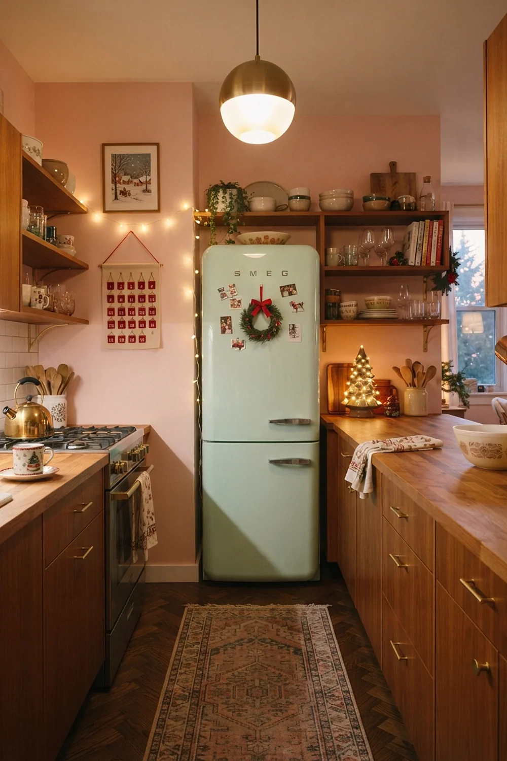
A kitchen in greige, white, and oak needs just one metallic, such as a 20-inch brass tray, to feel dressed for the holidays. The metal reflects candle flames and catches your eye at night, adding sparkle that the muted surfaces cannot.
This is the safest choice for anyone unsure of color, and it costs little since one tray does the work. Match the metal to existing hardware so it looks planned; a brass tray beside nickel pulls looks accidental.
Testing colors before you commit
Cozy christmas kitchen decor lives or dies under real bulbs, so test paint in the room that will hold it. A chip in the hardware store tells you almost nothing.
- Paint two 24-inch squares on different walls, since light changes across a room.
- Check each square at 9am, at 4pm, and after dark under your actual bulbs.
- Hold your textiles and metals against the squares to see the undertones fight or agree.
- Leave the samples up for at least three days, including one gray day.
Peel-and-stick sample sheets cost about $5 each and are movable, which helps in a rental. Standard 8-ounce sample pots run closer to $8 and cover roughly 20 square feet.
Bulb temperature is the sneaky factor. A 2700K bulb turns a blue-leaning red toward orange, while a 4000K bulb makes green look sharp and cold. Switch bulbs before blaming the paint.
Common mistakes
Cozy christmas kitchen decor can slip off course when the paint reads too bright, too dark, or too pink. Repainting is the last resort, not the first.
- If the color is too saturated, break it up with white trim and cream textiles.
- If the wall looks gray at night, swap to 2700K bulbs before touching a brush.
- If red and green clash, add a neutral wood or metal between them.
- If cabinets feel heavy, paint the inside of open shelves a lighter shade.
Here’s the deal: undertone errors rarely improve with more of the same color. Add the opposite temperature instead, such as a cream rug against a too-cool wall.
If the paint still looks wrong after those tweaks, repaint only the smallest section, a single wall or the island. A 1-gallon can covers about 350 square feet, so one gallon is usually enough.
Bringing it all together
Good cozy christmas kitchen decor starts with a quiet base, one holiday color with the right undertone, and a metal or wood that catches the light. Pick one pairing from this list and let everything else stay plain.
Save or pin this list so you can find it when you’re ready to start. First, paint two 24-inch test squares and watch them for three days before buying a full gallon.


