
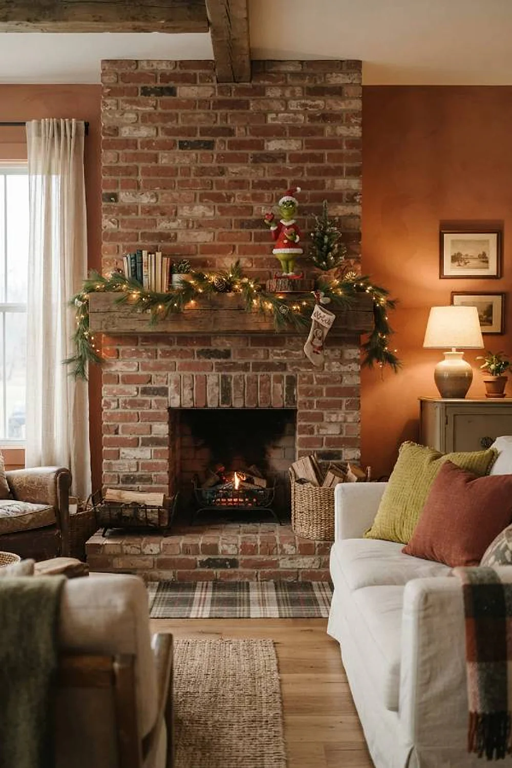
21 Grinch Christmas Decorations Designers Swear By
Most people expect Grinch decorating to mean one loud blast of fuzzy green, but the rooms that look good lean on a tight palette where green is only one voice. Grinch christmas decorations work when the green has a partner that settles its undertone, and the partner matters more than the green does.
Below are 21 pairings, each built around undertones and light, with paint names where they help. Some are loud and some are nearly restrained. All of them answer the same question: what goes next to that green?
Key Takeaways
- Grinch green looks best when a second color corrects its yellow or blue undertone instead of competing with it.
- Dark neutrals like charcoal and navy make lime read richer, while cream softens it.
- Test every swatch at 4pm and after dark, because lime shifts dramatically under warm bulbs.
- A single oversized accent in the second color beats five small scattered ones.
The color logic behind great grinch christmas decorations
Chartreuse and brick red
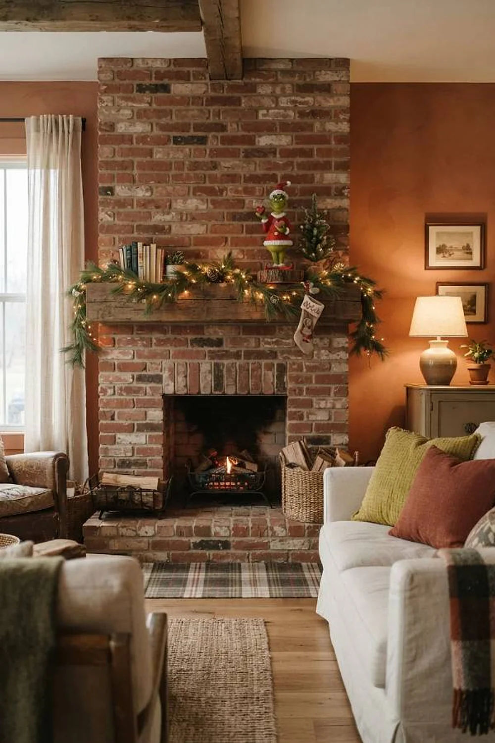
A felted wool stocking in chartreuse beside a brick-red velvet cushion gives you the Grinch contrast without the candy-cane sharpness of pure red. The brick carries brown underneath, and that brown calms the yellow in the green.
This suits living rooms with oak or walnut floors, where the brown undertone echoes the boards. Skip fire-engine red here, because it fights chartreuse and the pair starts to look like a traffic signal.
Lime green and charcoal
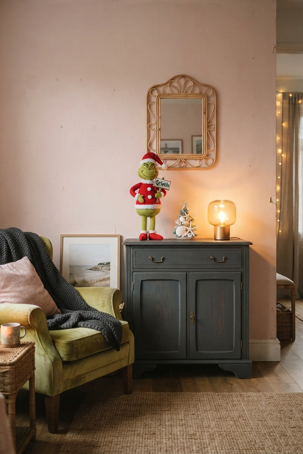
A mantel painted in Benjamin Moore Kendall Charcoal makes a lime garland look lit from inside. Dark neutrals absorb light, so the green reads more saturated than it does against white.
It’s the right move for a small room with one dominant fireplace wall. Keep the garland to about 6 feet and limit the green to three pieces, or the wall turns into a costume.
Grinch green with cream
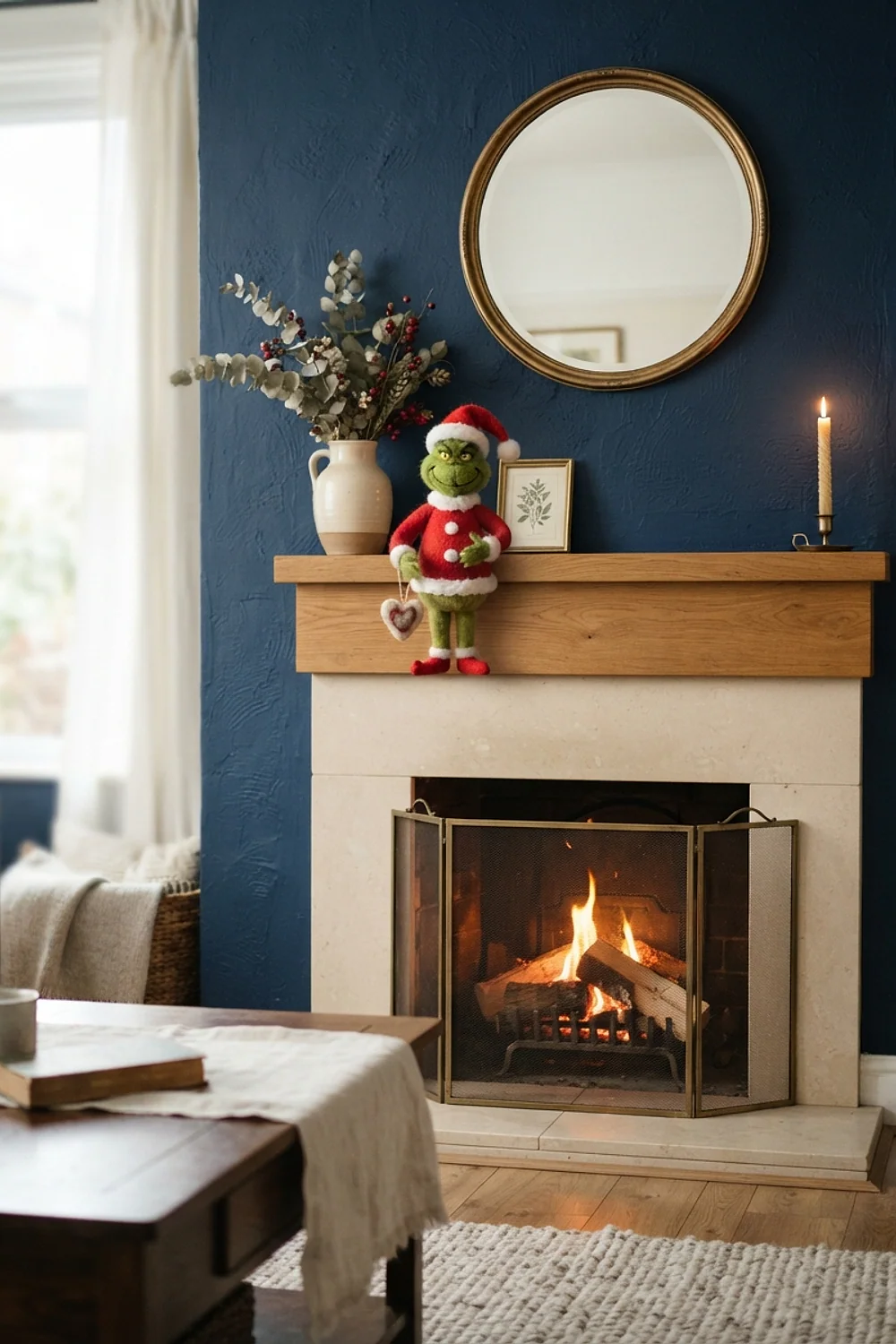
A 6-foot flocked tree in soft cream, hung with lime glass balls, feels gentler than any red-and-green scheme. Cream cuts the glare of the green, and the flocking has a dense, powdery texture that’s pleasant to brush past.
Choose a warm cream in the family of Benjamin Moore White Dove rather than stark white. Stark white goes blue beside lime and makes the whole tree look chilly.
Moss green and cranberry
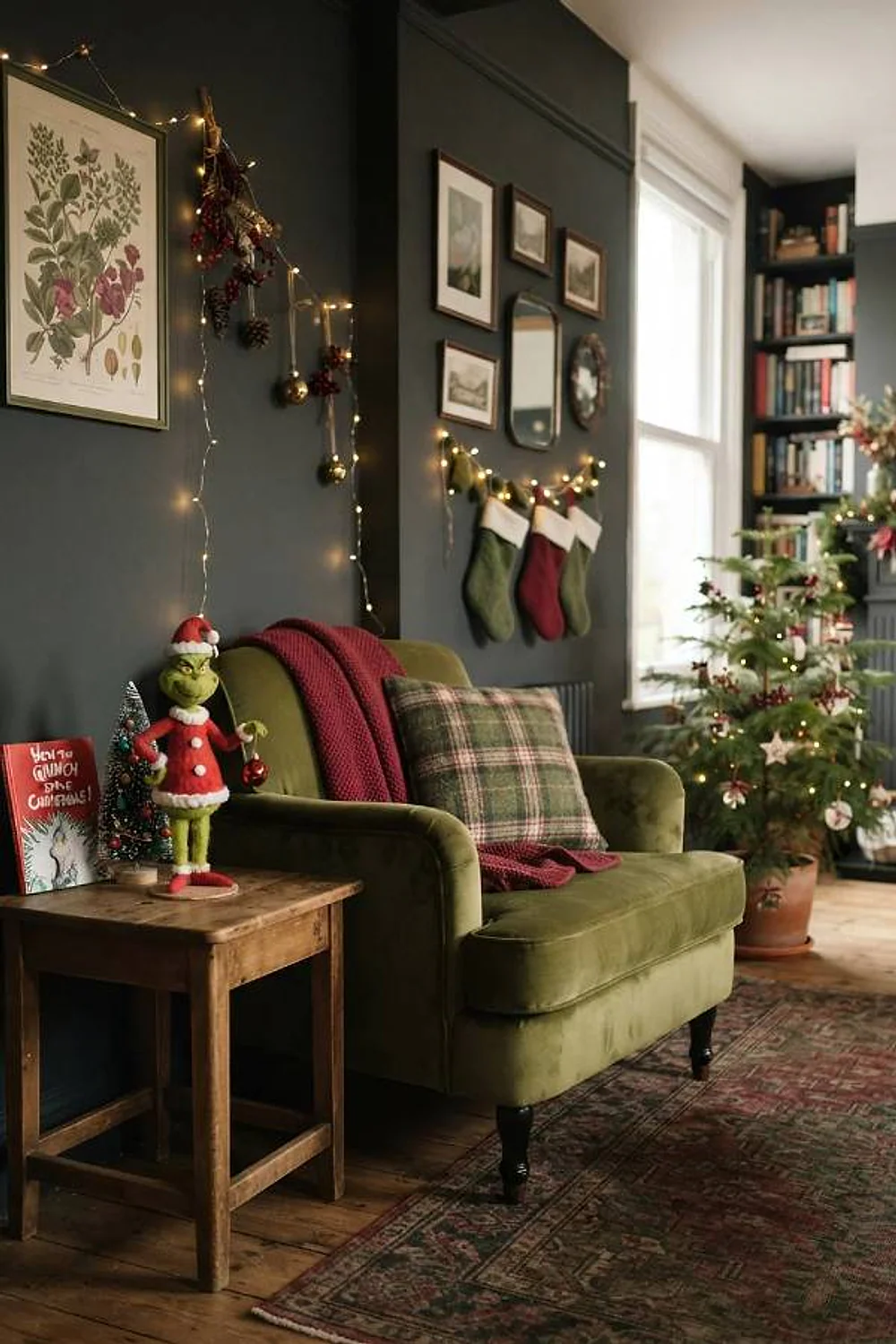
Moss velvet ribbon, roughly 2.5 inches wide, tied around a cranberry-berry wreath is the grown-up nod to the Grinch. Both colors are muted, so neither shouts, and the pairing sits comfortably in a dining room with deep wall paint.
The common mistake is dropping a bright lime ornament into the mix. One neon note makes the moss look dusty by comparison.
Lime and black-and-white buffalo check
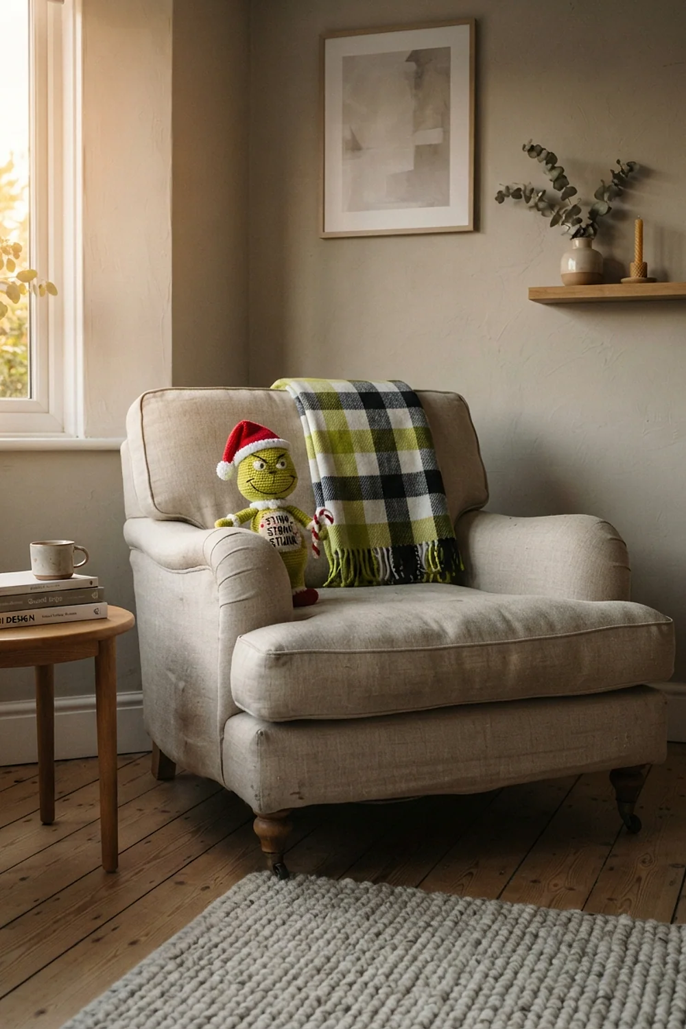
A buffalo check throw with a 3 to 4 inch repeat gives lime pillows a graphic backdrop. The check works because black and white are neutral, so the green carries all the color and the pattern supplies the structure.
Scale decides everything here. A check smaller than an inch blurs to gray from across the room, and the green loses its frame.
Mint and tomato red
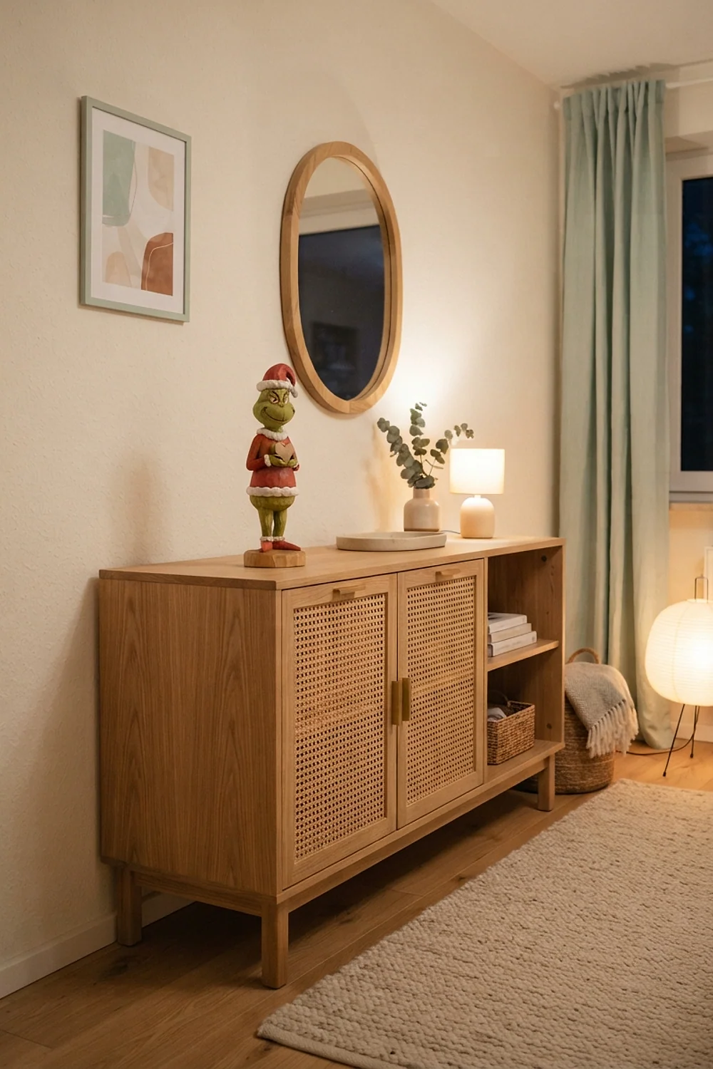
Mint-green tableware with tomato-red napkins has a retro-toaster charm that suits a breakfast nook. The red has to lean orange, because a blue-leaning red makes mint look sickly and cold.
This is the pairing people get wrong most often, usually by buying a cranberry napkin because it sits on the same shelf. Hold the napkin next to the plate in daylight before you buy more than one.
Olive and mustard
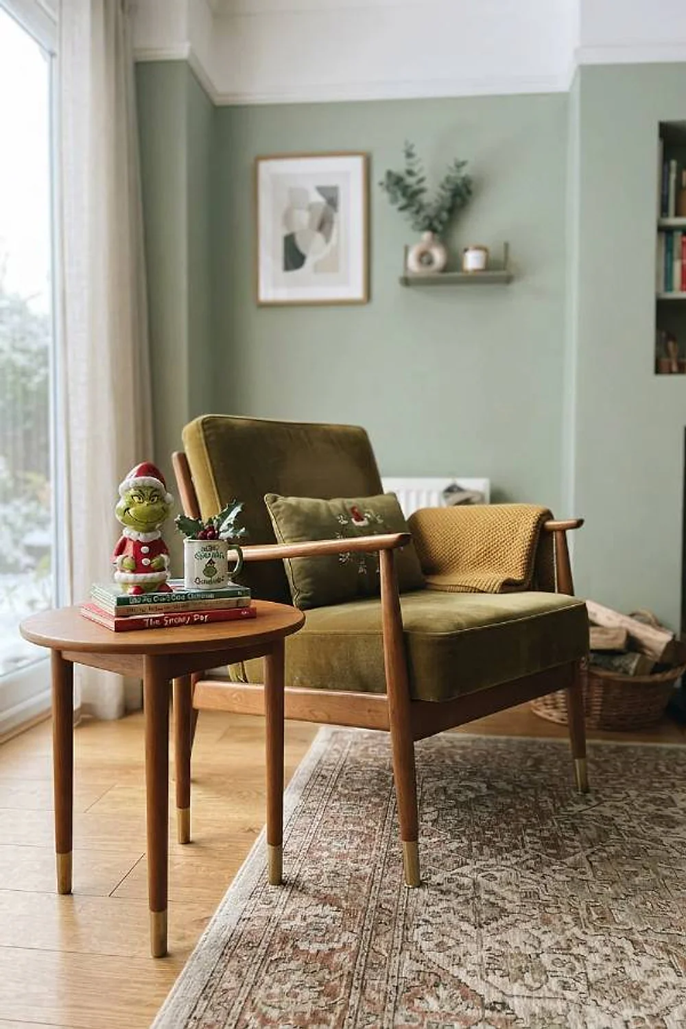
Olive pillar candles at 10 inches tall, with mustard ceramic bowls at 4 inches on a 48-inch console, build a triangle the eye reads in one pass. Both colors share a yellow base, so they sit together like relatives.
Put the tall olive pieces off-center and the low mustard ones in front. Honestly, the basics of this arrangement get repeated everywhere, but the yellow-base logic is why it holds up.
Green and gold
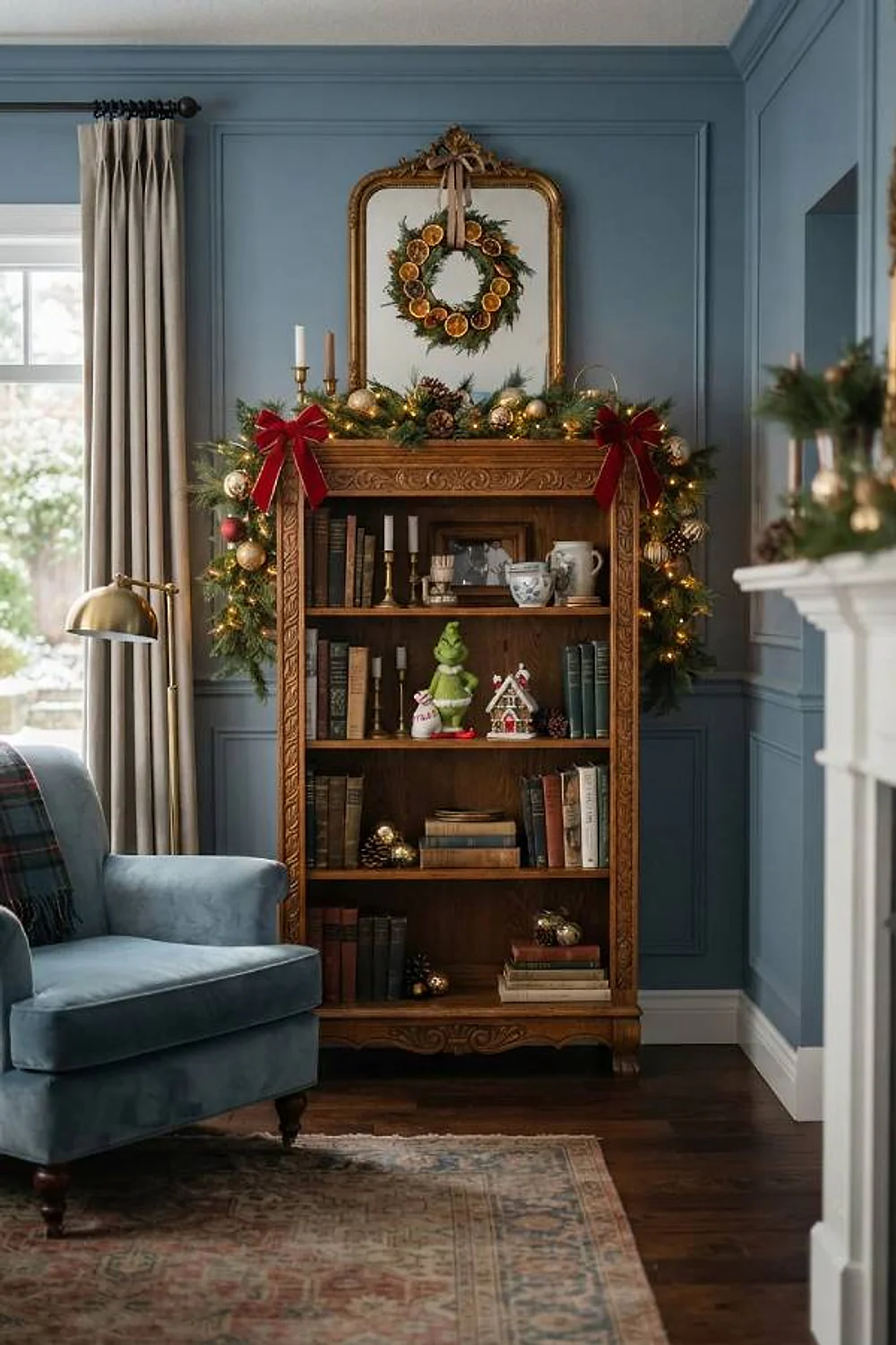
Brass bells with lime glass ornaments look best stored in a divided box with 3-inch cells, about $25 for a 64-compartment version. Brushed brass hides fingerprints, and the cells keep the glass from chipping against the metal.
Gold works with green because both lean warm, so the pairing looks settled rather than loud. It suits anyone with a growing collection and a single closet shelf, since the box stacks flat. Skip shiny yellow-gold plastic, which has a green cast under LEDs and looks greasy.
Lime and navy
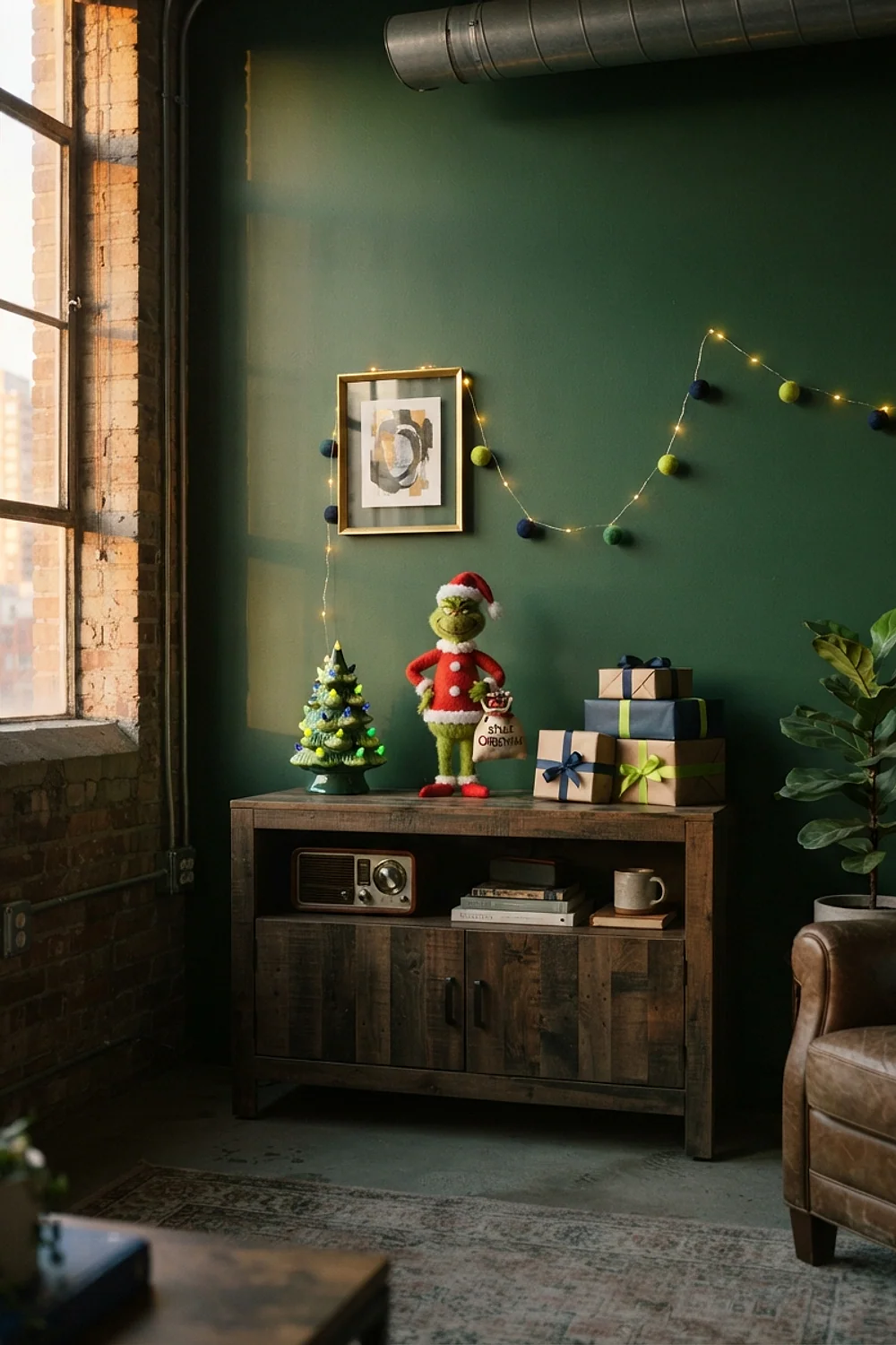
Navy walls in a shade like Hale Navy turn lime ornaments into small lamps, but only if the bulbs are right. Under 2700K lighting the lime shifts toward yellow, and under cool white the navy goes nearly black.
A gray November Tuesday at 4pm is the real test, when a north window turns navy icy. Pick 2700K to 3000K bulbs and check again after dark.
Pine and fur white
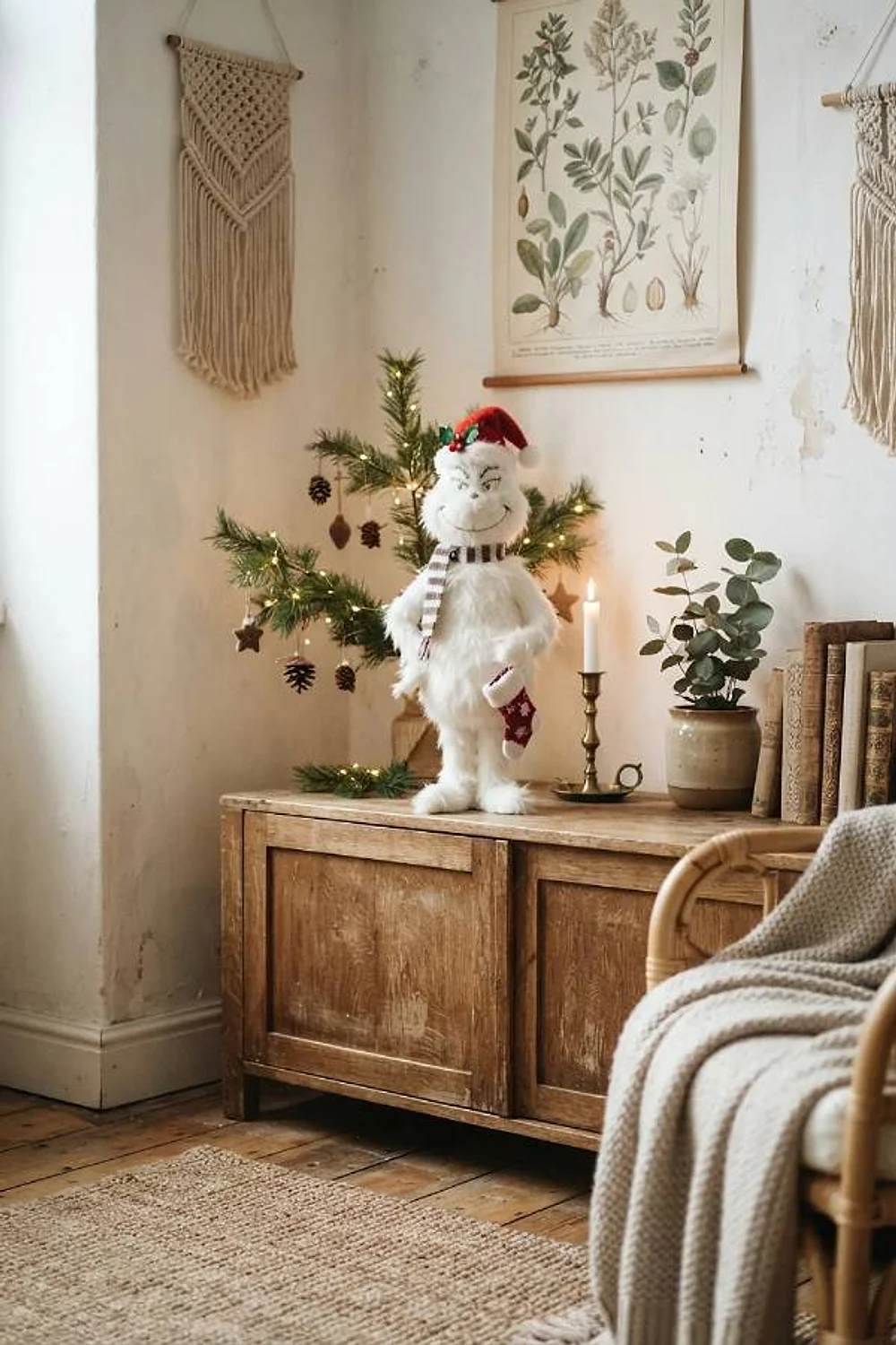
A 48-inch faux-fur tree skirt, around $60, in ivory under a dark pine tree gives you the Grinch’s own fur trim. It earns its place because machine-washable fur survives pets and spilled cider.
Ivory against dark needles also gives the base of the tree a bright, defined edge. It suits homes with pets or toddlers, where a skirt that goes in the wash after every mishap beats a delicate one. Avoid it near an entryway, where pure white collects salt and grit within a week.
Chartreuse and hot pink
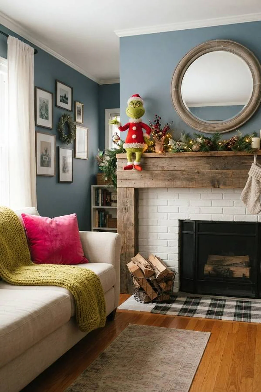
A glossy pink ceramic tree beside a matte lime pompom garland is the Whoville side of the story. The gloss against felt gives each color a different surface, which keeps two loud shades from blurring together.
This belongs in playrooms and nurseries, where bright color feels playful and a felt garland is harmless when small hands tug it. Two shades are plenty for a small room. Choose a coral-leaning pink, because a blue-pink beside lime looks like a highlighter pen.
Slate blue and snow white
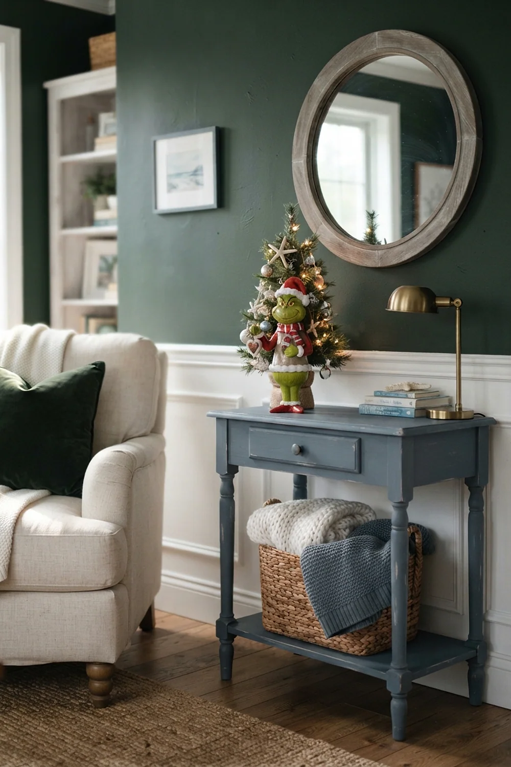
Cotton batting snow on a gray-blue wall, in a tone like Farrow & Ball Pigeon, builds Mount Crumpit without a drop of green. A single lime ornament then becomes the Grinch himself, peeking over the ridge.
It suits a bedroom or an entry with plenty of white trim. The mistake is going too blue, which turns the scene into a winter spa.
Green and copper
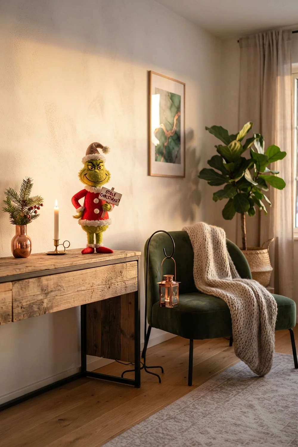
A brushed copper lantern about 14 inches tall holding a battery candle brings a warm glow and a pleasant weight to the hand. Copper’s orange cast takes the chill out of deep green.
It’s a good fit for a reading corner with a velvet armchair. Brushed finishes beat polished ones, since polished copper reflects the room’s clutter back at you.
Lime and plum
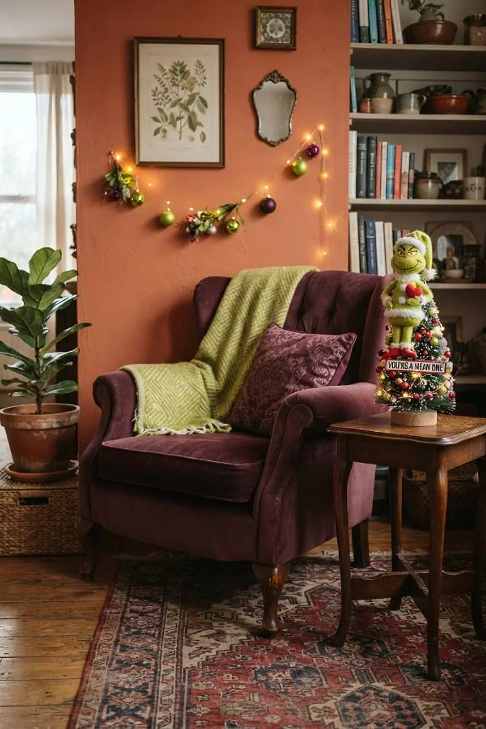
A 20-inch plum velvet cushion piped in lime sits close to opposite on the color wheel, since violet is the complement of yellow-green. That tension makes both colors look richer than they are alone.
It works in moody living rooms with dark rugs, where velvet’s deep nap soaks up lamp light and lets the lime piping glow. A charcoal throw nearby keeps the palette calm. Use two plum pieces at most, or the lime starts to feel like an afterthought.
Sage and red velvet
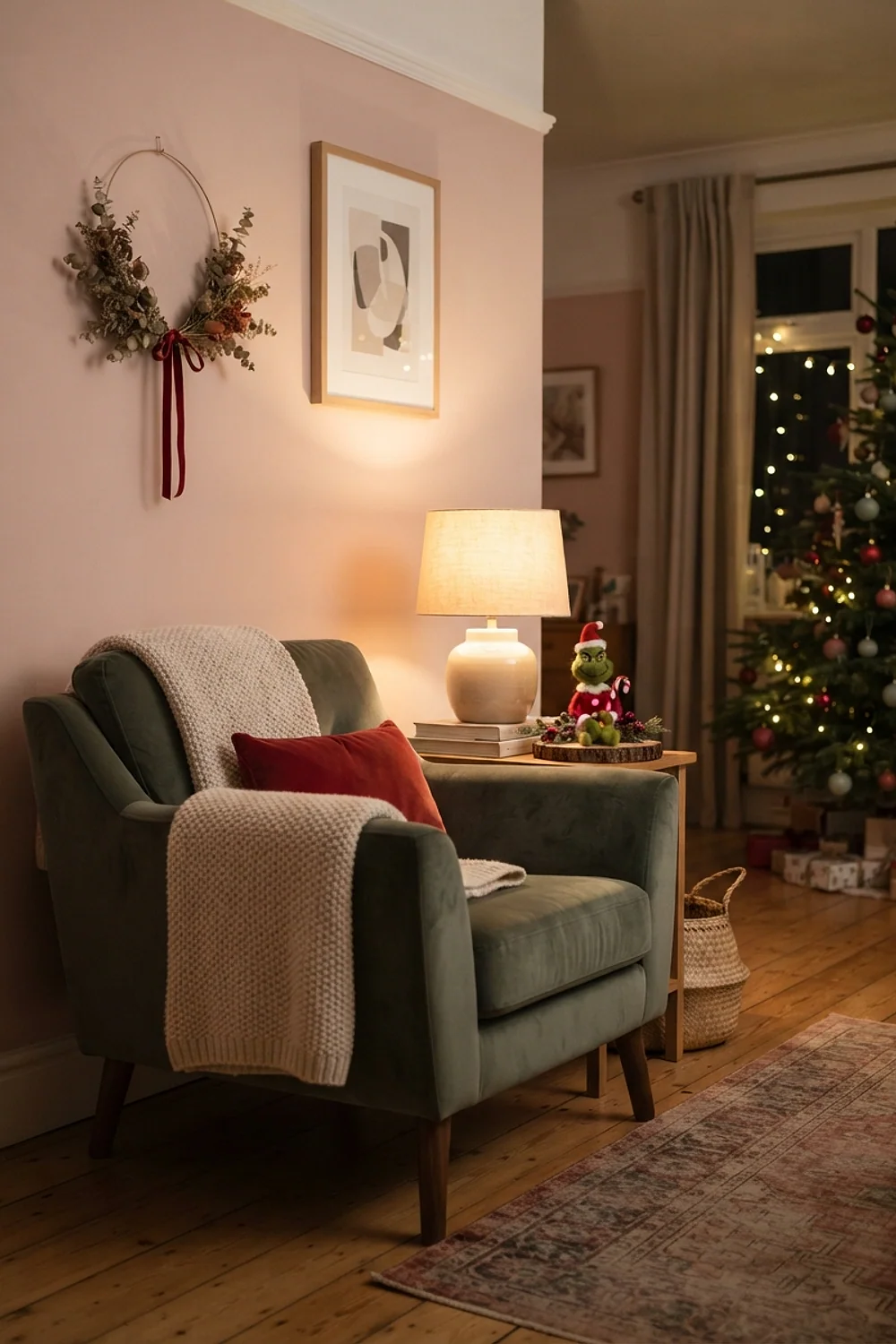
One 22-inch red velvet pillow on a sage sofa carries the whole scheme. Red covers perhaps 10 percent of the view, the sage covers the rest, and the eye lands exactly once.
This is a fix for people who own a green sofa. Five small red cushions would look like confetti, so go big on one and leave the rest alone.
Matte black and neon green
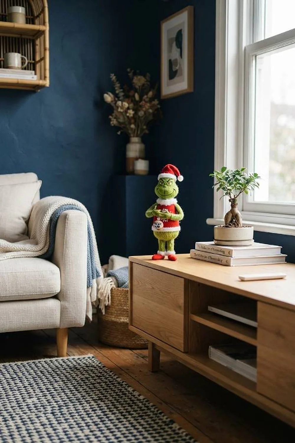
Matte black paired with neon green is the loudest combination in the list, and a game-room wall suits it. Skip glossy black, which picks up every reflection and turns tinny. No, scratch that: a bar cart is too small a canvas, so give the pairing a full wall.
Keep the neon to about 15 percent of the surface. Beyond that, the green overwhelms the black and the whole thing stops reading as a design.
Mint and blush
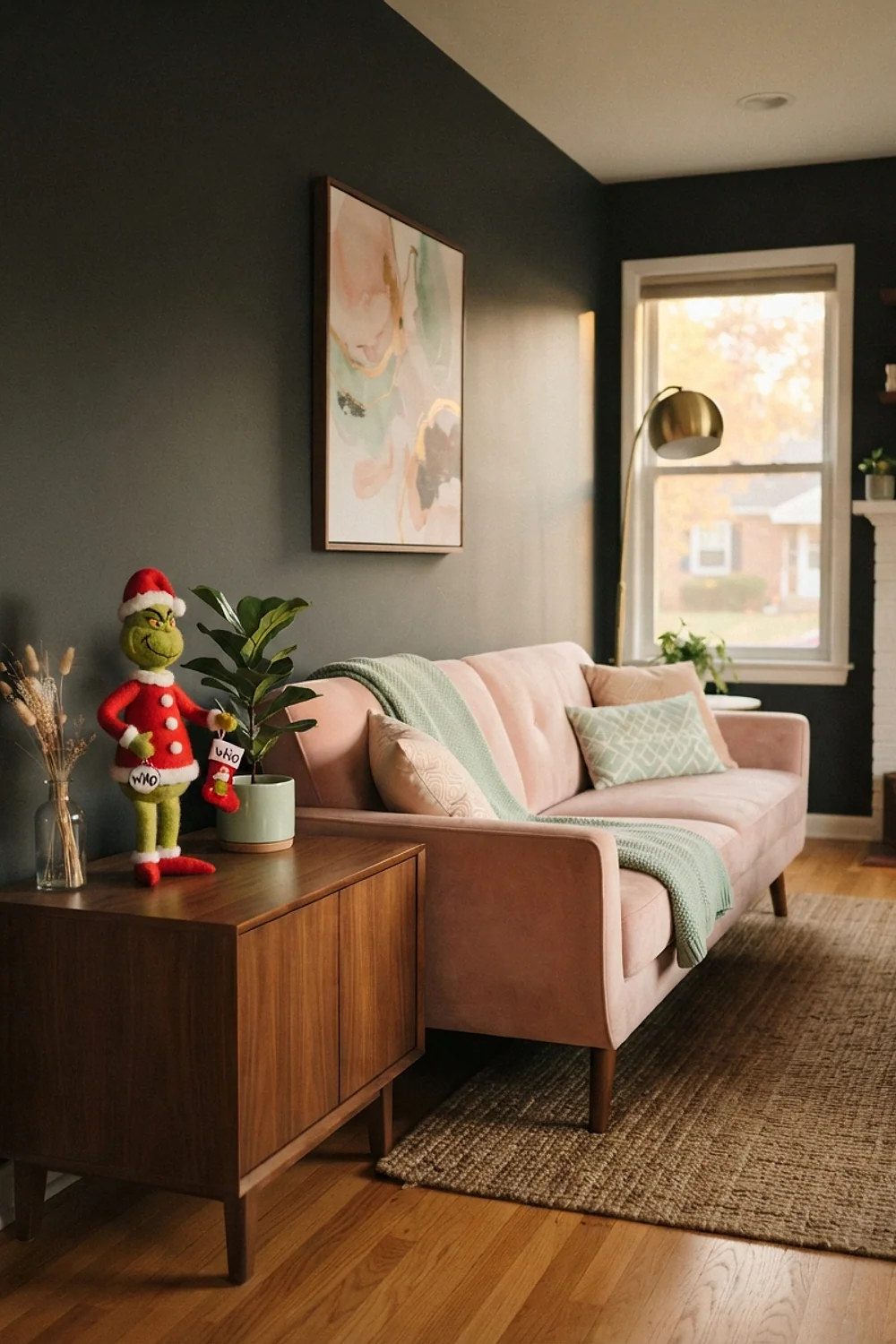
Three mint glass trees at 8, 12, and 16 inches, set on blush chargers down a 48-inch round table, make a soft brunch setup. Odd numbers and varied heights stop the table from looking staged.
It suits morning gatherings in daylight, when pale glass picks up window light and the pastels read as fresh rather than faded. Leave at least 12 inches clear in front of each place setting, or the trees crowd the plates.
Green and natural wood
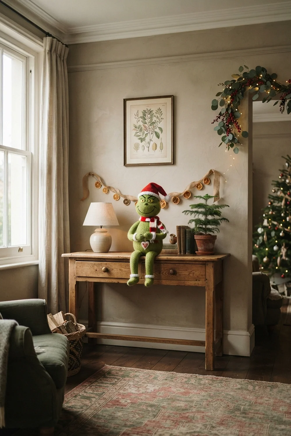
A 72-inch pine ladder shelf stacked with green hat boxes stores the season’s smaller pieces in plain sight. The boxes hide cords and ornaments, and the wood keeps the green from feeling plastic.
Choose oak or walnut over orange-toned pine, which fights lime, and if the ladder is pine, pick a pale, unstained one. This works best in a hallway where closed storage is scarce, since the ladder leans against the wall and takes little floor space.
Grinch green and turquoise
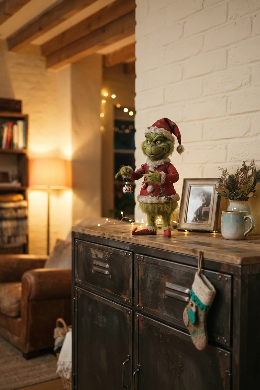
Turquoise glass ornaments on a green tree catch cool light from LED strands and look like shallow water. The two colors sit side by side on the wheel, so they blend instead of clashing.
That suits a tree in a bright living room or a modern space with white or gray walls, where cool tones feel natural. Don’t mix amber and cool-white strands on the same tree. One temperature of light keeps the turquoise from going muddy.
Cream, red, and one green accent
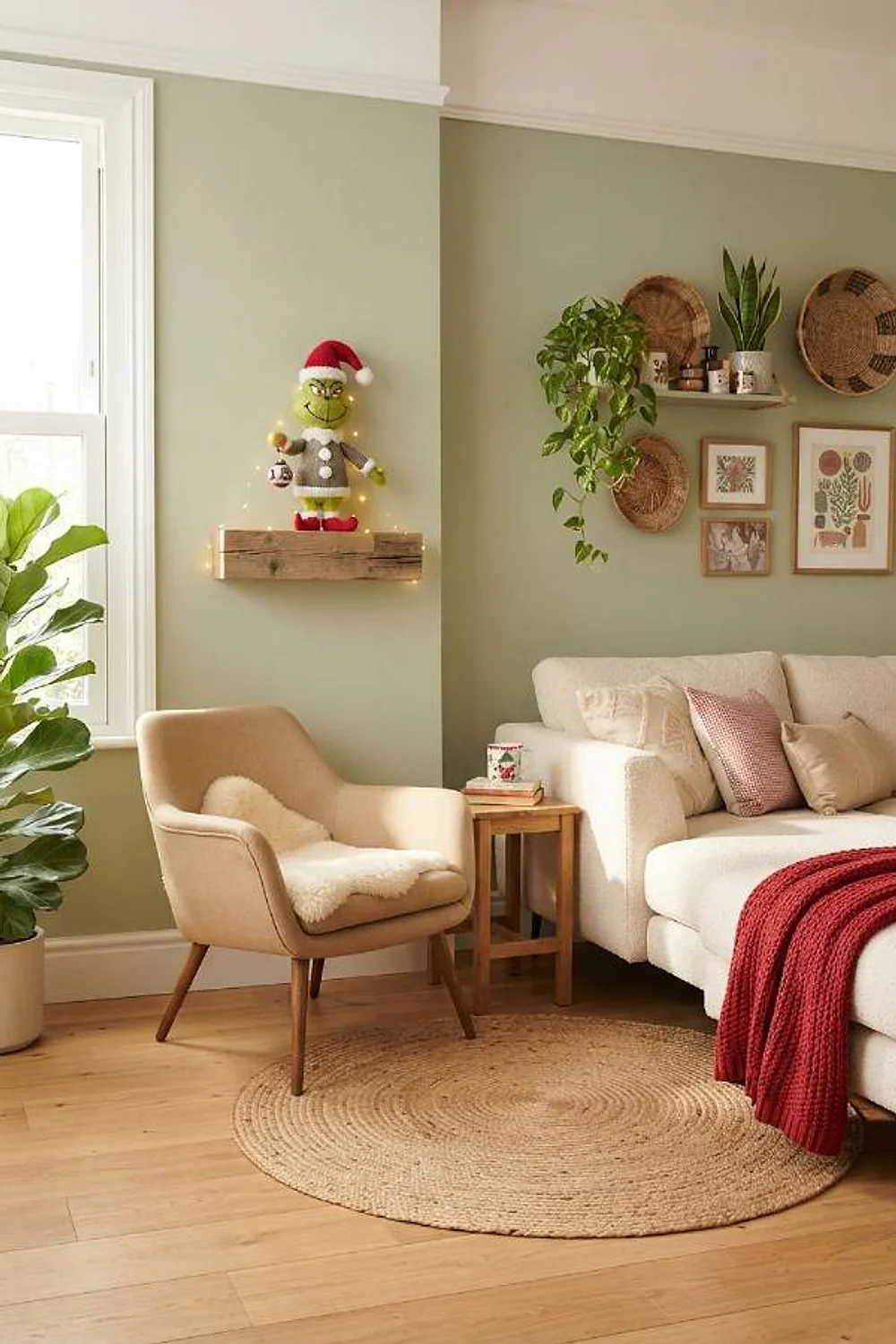
A hallway console in cream with red candles and a single 30-inch lime wreath, around $40, is the restrained take. One green piece reads as a joke, while ten would read as a theme.
It’s the right call for rentals and for households where one person can’t stand green, since a wreath hangs on a removable hook and leaves the rest of the palette classic. Let the wreath hang alone, and resist adding a second.
Silver and lime
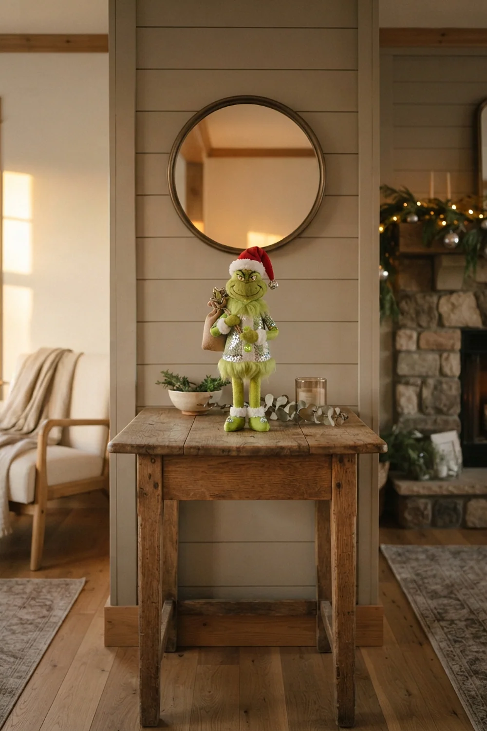
Mercury glass beads in silver draped over a frosted window turn lime ornaments electric, because silver is a cool metal and exaggerates the green’s brightness. The glass has a soft, aged shimmer that cheap tinsel can’t copy.
It suits modern rooms with white walls, where the cool sparkle looks deliberate and the frosted glass diffuses daylight evenly. Small adhesive hooks along the frame hold the strands without nails. Avoid plastic tinsel, which looks thin against lime and sheds on dark rugs.
Testing colors for grinch christmas decorations before you commit
Grinch christmas decorations change character under different bulbs, so swatches deserve more scrutiny than a quick glance at the store. A lime that glows in the shop can look like a garden hose by evening.
Run through this before buying anything large:
- Tape a 2 by 2 foot paint sample to the wall and look at it at 9am, 4pm, and after dark.
- Hold a fabric or ornament sample against the swatch to compare undertones.
- Take a grayscale photo, which shows whether the two colors have enough contrast in value.
- Check the bulbs in the room, since 2700K and 4000K shift lime in opposite directions.
The counterintuitive part: dark, muted greens often survive evening light better than bright ones. Lime can look sickly under yellow bulbs, while a deep pine just gets cozier.
Lessons learned
Most color mistakes come down to undertone, and most are fixable without repainting. Start with the smallest change and work outward.
- If the green looks too yellow, add a blue-based white or a navy piece nearby to pull it cooler.
- If the room feels too loud, swap two bright pieces for charcoal or black, which quiets the saturation.
- If red and green clash, replace the red with a brick or burgundy that carries brown.
- If everything looks flat, add one object in a contrasting metal, such as brushed copper or brass.
Grinch christmas decorations that feel off are rarely wrong in color alone. Usually there are too many competing accents, so remove half of them before buying anything new.
Choosing your grinch christmas decorations palette
Pick one pairing from the list, commit to it, and let the green be the loudest thing in the room only once. That discipline is what separates a styled mantel from a costume shop.
Save or pin this list so it’s handy when the decorations come out. Then start with idea 2 or 20, and sample the paint or fabric at 4pm before you buy anything else.


