
12 Diy Thanksgiving Decorations Dollar Tree Ideas
A table for eight on a $1.25-per-item budget leaves almost no room for color mistakes. That’s why diy thanksgiving decorations dollar tree projects succeed or fail on palette choice, not on how many pumpkins fit in the cart.
Dollar Tree’s fall aisle is a loud mix of saturated orange, glossy gold, and craft-store green. Pair those pieces by undertone and finish, and the whole table reads as one decision. Below are 12 palettes, plus the testing and rescue steps that keep every choice reversible.
Key Takeaways
- Matching undertones (warm with warm, cool with cool) matters more than matching exact shades across cheap decor.
- Matte spray paint is the fastest way to stop inexpensive pumpkins and vases from looking like plastic.
- Test every color under your dining room’s own 4pm light before painting or gluing anything.
- Choose removable fixes like painter’s tape, double-sided tape, and chalk-style paint so a bad color can be undone.
The color logic behind great diy thanksgiving decorations dollar tree
Every inexpensive decor item carries an undertone, and the undertone decides whether two pieces get along. Orange leans red or yellow. Green leans blue or olive. Cream leans pink or butter.
Pick one temperature, warm or cool, and hold it across at least three items. The first four palettes below show how that works on a real table.
Burnt orange and cream pumpkins
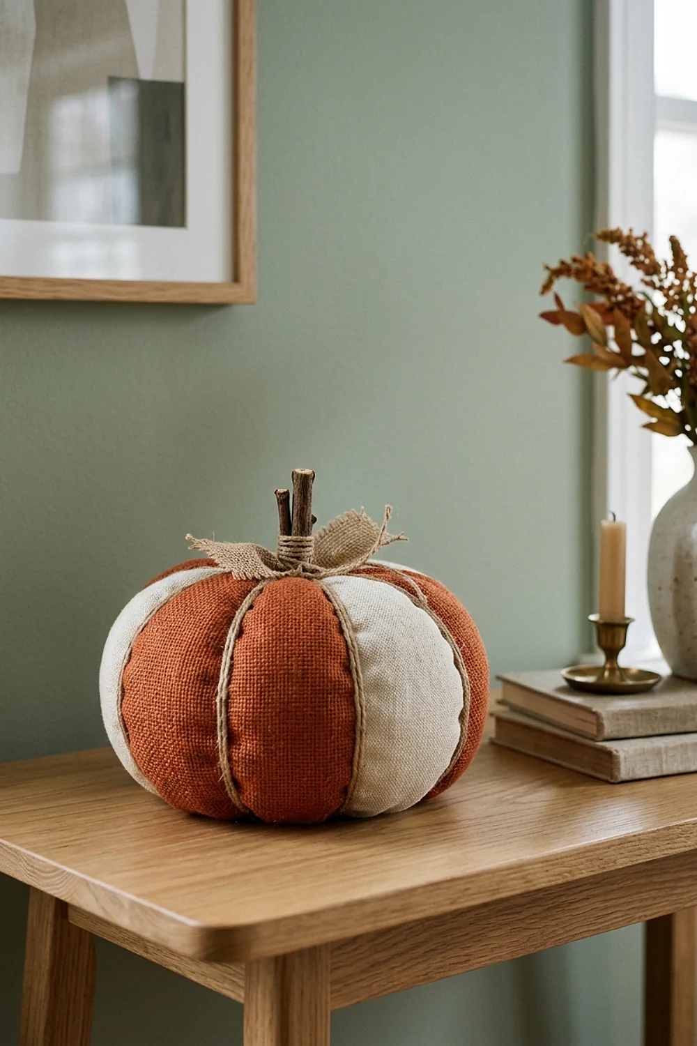
A cluster of three foam pumpkins sprayed in a matte burnt orange, close to Sherwin-Williams Cavern Clay, sits on a cream runner and lifts off in one move. That matters on Thanksgiving, when platters arrive and the center needs clearing in ten seconds.
Here’s the counterintuitive part: the orange is rarely the problem with dollar-store pumpkins. The sheen is. A matte coat (two thin passes, about 20 minutes apart) fixes what no color swap can.
This suits a first-time host with a 30-inch-wide table. Skip the glossy orange entirely.
Olive leaves with brass candlesticks
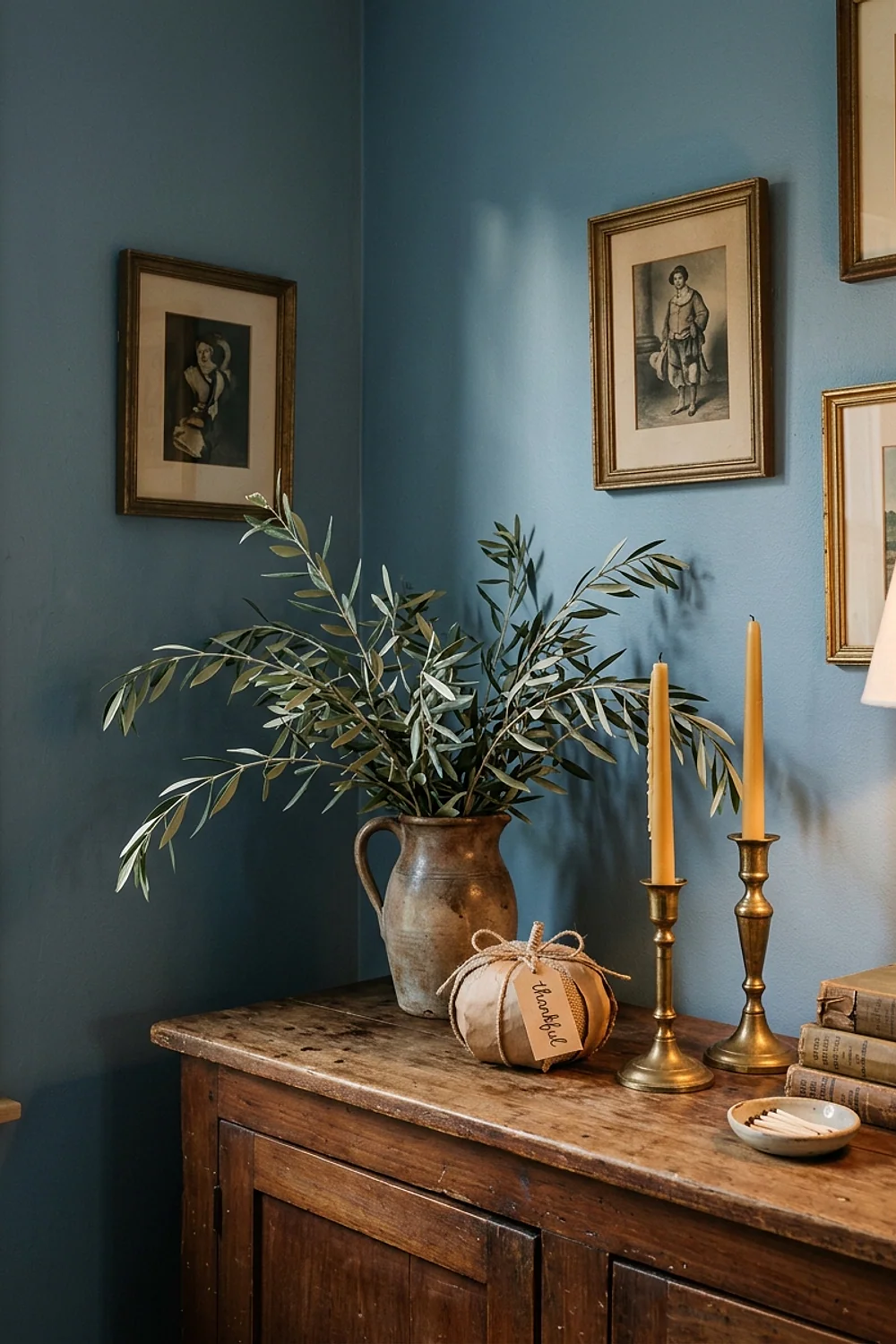
Faux greenery stems in a yellow-leaning olive look right beside brass-toned candlesticks because both share a warm undertone. Blue-green eucalyptus stems beside brass look slightly sour. The eye catches the mismatch before it can name it.
This works best on a wood table in oak or walnut, where the olive picks up the grain’s warmth. Hold a stem against the candlestick in daylight before buying six of them.
Navy and copper that flat-pack
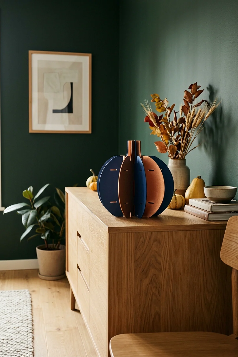
Navy paper garlands, a deep shade like Benjamin Moore Hale Navy on painted jar lids, and copper foil leaves all store flat in one shoebox. At $1.25 a piece, a full set of this palette stays small enough to reuse next November.
Hang the garland with painter’s tape, not nails, and nothing marks the wall. The common mistake is mixing a shiny copper with a flat navy. Match the finishes or the copper looks like gift wrap.
Charcoal glass with blush dried stems
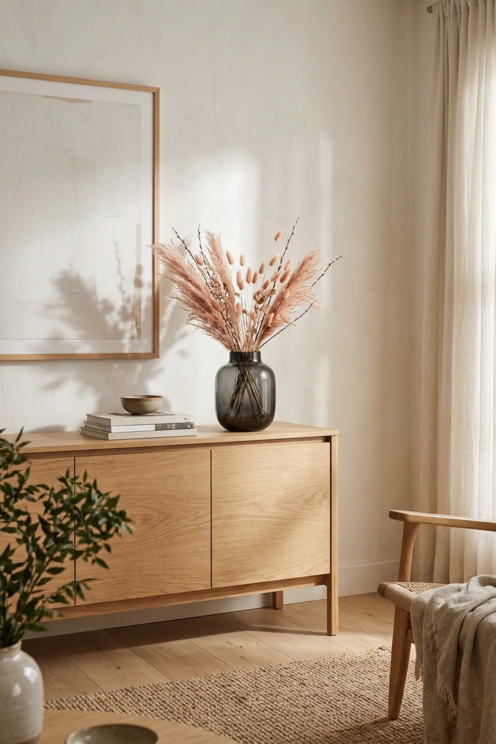
Clear glass cylinder vases take matte charcoal spray well, a shade near Sherwin-Williams Iron Ore, if the spray is rated for glass and applied in thin coats. Paint over 24 hours of cure time chips when a stem gets pulled out.
Blush dried grasses soften the dark vessel. If the charcoal looks too heavy, chalk-style paint scrapes off glass with a razor blade, which keeps the experiment undoable.
Neutral and moody pairings that calm a loud table
Once the basic warm palettes are settled, quieter combinations are the next step. These four rely on texture and proportion instead of saturation.
Tonal white pumpkins in three sizes
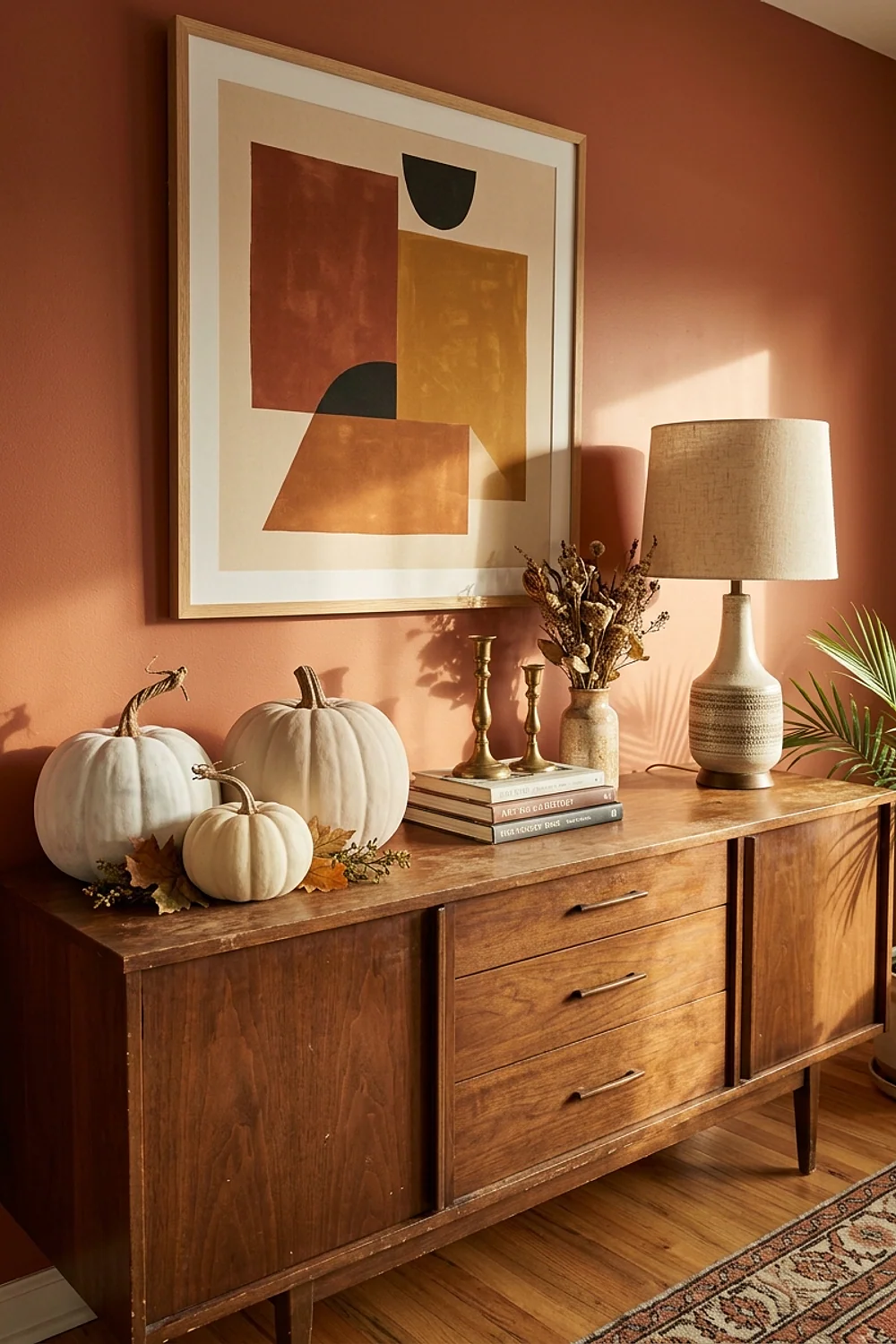
White pumpkins in graduated sizes, roughly 3, 6, and 9 inches, create a landscape on a table without a single bright color. Paint every one in the same warm white, like Benjamin Moore Cloud White, so the sizes carry the interest.
Odd numbers read as natural, so go with three or five. On a narrow table under 36 inches wide, skip the 9-inch size, because it blocks sightlines across the plates.
Terracotta felt with sage napkins
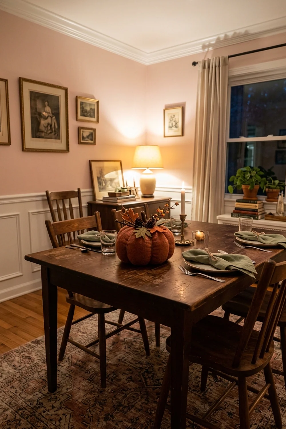
Felt placemats cut from 9×12-inch craft sheets feel soft under forearms and muffle plate clatter. Layer two sheets in a clay shade, then fold a gray-sage napkin (think Sherwin-Williams Evergreen Fog) across the top.
Secure the layers with double-sided tape rather than glue, and the sheets peel apart for next year. Felt pills if it gets damp, so keep it away from gravy boats.
Mustard candles on kraft paper
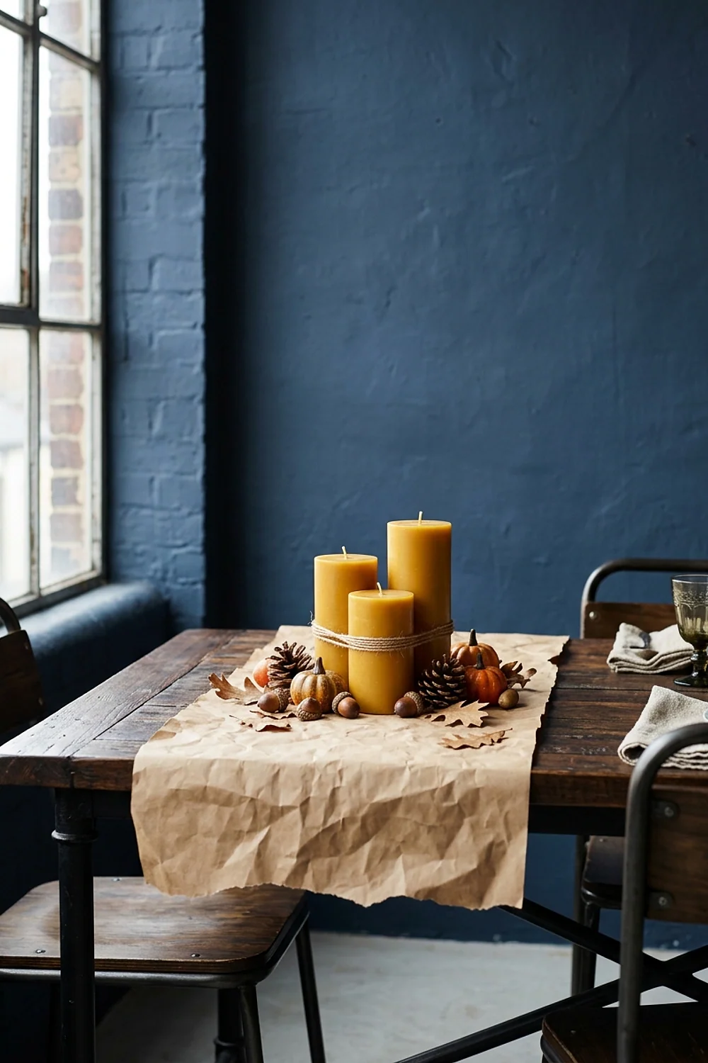
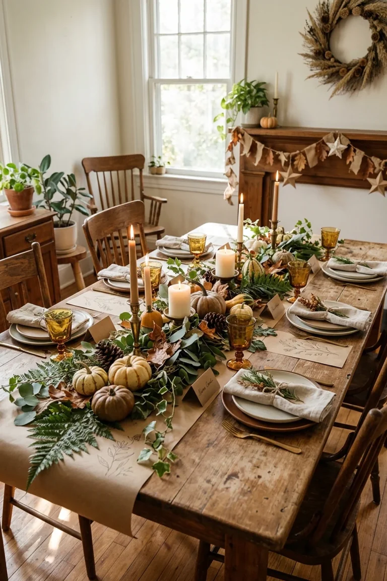
Kraft paper rolled down the table center at the $1.25 price point makes a runner that doubles as a doodle surface for guests. Mustard taper candles stand out against the brown because mustard is a yellow with a dash of brown in it.
This works for a casual family table where kids will be coloring. Cool white plates fight the mustard, so choose ivory or stoneware.
Cranberry and forest green on a long table
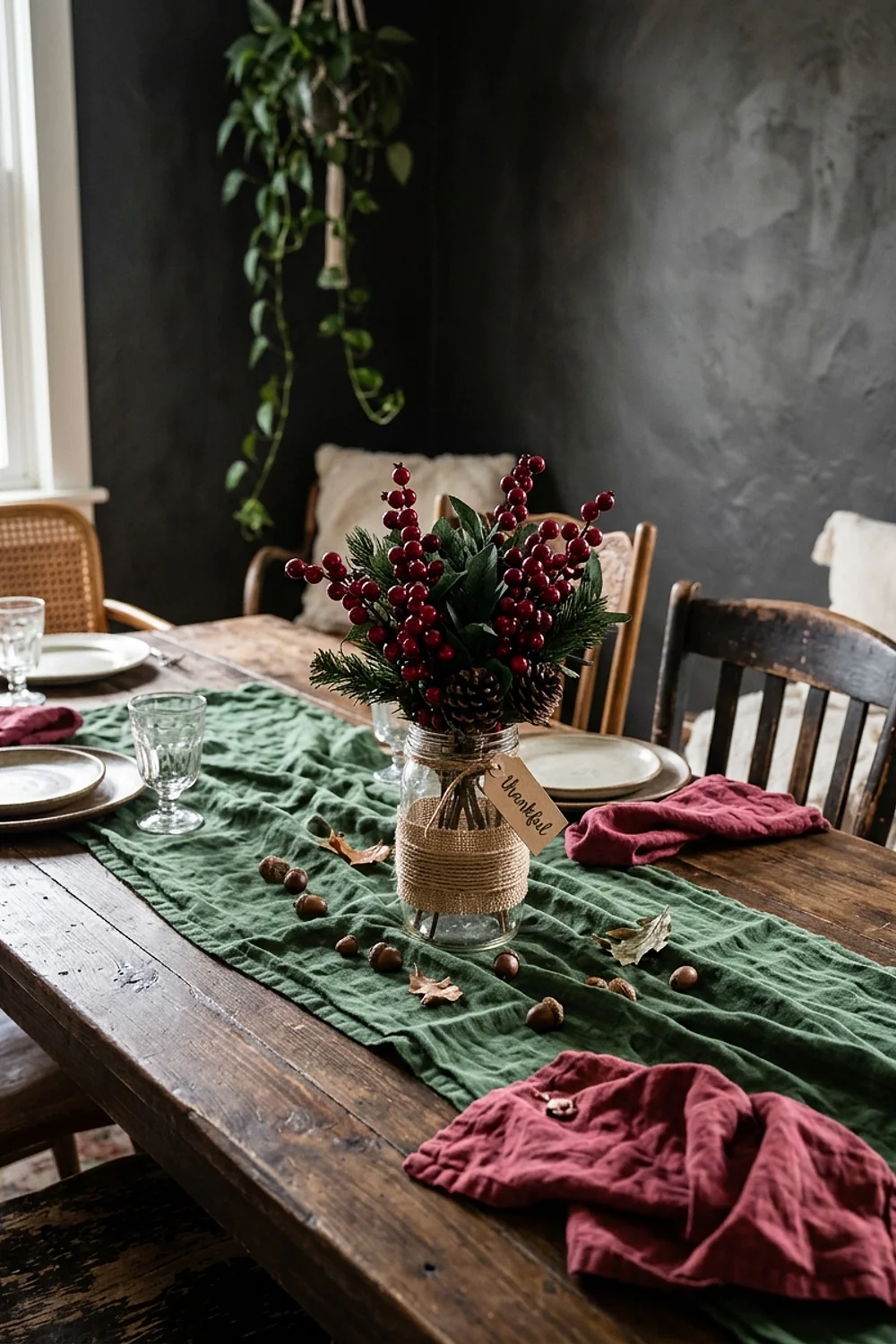
On a rectangular table seating ten or more, repeat cranberry accents every 18 inches (a napkin, a small bowl of faux berries, a place card) with forest green stems between them. The rhythm stops the eye from landing in one spot.
A round table calls for the opposite: cluster the cranberry in the middle and keep the green at the edges. Both need a neutral base, since red plus green on a patterned cloth looks like December too early.
Palettes that depend on light and restraint
The final four palettes lean on lighting, discipline, and one deliberate rule each.
Warm white and amber glow
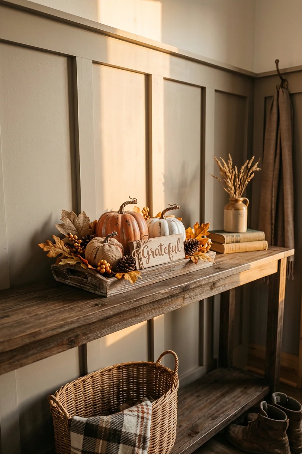
Amber glass votives catch the low, golden light of 4pm in late November and turn it into honey on the tablecloth. Battery tealights rated near 2700K match that glow, so the flame and the glass agree.
This suits a dining room facing north, where daylight runs gray and amber glass supplies the missing warmth. In a south-facing room, clear glass is enough, which saves money.
Avoid cool-white LEDs, which look faintly blue beside real candles, and check the package for the Kelvin number.
Plum and pale gold, not glitter gold
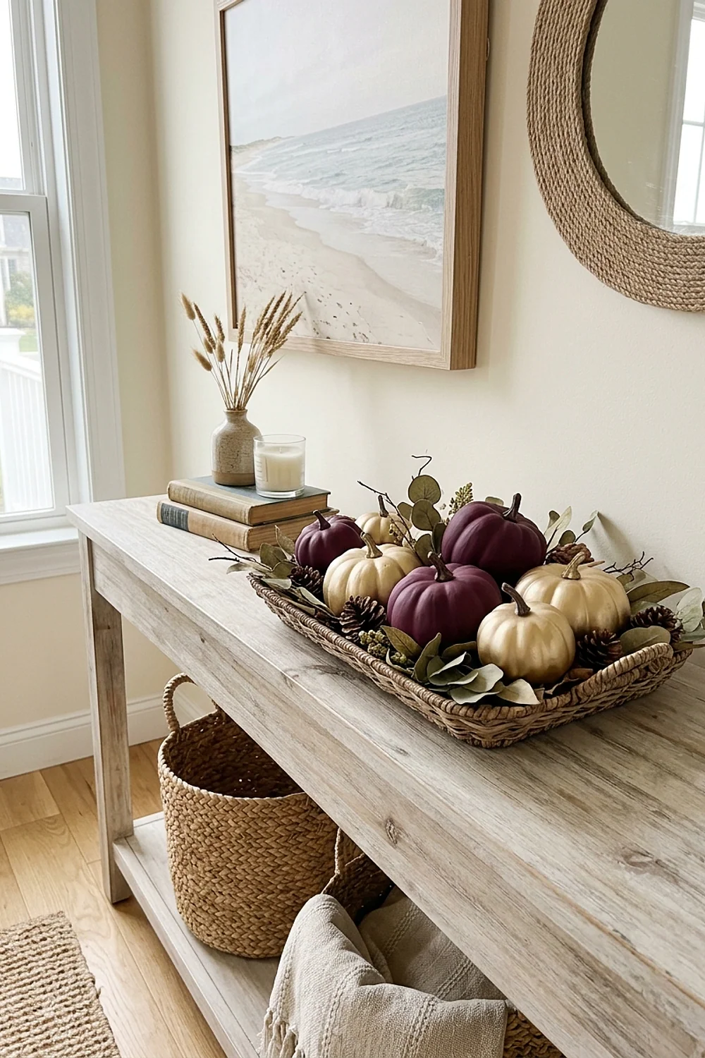
Plum napkins with champagne-gold accents feel grown-up, but shiny glitter gold ruins them fast. Plum has a blue undertone, and a brassy yellow-gold fights it. Matte paint pen in pale gold, applied to leaf edges, behaves better.
The usual mistake is buying everything gold in one aisle and hoping the shades match. They won’t. Pick one gold, then paint or swap the rest.
Chocolate brown and oatmeal napkin rings
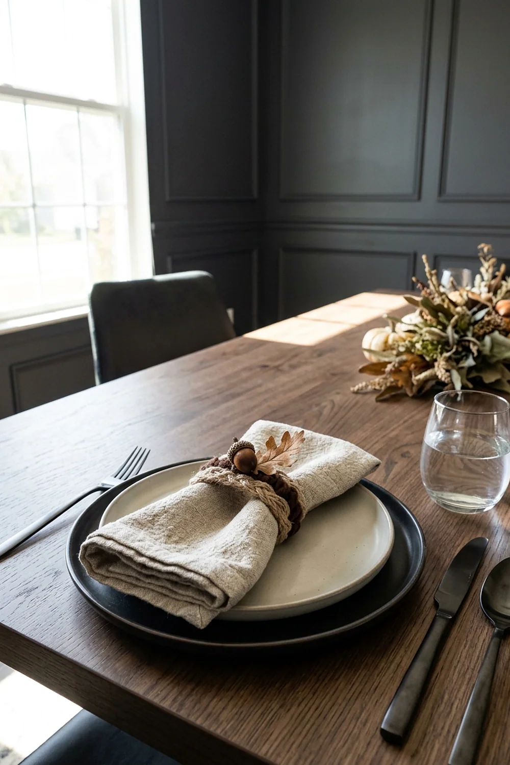
Napkin rings cut from cardboard tubes in 1.5-inch sections, wrapped in jute and brushed with a deep brown like Sherwin-Williams Urbane Bronze, hold a rolled oatmeal napkin firmly. A $1.25 roll of jute twine covers eight rings.
This suits anyone short on time, since each ring takes about three minutes. Dry the paint fully before wrapping, or the jute sticks and frays.
Black, white, and a single orange accent
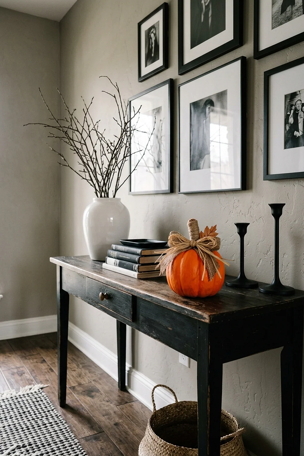
Black plates, white napkins, and one orange element, such as a pumpkin or a ribbon, make a modern table that photographs cleanly. Limiting the table to one accent forces the eye to the focal point, because nothing else competes for attention.
This palette fits small apartments and minimalist rooms best, and it is cheap, since black and white dinnerware is easy to find at a dollar store and one pumpkin costs little.
Do not add a second accent color, because the contrast collapses.
Matching the palette to your walls and wood
Dining room walls shift every color on the table. A greige wall, such as Benjamin Moore Revere Pewter, tolerates nearly every warm palette above. A cool white wall makes orange look louder than it did in the aisle.
Wood tone matters just as much. Check these three things before choosing a palette:
- Wood undertone: red cherry loves olive and cream, while yellow oak prefers navy and plum.
- Wall temperature: warm walls absorb orange, and cool walls amplify it.
- Tablecloth pattern: any pattern wider than 2 inches limits you to one accent color.
Testing colors before you commit
Isn’t the store aisle the worst place to judge orange? Exactly. Fluorescent light flattens warm tones and exaggerates yellow, so what looked mellow on the shelf turns loud at home.
Buy one of each item first. Set them on the actual table for a full afternoon, since light changes between noon and 4pm.
Paint a test pumpkin or a scrap of cardboard. By the second coat, a shade that looked tame on the can often reads two notches darker, which is why the swatch and the finish rarely agree.
A paint sample pot costs under $6, and a spray can for a single glass vase is cheaper than a failed palette.
Mistakes that keep showing up
When a palette looks off, the problem is usually one piece, not all of them. Remove the loudest item and look again before repainting anything.
These fixes undo cleanly:
- Too glossy: a light mist of matte clear coat dulls shine in 15 minutes.
- Too bright: cover the item with a layer of cream or gray tissue, or swap it for a neutral piece.
- Clashing undertones: place a bridging color, like cream or wood, between the two.
- Paint gone wrong on glass: scrape chalk-style paint off with a razor blade, then wash.
Permanent fixes like repainting furniture or wallpapering can wait until after the holiday. A rental-friendly rescue is always a swap.
Bringing it all together
Good diy thanksgiving decorations dollar tree choices come down to undertone, finish, and a test in your own light. Pick one of the twelve palettes, keep one temperature, and let a matte finish do the heavy lifting.
Save or pin this list so it’s ready when you start shopping. Try palette 1 first, and bring a swatch of your tablecloth to the store.